Brooker’s style was very much his own. Although he looked carefully at contemporary art, few of his paintings exhibit distinct stylistic influences. He was more obviously affected by listening to music and by reading widely. Contrary to trends in Canadian art at his time, he was a forerunner of abstract art in Canada and turned to realist representation in his mid- and late-career work. His artistic endeavours relate closely to his work as an advertising creative and as a literary writer.
A Self-taught Talent
Brooker’s major paintings are in oil, but he made a substantial number of tempera paintings, watercolours, and drawings. In stylistic terms, he is an anomaly. He was a self-taught artist who learned a great deal from observing, among other sources, Lionel LeMoine FitzGerald (1890–1956), Kathleen Munn (1887–1974), and Rockwell Kent (1882–1971).
Brooker derived much of his wide knowledge of the plastic arts and music from books and periodicals. For example, although he missed the landmark 1913 Armory Show in New York City, he would have read newspaper reports of this event. The show included major works by exemplars of the early European avant-garde, for instance, those by Marcel Duchamp (1887–1968)—whose Nude Descending a Staircase (No. 2), 1912, was one of the many works reviled in the press—Francis Picabia (1879–1953), Wassily Kandinsky (1866–1944), and Constantin Brancusi (1876–1957). Brooker made title designs and illustrations based on items on display at the Armory Show that were reproduced in the press, which had published copies of work by Duchamp, Brancusi, Gustav Klimt (1862–1918) and Henri Matisse (1869–1954), among others.
Brooker’s own sinuous line drawings of around 1912–13, for example, Ultrahomo, are not especially daring or innovative. They show the influence of the celebrated black-ink Art Nouveau drawings of Aubrey Beardsley (1872–1898). The ideas behind Brooker’s early compositions, as in Symbolic Man III, 1913, are more interesting than their execution, however. They reveal a young man intrigued by Friedrich Nietzsche’s notion of the Superman, a heroic figure of a new spiritual order.
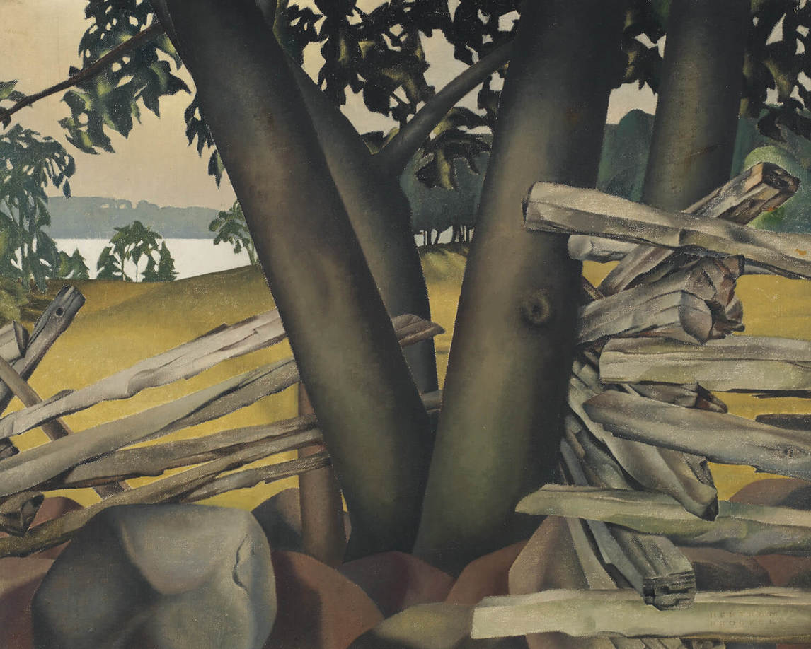
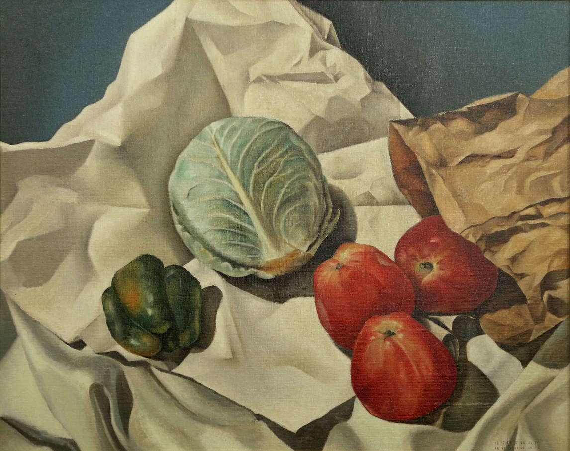
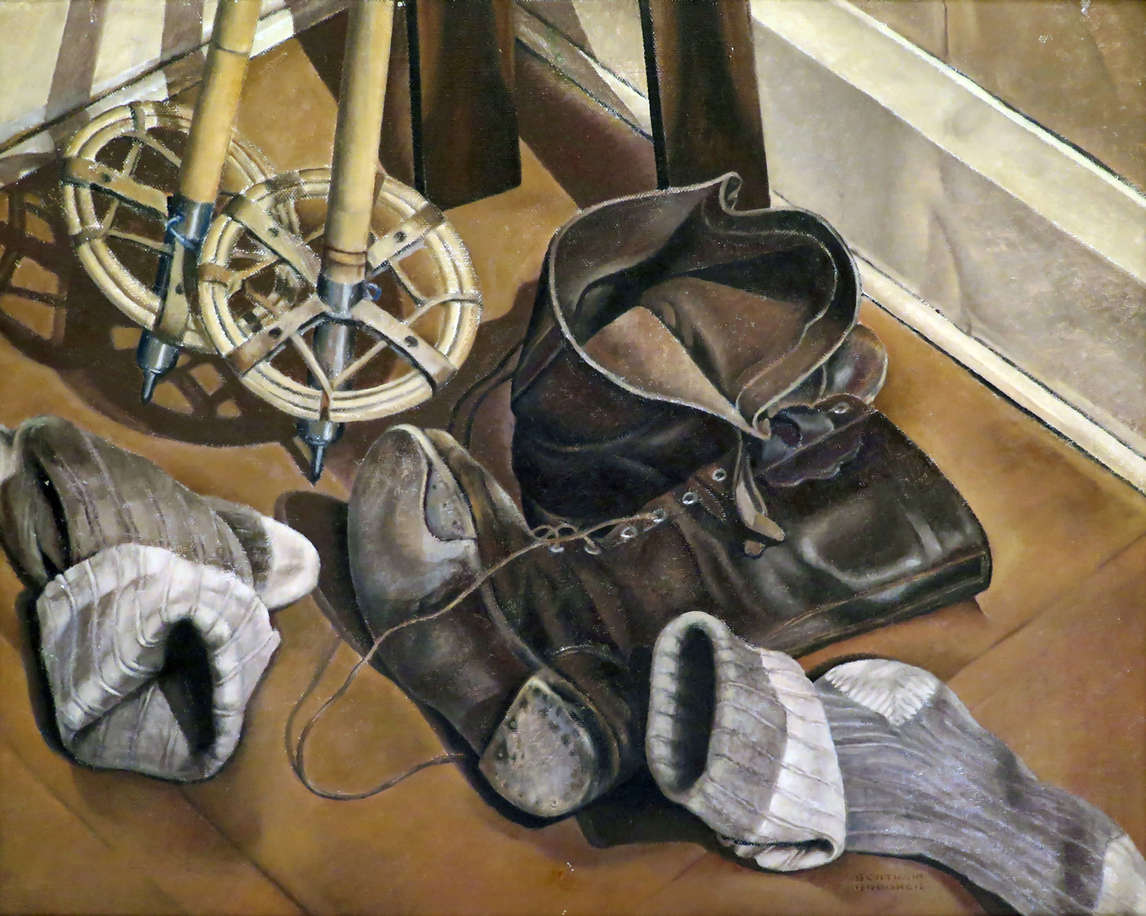
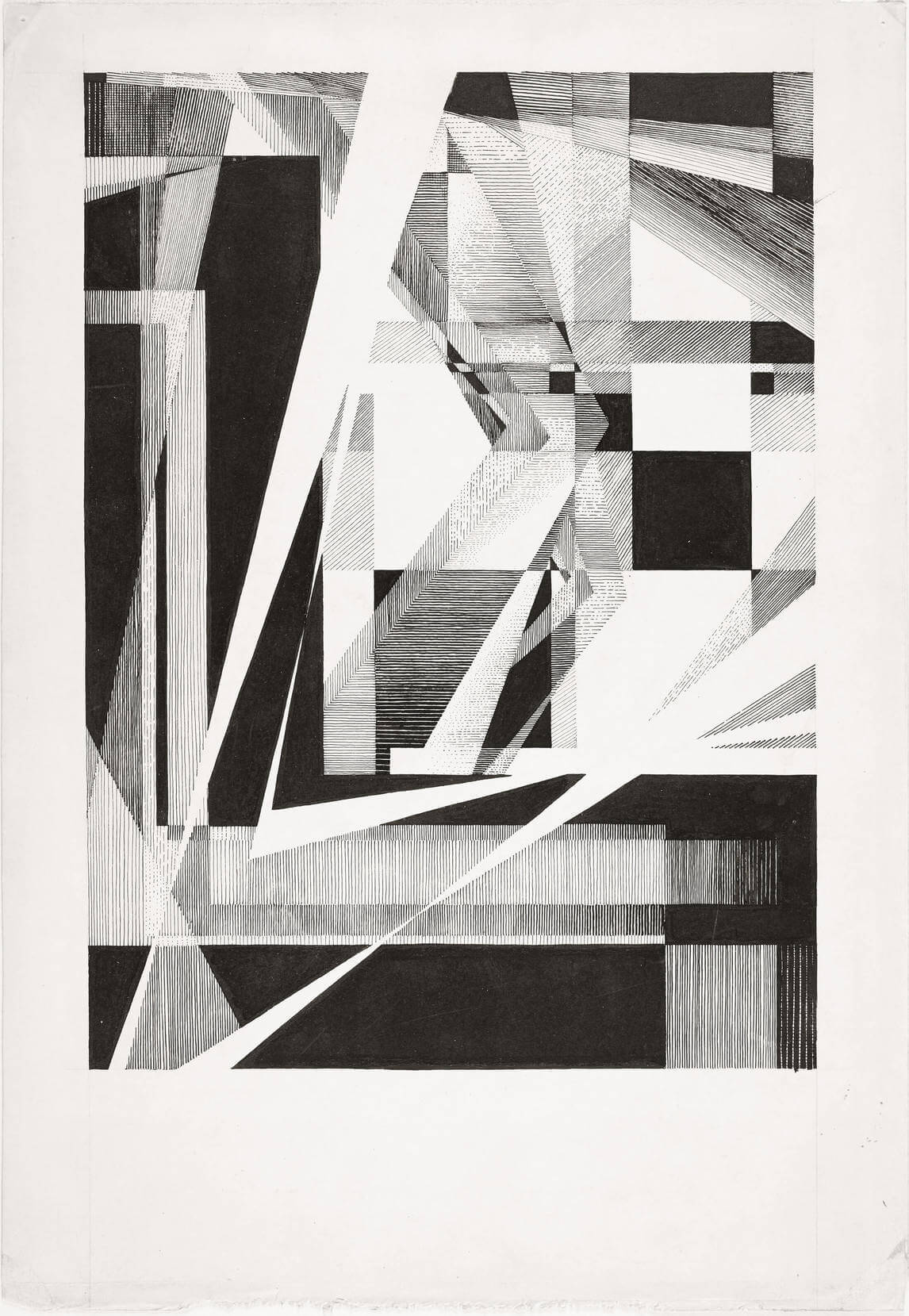
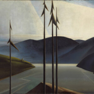
Though Brooker never attended art school, his canvases from 1927 to 1931 and after are remarkably well turned. The brush strokes in his oils—for example, Fawn Bay, 1936, Ski Poles (Ski Boots), 1936, and Cabbage and Pepper, c.1937—are carefully and precisely executed; he was also a skilled draftsman with an exacting hand in sketching. As can be seen in his many graphic illustrations, his technique in pen-and-ink drawing—his dexterity in creating fine lines, his contrasts between light and dark spaces, and his ability to balance white values against black values—renders compositions both vivid and striking.
By the 1930s Brooker was sufficiently confident of his technique that he took great pleasure in lecturing as yet another way that he could communicate his passion for art. As a public speaker, Brooker fervently espoused his commitment to “cosmic consciousness”; he was a mesmerizing performer who also talked with assuredness about the technical aspects of images. David Milne (1881–1953) heard Brooker speak on El Greco (c.1541–1614) at the Art Gallery of Toronto (now the Art Gallery of Ontario) on February 28, 1930, and was deeply moved.
International Influences
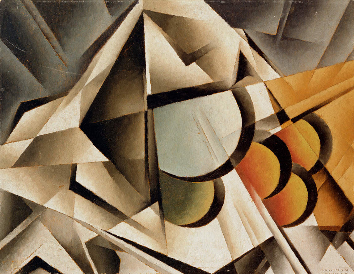
Brooker’s first set of abstracts, from 1922 to 1924, and later works such as Ascending Forms, c.1929, appear to be inspired by the Vorticist paintings of Wyndham Lewis (1882–1957), David Bomberg (1890–1957), William Roberts (1895–1980) (for example, Two-step II, study for the lost painting Two-step, c.1915), and Helen Saunders (1885–1963) (for example, Dance, c.1915). The art of this group, particularly that of Lewis, used abstraction in sharp-edged lines to denote movement in a violent, slashing way. Brooker’s first abstracts are influenced by the English group’s use of precisely defined geometrical forms in aggressive contortions and highly saturated hues.
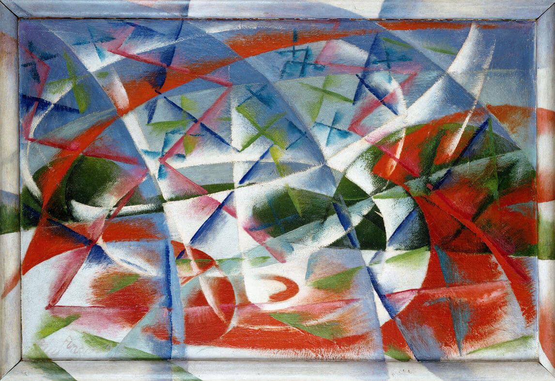
Closely related to Vorticism was Futurism, which began in Italy in around 1909. Like Vorticism, it was concerned with speed and violence and was politically right wing. Brooker would have seen examples of Futurist work, and he might have been attracted to its stylistic mixture of Cubism and other kinds of abstraction. The swirling, abstract shapes of paintings such as Abstract Speed + Sound, 1913–14, by Giacomo Balla (1871–1958) may have inspired Brooker’s attempts to portray movement in such works as Sounds Assembling, 1928.
Brooker imitated Vorticist and Futurist forms, but he was not a proponent of the politics of those movements. The artists from these two groups sought to eradicate the past through violence and a strident rebellion against the rigid standards of traditional ways of painting. Brooker was more interested in exploring the dynamic tranquility of the spiritual world (for example, in the 1927 painting Hope) and soon abandoned Vorticist form. His nonfigurative works from 1927 to 1931, such as Alleluiah, 1929, emphasize harmony.
Brooker would have agreed with Lawren Harris (1885–1970) when the latter wrote in 1926 that the artist,
because of his constant habit of awareness and his discipline in expression, is perhaps more understanding of [Canada’s] moods than others are. He is thus better equipped to interpret it to others, and then, to create living works in their own right by using forms, colour, rhythms and moods, to make a harmonious home for the imaginative and spiritual meanings it has evoked in him.
This way of thinking would not have been new to Brooker, who was well aware of Harris’s primary source: Wassily Kandinsky’s book Concerning the Spiritual in Art (1911), which had been translated into English in 1914. Some of Brooker’s abstracts from 1927 to 1931, as in Still Life Variation IV, c.1929, resemble Kandinsky’s in their vivid use of colour, but his work lacks the jagged, sprightly, and lyrical edge achieved by the Russian artist and theorist.
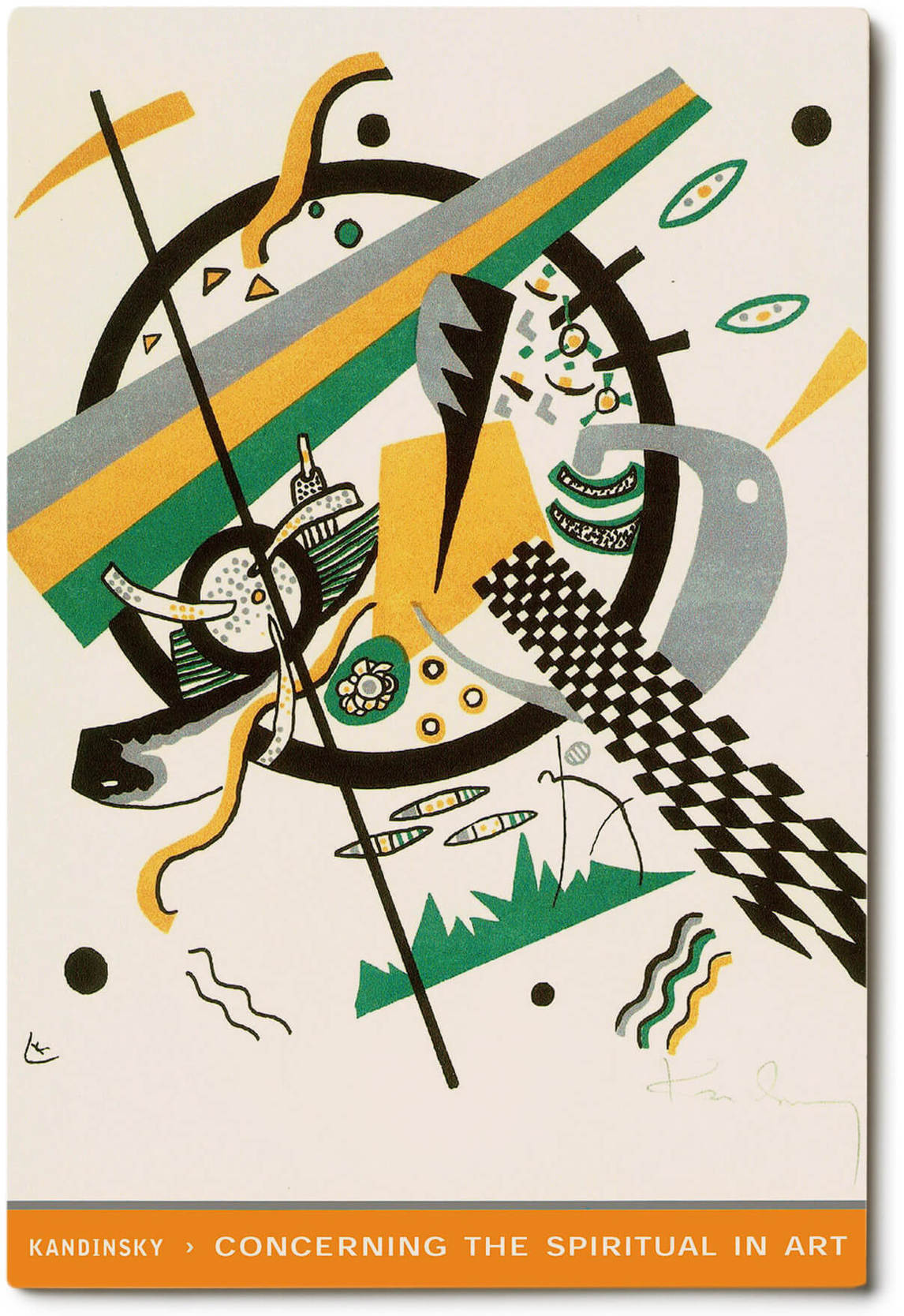
For Brooker and Harris, Kandinsky’s book was a manual that explained how the artist could and should instill his work with spiritual values. Specifically, Kandinsky argues that the abstract elements of music could be infused into nonfigurative painting by allowing various abstract motifs to exist simultaneously in the same work of art. He was fascinated by the way music could elicit an emotional response without being tied to recognizable subject matter. Painting, Kandinsky believed, should aspire to be as abstract as music, with groups of colours in a picture relating to one another in a manner analogous to sequences of chords in music. As can be seen, for example, in The Finite Wrestling with the Infinite, 1925, Brooker adapted Kandinsky’s principles in his own image making, in part because he believed they allowed him to gain entry into the fourth dimension, which he defined as possessing “instead of the usual space perspective that makes a painting three-dimensional, a new and puzzling illusion of space that is foreign to normal visual experience.”
Abstract to Representational Influences
The Société Anonyme International Exhibition of Modern Art was held in Toronto in 1927, and at it Brooker would have seen many abstracts and other examples of advanced contemporary art. However, by 1927 Brooker was well on his way to creating paintings, such as Sounds Assembling, 1928, Alleluiah, 1929, Resolution, c.1929, and Striving, c.1930, that show no obvious indebtedness to international abstraction. In 1924 Brooker purchased a Cubist work, Seated Nude, 1919, by A.S. Baylinson (1882–1950); yet Brooker’s work from 1927 onwards displays no overt Cubist features—nothing that recalls the works of Pablo Picasso (1881–1973), Georges Braque (1882–1963), Juan Gris (1887–1927), or Fernand Léger (1881–1955). Nowhere do we find even a hint of Russian Constructivism; and most puzzling of all, there is no discernible trace of Wassily Kandinsky, though it could be argued that the sense of dynamic movement and incorporation of musical forms in Kandinsky’s abstracts served as an inspiration for Brooker’s 1927 to 1931 abstracts.
Ann Davis, who has thoroughly investigated all Brooker’s possible influences, concludes that his abstracts must be explained in terms of the mystical traditions to which he adhered. If she is correct, Brooker sidestepped obvious visual influences to create his abstracts according to his spiritual credo. This would explain in part why these paintings do not look like Kandinsky’s.
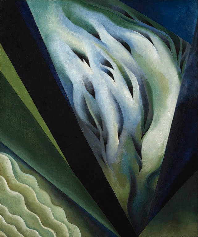
Brooker did not like to think of himself as having been influenced by other artists. In February 1934, while in New York City, he visited an exhibition of forty-four oils by Georgia O’Keeffe (1887–1986), “some of which looked awfully like my early abstract things,” he noted, “and I didn’t like them, perhaps for that very reason.” It is likely that Brooker made a connection between Abstraction, Music, 1927, and an O’Keeffe canvas such as Blue and Green Music, 1919/21. Like Brooker, the American artist was intrigued by the relationship between music and painting. He clearly hated the possibility that he could be accused of imitation and, if we believe his statement above, we must conclude that he never consciously copied another artist, with the possible exception of Lionel LeMoine FitzGerald.
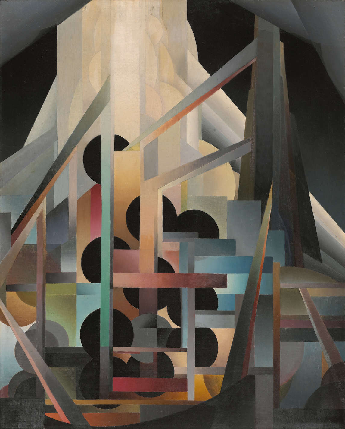
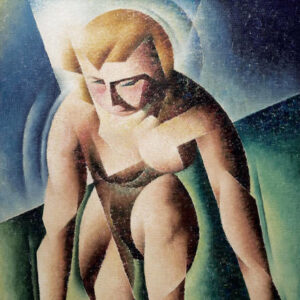
After meeting FitzGerald in 1929, Brooker undertook a major stylistic change, in accordance with his new friend’s practice, and began to mingle naturalist and abstract elements in his work, as in Manitoba Willows, c.1929–31. The willows in this work are obviously trees, but they are rendered in a highly stylized way that suggests abstraction. Although he sometimes returned to pure abstraction and sometimes ventured into paintings that were essentially representational, as in Muskoka Lake and Blue Nude, both c.1936, much of his work from 1930 until the end of his life was a playful mixture of these two modes. The conjoining of two styles became the mark of his work after 1930.
Advertising
As a writer of advertising copy, Brooker drew upon many of the philosophical concerns that dominated his work as an artist. Just as he used music as the inspiring force for his great non-objective paintings, he attempted to incorporate sound and motion in his advertising copy. As Adam Lauder has pointed out, Brooker’s methodology—and his contribution to his calling—was to insist that “eliciting a corporeal response from the spectator” could enliven advertising material.
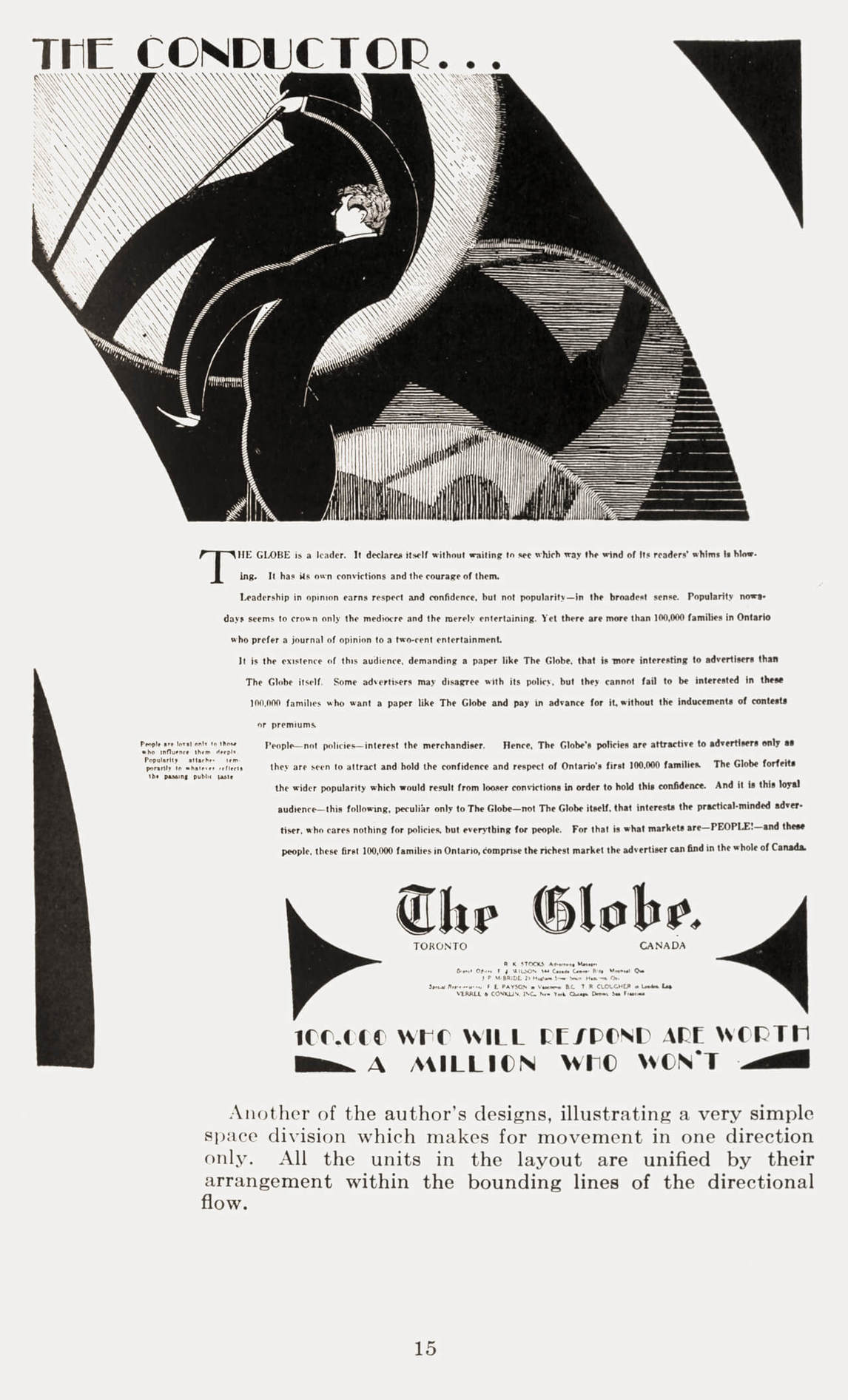
Brooker’s advertising copy was influenced by ideas from Jay Hambidge (1867–1924) in The Elements of Dynamic Symmetry (1920). Asserting the notion that human beings and plants develop according to the Greek concept of the golden ratio, Hambidge argues that the proper use of proportion, as seen in root rectangles, can be beneficial in all kinds of activity. According to Brooker, “The best way for me to get my thoughts [about advertising] into any sort of order was to think of the whole advertising process in terms of motion. Ideas in advertising, I said to myself, should move.” Just as he tried to establish visual analogues to music in his paintings, the ideas of motion and proportion became a means of creating a successful piece of advertising, as is well demonstrated in an ad by Brooker featured in a 1929 issue of The Globe.
Brooker’s theory of advertising was ahead of its time. He rebelled against the behaviourist approach in which simple-minded demographics were used as the basis for marketing products. In its place, he substituted what he called “humanics,” which elicited the sensory responses of readers. He believed that a sense of synesthesia could be established in advertising copy to construct a bridge between the product and a prospective consumer. For him, as for Marshall McLuhan (1911–1980) decades later, the medium became the message. In Brooker’s time this was a very radical idea.
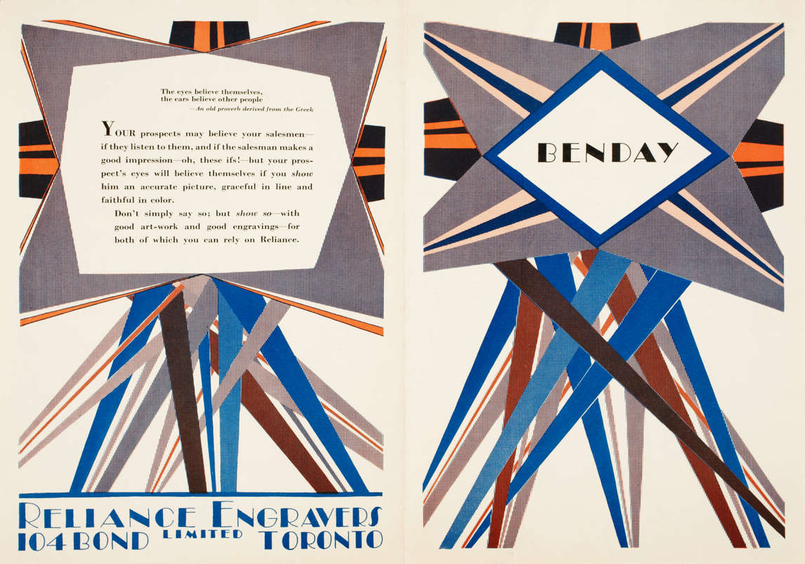
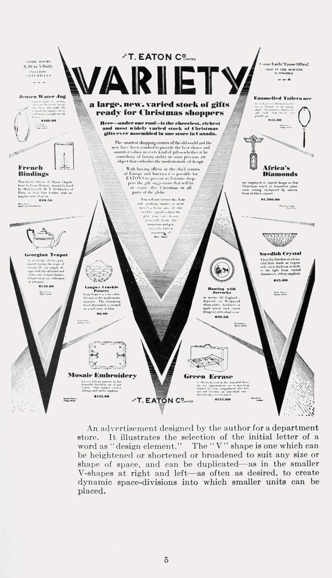
There are correspondences, as Adam Lauder has observed, between Brooker’s abstract art and his commercial designs, as in a 1928 advertising for Reliance Engravers. In his “V (for Variety)” ad for the T. Eaton Company Limited, he created “dynamic space divisions into which smaller units can be placed.” The repetition of the letter gives a pleasing, almost abstract feel to the resulting layout. In one of his books on advertising he wrote, “the problems of Layout must usually be solved by another type of man—the artistic, rather than the merchandising type.”
Ultimately, in his writings about advertising and his practice of it, Brooker advocated a kind of copywriting that demanded the would-be purchaser interact with the product being sold. In such a scheme, a product was never matter-of-factly presented with all its advantages listed. Rather, the idea was to lure a potential buyer into a relationship with the product.
Graphic Art
Brooker’s experience as an illustrator of advertising copy influenced his career as a book illustrator. His advertising commissions gave him the opportunity to work in black and white and to discover the most effective way of telling a story within the constraints imposed by limited space.
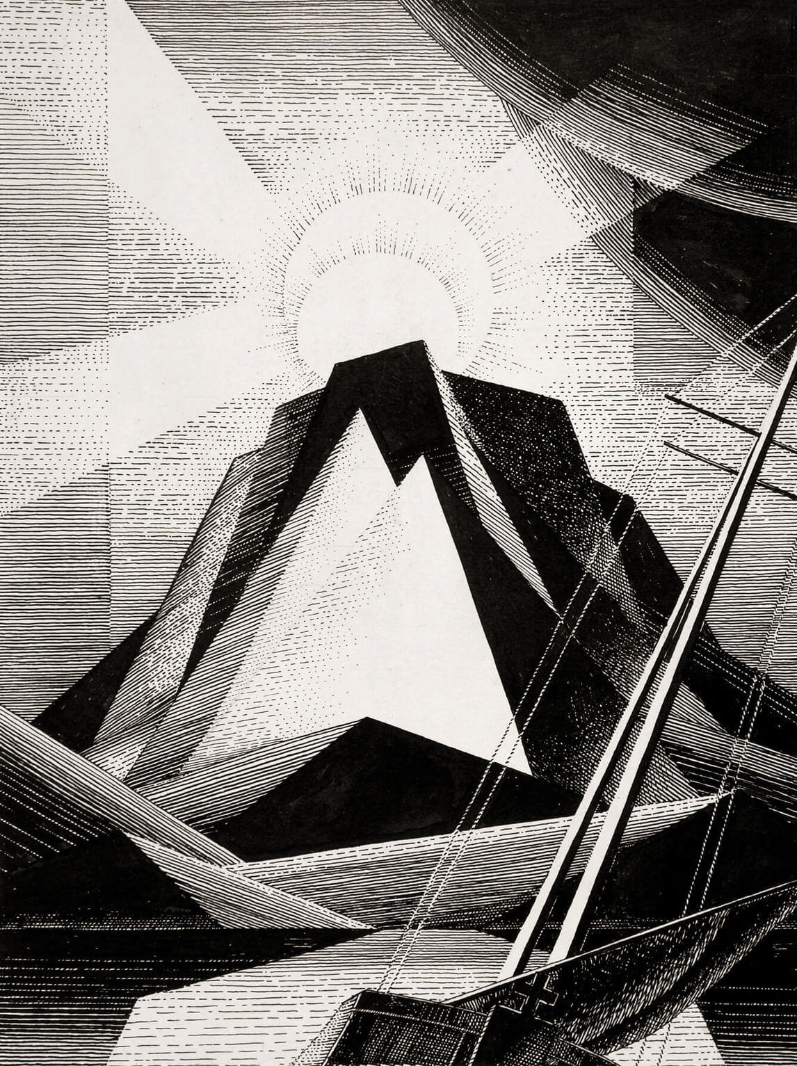
His unpublished black-ink illustrations (c.1930) for “The Rime of the Ancient Mariner” (1798), by the Romantic poet Samuel Taylor Coleridge (1772–1834), provide excellent examples of his storytelling skill. The mariner, who is guilt-ridden because he has shot an albatross, wanders the earth seeking to expiate his sin. The poem inspired Brooker to create some daring landscapes, including an illustration for the following passage:
The rock shone bright, the kirk no less,
That stands above the rock:
The moonlight steeped in silentness
The steady weathercock.
And the bay was white with silent light . . .
Brooker uses black lines to depict the rock and the ship and then shows the convergence of the translucent moonlight and the dark rock. Upon the latter, he imposes two white triangular shapes. The oppositions between white and black in this drawing are masterful, very similar in their dexterity to the work of Rockwell Kent. Here Brooker harnesses his technical skills in black-ink drawing to create an image that in its controlled austerity resembles the backgrounds in his abstract canvases from 1927 to 1931.
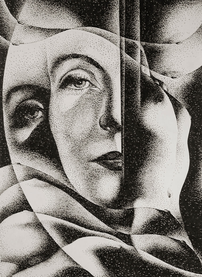
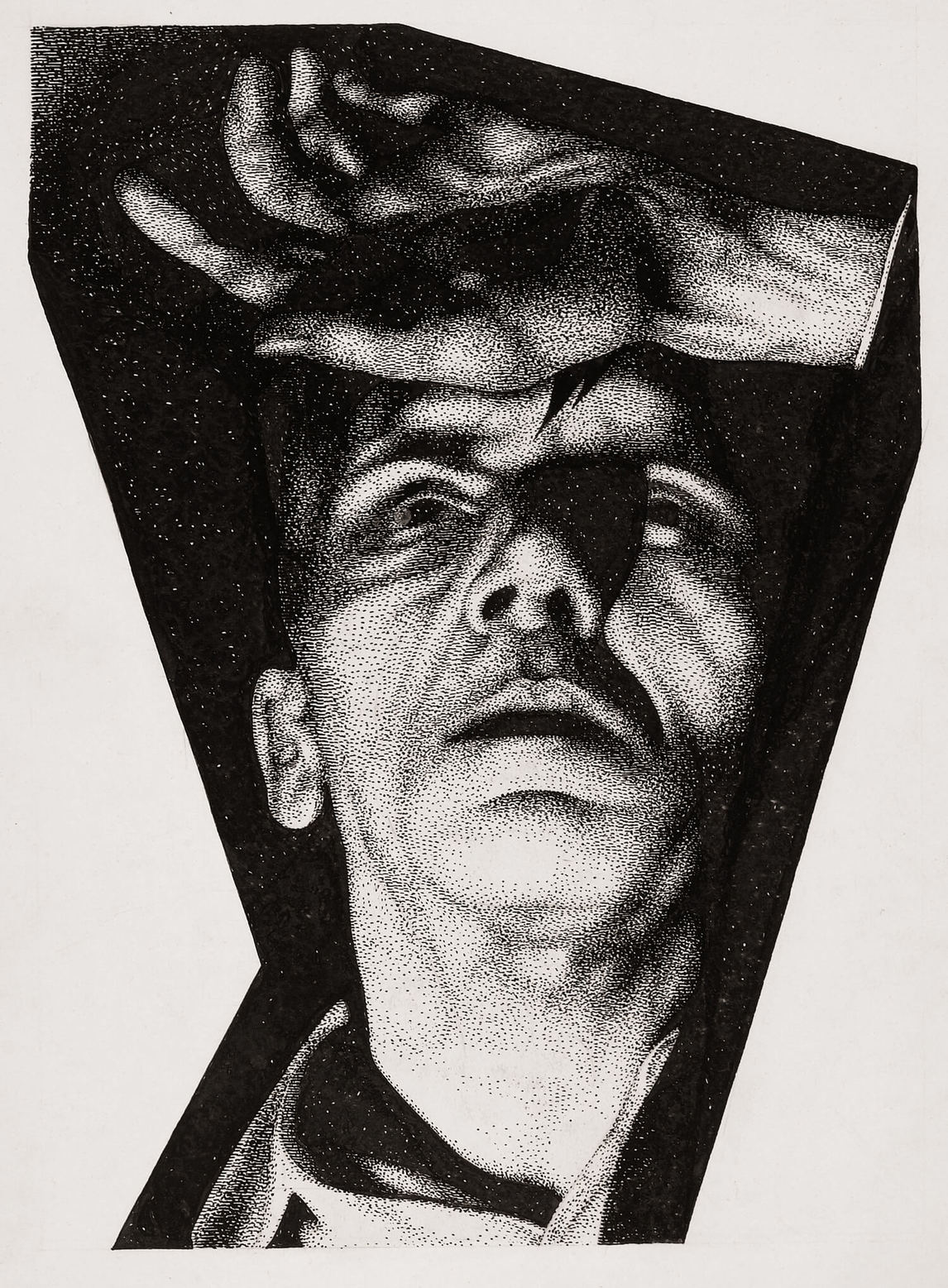
In addition to those for “The Rime of the Ancient Mariner” and the published book Elijah, with illustrative drawings (1929), Brooker drawings exist for editions of poetry by Walt Whitman, the Book of Job, William Shakespeare’s Hamlet (1603), Victor Hugo’s Les Misérables (1862), and Fyodor Dostoevsky’s Crime and Punishment (1866). Of these, the sixteen pen-and-ink drawings for Crime and Punishment are a particularly dazzling display of his talents as a draftsman.
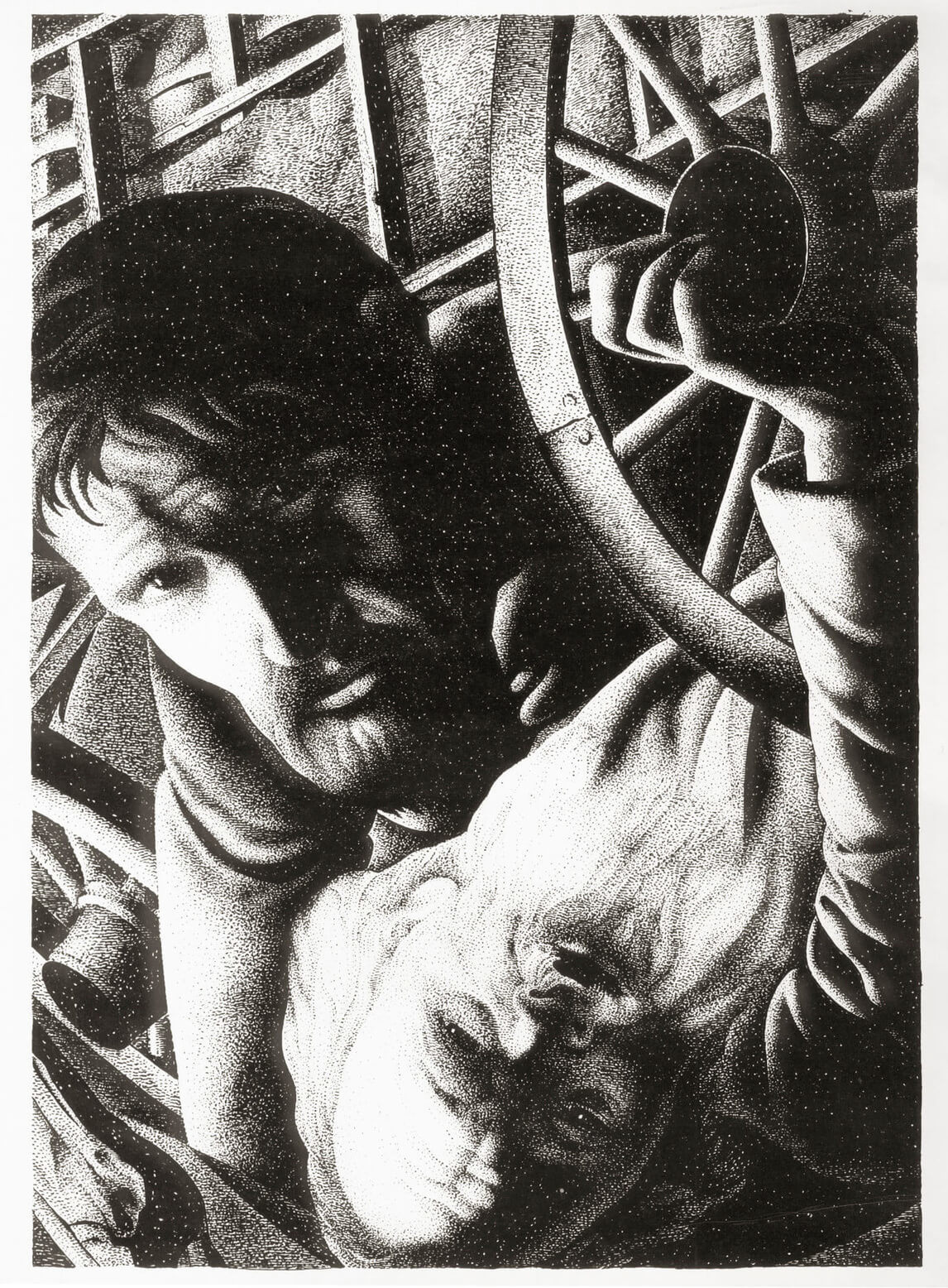
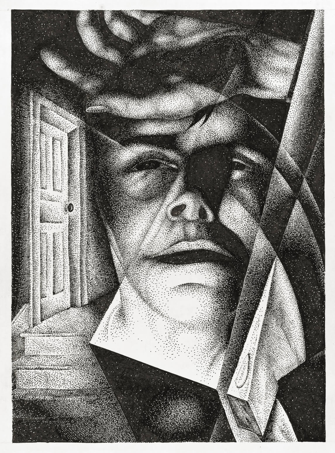
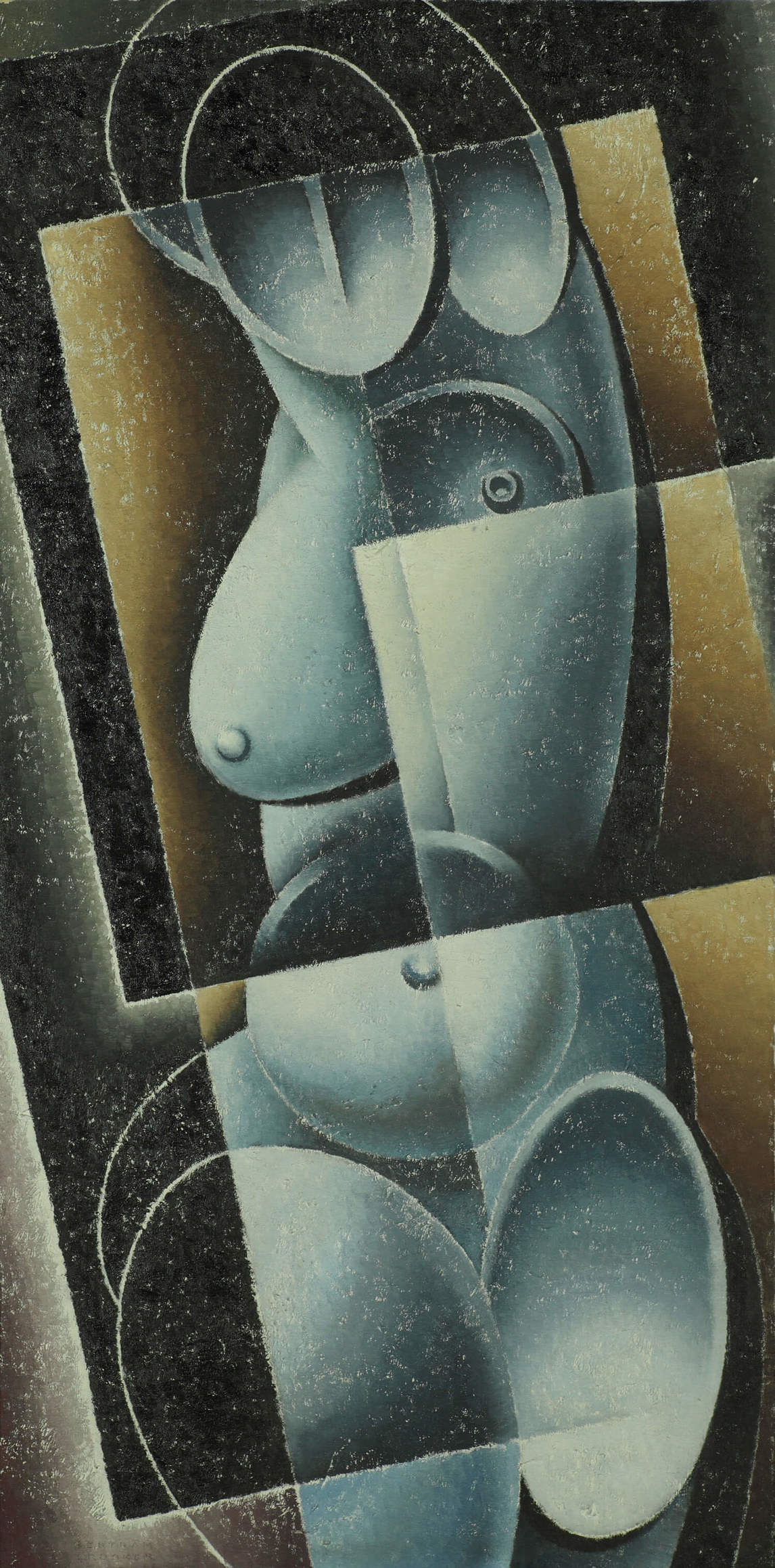
The Dostoevsky drawings seem to be heavily influenced by the conventions of silent cinema, where close-ups were a key element in storytelling. In one of the illustrations, Face and Breasts, 1930–34, women’s torsos are superimposed on a likeness of cinema icon Greta Garbo. To the left of Garbo’s face, her eye stares out at the viewer. By using an image from popular culture to illustrate a nineteenth-century classic, Brooker was reminding viewers that the truths of the human condition revealed by Crime and Punishment were still relevant.
Brooker told Lionel LeMoine FitzGerald that the Dostoevsky drawings were unlike anything he had previously attempted: “more realistic in one way, and yet quite abstract in another. They are more contrasty than ever, with terrific black areas, and very large faces, mostly in deep shadow.” The artist wanted to emphasize “the mood or emotion of the main characters during the various crises through which they pass.”
Art and Literature
Brooker was a talented writer as well as being an accomplished artist. In each area, he exercised different realms of his imagination to articulate his theory of Ultimatism. Regarding writing, he states,
In a word, we may say that literature on the grand scale is never contemporary. It gathers its energies from the heroic exemplars of a past time and leaps forward. . . . Its essential grandeur is in this tremendous arc from past to future which swings over the dwarfed concerns of the “present” of each generation that catches up to it.
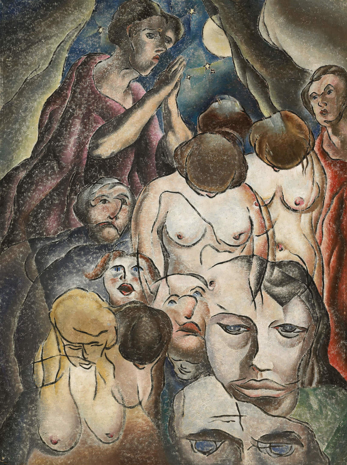
In his novels and short stories Brooker expressed “this tremendous arc” with highly symbolic narratives in which his characters dramatize conflicts between the material and the spiritual worlds. In his short stories, he talks openly about the disparity between society’s “haves” and “have-nots.” In his art—except in The Recluse, 1939—the depiction of the plight of the underclass is largely absent.
The plot of Brooker’s 1936 novel, Think of the Earth, places the outsider Tavistock in opposition to the inhabitants of Poplar Plains (based on Portage la Prairie). In contrast to the down-to-earth residents of the town, the protagonist is an intellectual and mystic. As the novel unfolds, Tavistock learns that his mystical inclinations have to be tempered by day-to-day reality and thus grounded. He has to “think of the earth.” In this narrative, Brooker critiques the values of the town and of his protagonist. He questions both sides of the equation, and he does not reconcile these two points of view. For Brooker, writing offered a way of discussing the conflict between materialism and spiritualism in a much more nuanced way than was possible in art.
Obviously less ambitious than Think of the Earth, the short stories, as Gregory Betts argues, highlight “the social and economic implications of the ideological shifts in the world during [Brooker’s] lifetime. . . . The movement in his own life, from labouring villager to urban artist, exemplifies the dramatic social transition from pre-modern settlement to the modern urban phase of Canadian history that is documented in these texts.”
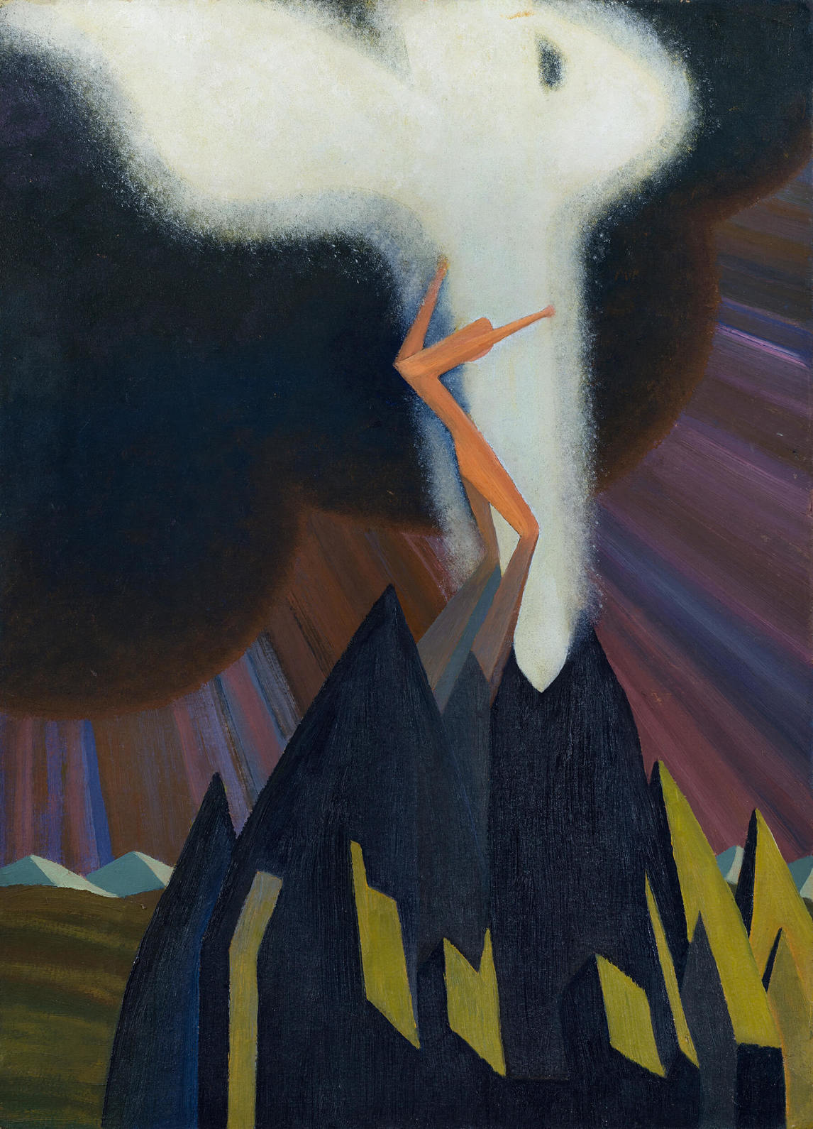
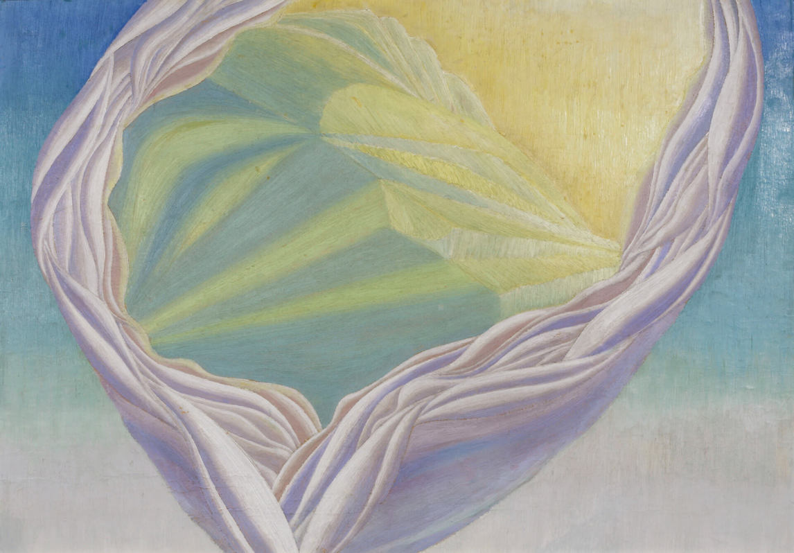
Brooker’s prose fiction is about the possibility of the individual achieving spiritual transcendence, but he often shows how difficult it is to reach that state. In contrast, in his drawings and paintings, he often provides glimpses of that hidden, mystical world, as can be seen in Untitled, n.d., and White Movement, 1936.
 About the Author
 More Online Art Books
 Acknowledgements