Arnaud Maggs’s multifaceted career points to the significance of the applied arts to Canada’s art history. Frequently positioned within the context of Conceptual art, his photographic artwork reveals a synthesis of strategies from each stage of his career. His explorations of the grid, portraiture, and collecting informed his thematic investigations, including systems and classification, time, memory, and death.
Reputation in Design and Illustration
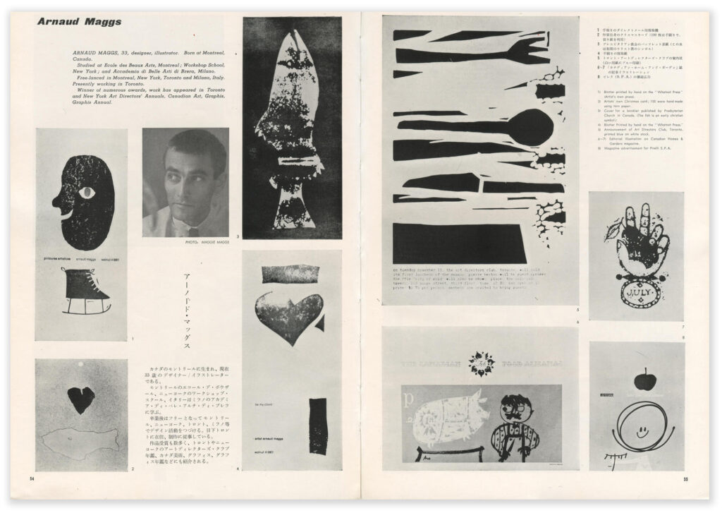
In the 1950s and 1960s, many people employed in commercial art produced both design work and illustration, and Arnaud Maggs was firmly part of this flourishing scene. He worked alongside Frank Newfeld (b.1928) and Theo Dimson (1930–2012), for instance, who were award-winning designers and illustrators. Though their reputations in commercial art would eclipse Maggs’s, he received national and international recognition. In 1952, graphic designer Carl Dair (1912–1967) asserted in Canadian Art magazine, “Montreal has its bright sons in Arnaud Maggs, George Wilde, Hector Shanks and Tancrède Marsil.” Dair was summarizing the 1951 exhibitions of the Art Directors Clubs of Montreal and Toronto, drawing attention to successful projects and asserting the promise of the younger generation, arguing, “The new crop of artists is sturdy and sound and imaginative.”
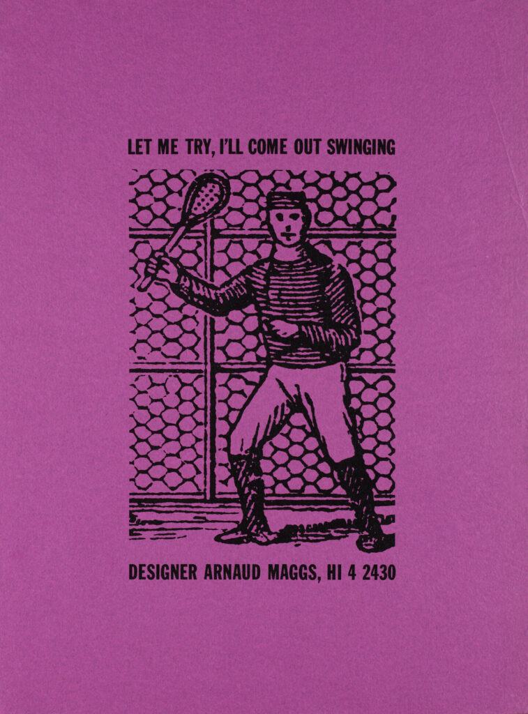
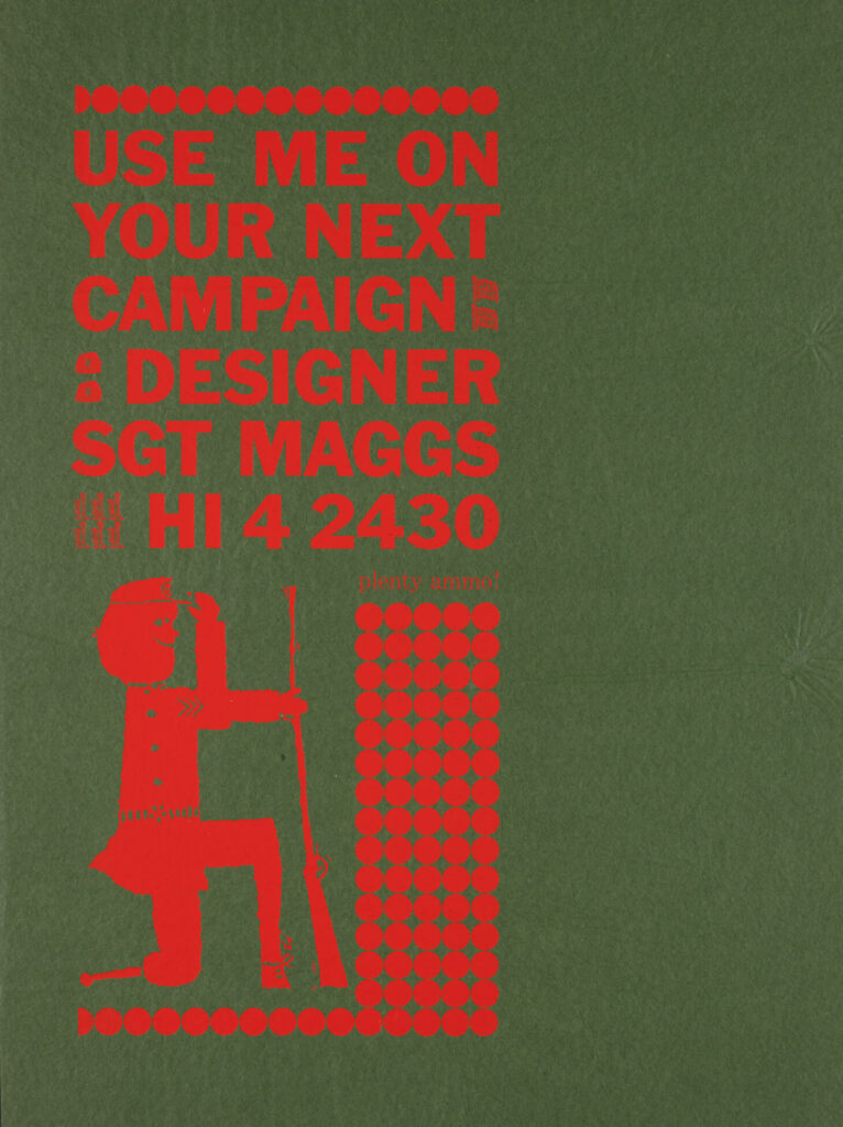
Maggs’s reputation in design would continue to grow. At the time, it was common for designers―even if they were employed by a studio―to make self-promotional projects. Maggs did several such projects over the course of his design career that are notable for their creativity. Graphic designer Jim Donoahue (1934–2022) remembered one that Maggs made by silkscreening phrases such as “Let Me Try, I’ll Come Out Swinging” or “Designs to Please the Most Discriminating Art Director” on brightly coloured tissue paper. The inventiveness of the work and unconventional materials left a lasting impression. “I can’t remember anybody ever trying anything like that,” Donoahue explained. “I mean tissue paper is pretty light and flimsy, and silk screen is pretty heavy . . . It was so bizarre to try to do something on tissue.” In his view, the work revealed something of Maggs’s character as a designer: “At the time, it occurred to me that this was a very unusual guy who would attempt that . . . But Arnaud did it . . . [and] he actually pulled it off.” But, as Donoahue asserted, Maggs did not simply “pull it off” from a technical point of view—“they were quite cunning images.”
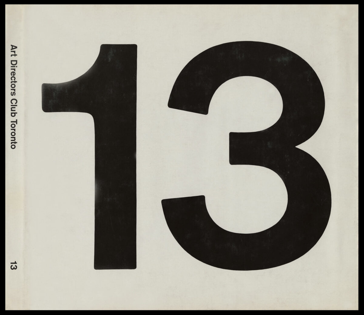
Maggs’s innovative approach and willingness to experiment won the respect and admiration of his peers. Fellow designer Arnold Rockman declared, “His talent is an exciting one, rare anywhere, but especially in Canada. Unlike most designers in Toronto, Maggs likes to turn his hand to anything.” He was recognized regularly through inclusion in design and illustration annuals in Canada and the United States. The bold, minimalist work he created in 1961 for the cover of the 13th Art Directors Club of Toronto Annual, for example, was featured in the 1962 annual of the American Institute of Graphic Arts.
Maggs’s reputation for excellence in the advertising and design world in Toronto provided him leverage when shifting careers. Around 1966, he began working as a photographer, and was well supported by those familiar with his design work. According to Marjorie Harris, the Modern Living editor at Maclean’s, “The guys in the art department all of course knew who Arnaud was because he was a well-known graphic designer, and they told me, ‘you’re going to use this guy, Arnaud’ . . . And I said, ‘Well, great because how much does he know about fashion photography?’ and they said, ‘Nothing. So, it’ll be very inventive’ and it was.”
Contribution to Canadian Magazines
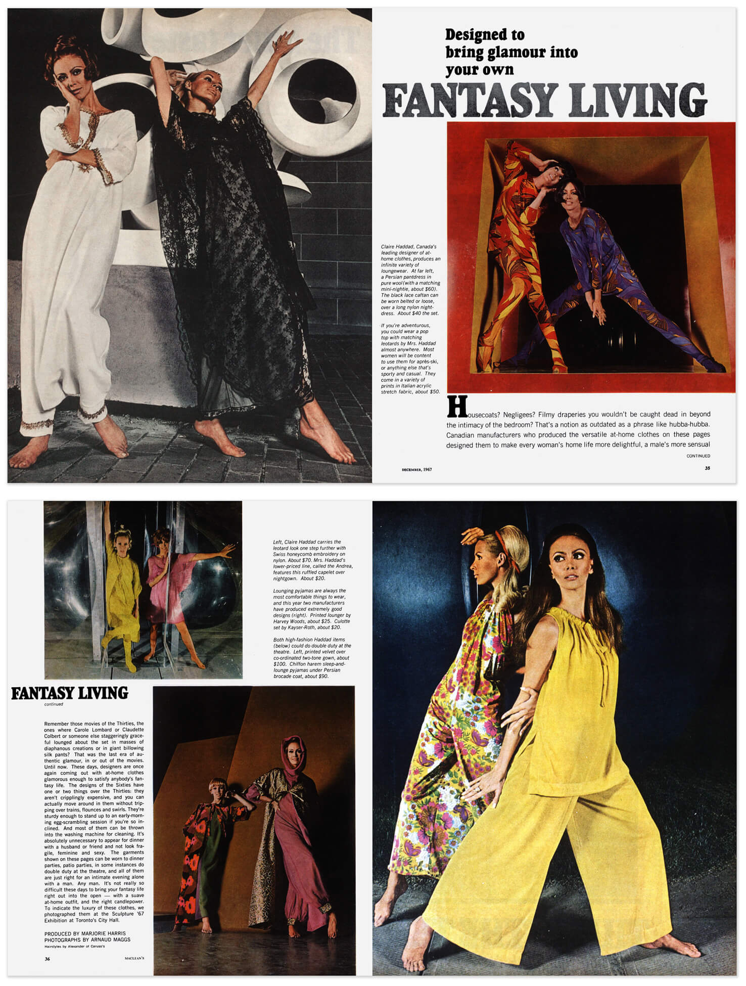
As a commercial photographer, Maggs played an important role at several Canadian magazines in the 1960s and 1970s, a time of cultural nationalism and change in the industry. At Maclean’s, as part of efforts to compete with American magazines and increase advertising and readership, new material was introduced. When writer Marjorie Harris joined the publication in 1966, she was assigned fashion and lifestyle content, which, as she explains, was “something they’d never ever done before.” Focused on Canadian fashion design, she chose to work with Maggs.
Maggs’s first fashion shoot was printed in December 1967. “Fantasy Living” introduced readers to stylish “at-home clothes,” which he had photographed at the Sculpture ’67 exhibition at Toronto’s City Hall. “We were both learning,” Harris proclaims. “He was learning how to take a photograph. I was learning how to set up a fashion shoot.” Maggs quickly became a staple in the magazine, with Harris using him “if I wanted to do something that was really daring.”
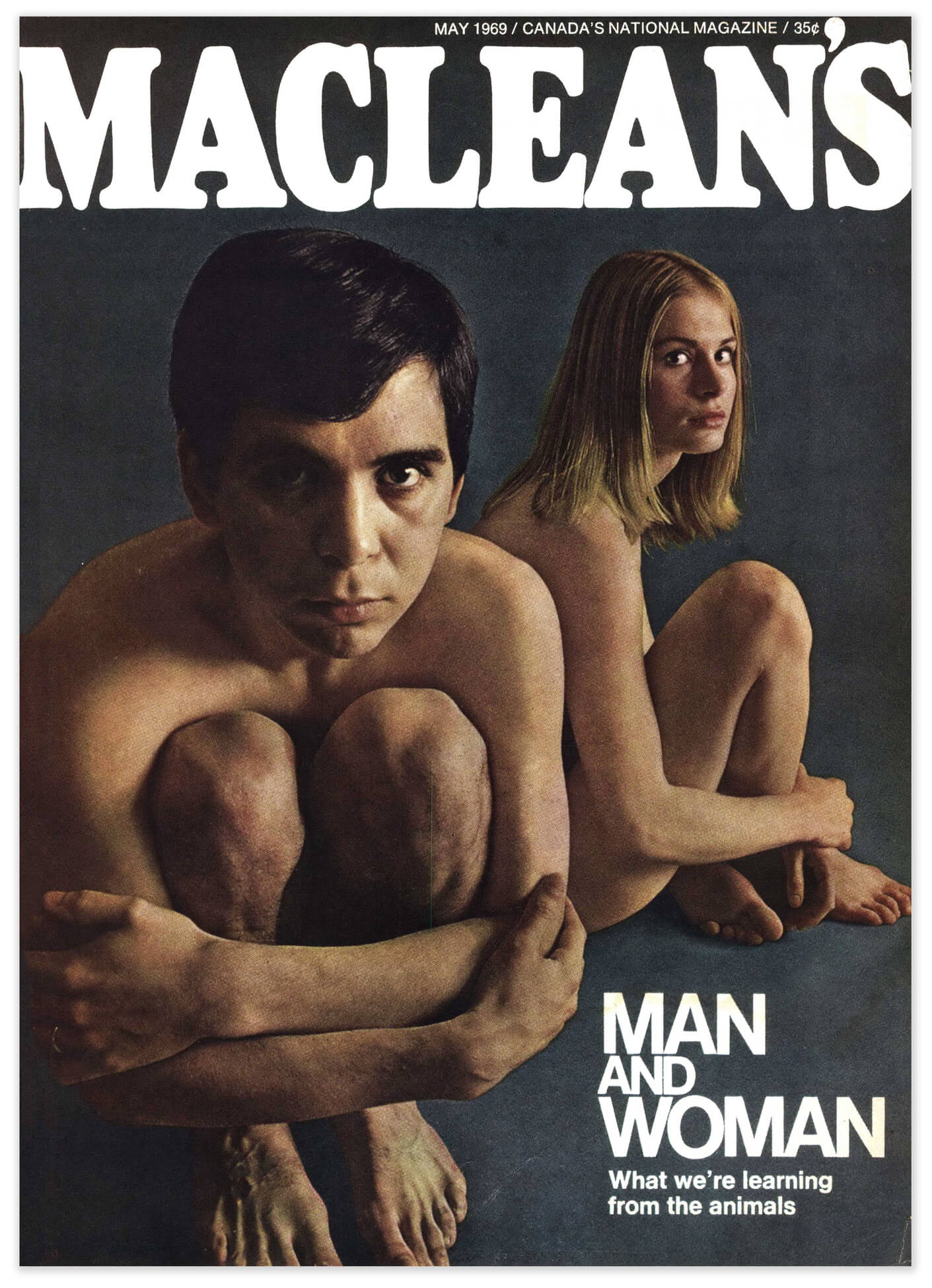
Jonathan Eby, then art director at Maclean’s, believed strongly that photographers are not simply hired hands. “I always thought it was important to keep the creative mind of the photographer in play,” he explains. “At the time there was a great scene going on in New York—Helmut Newton and other leading photographers—and it was obvious that these guys were not just clickers of cameras. They had an intellectual input to make.” He felt that Maggs was among those photographers who made intelligent contributions, noting “He had a keen mind and keen eye.” Maggs ultimately helped shape the look of Maclean’s as a photographer in the late 1960s.
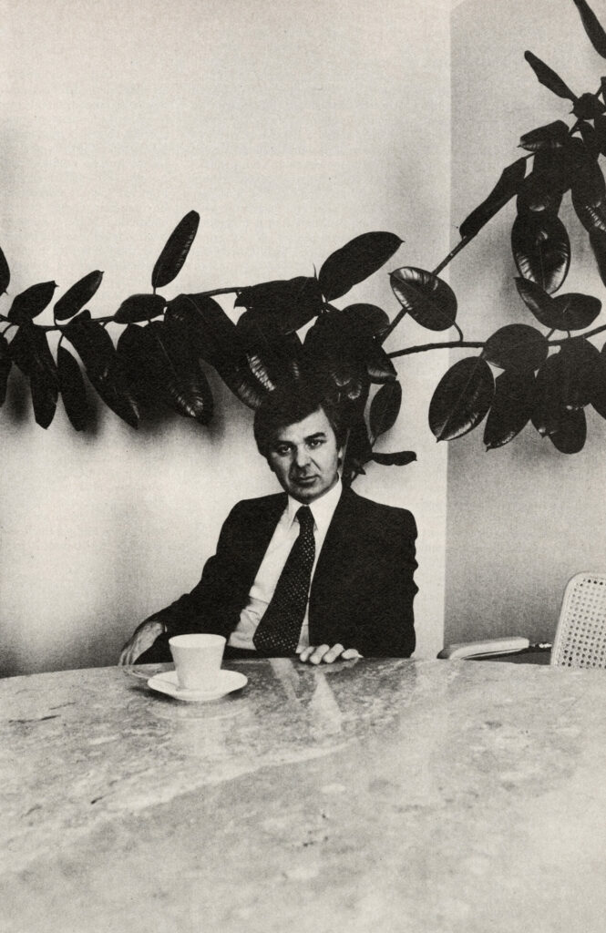
In 1975 Maggs was asked to shoot covers for the Canadian Magazine, which was distributed in newspapers across the country. As he recorded in his notebook, they were looking for “cover portraits that would be easily identifiable and that would stand out.” His photographs of prominent Canadians—Pierre Berton, Jean Chrétien, Ronnie Hawkins, and Stephen Lewis, for example—contributed to picturing the nation through portraiture. Photographer Paul Orenstein believes Maggs’s early careers in graphic art and magazine photography are central to who Maggs was, and Orenstein identifies Maggs’s work for Canadian Magazine as particularly influential for his practice. “I loved the shots,” he explains. “He was Canada’s greatest portraitist at that moment.” The covers mark an important shift in focus for Maggs, from fashion photography to portraiture, and they helped to shape his early artworks.
By the time Maggs worked for Canadian Business in 1977, his reputation as a portraitist was cemented and he had already begun working on 64 Portrait Studies, 1976–78. “He was absolutely a portraitist,” Donna Braggins, then graphic designer at the magazine, explains. “He had . . . a very distinct style of photographing people.” Maggs continued his artistic work and editorial projects for the magazine through the 1970s and into the 1980s, and his artistic reputation became an important part of what he offered editorial publications. He helped to define the photographic identity of Canadian Business at that time: his work aligned well with the brand and, moreover, propelled it forward. “To bring someone like Arnaud into that selection, it was really a very conscious effort to create a cultural statement about business,” Braggins argues. It was a period of mutual impact: Maggs’s editorial portraiture helped to shape the photographic style of Canadian magazines, and it offered opportunities for exploration that informed his art.
Conceptual Art
Conceptual art is distinguished by a shift in emphasis from object to idea. “When an artist uses a conceptual form of art, it means that all the planning and decisions are made beforehand and the execution is a perfunctory affair,” artist Sol LeWitt (1928–2007) famously argued. “The idea becomes a machine that makes the art.” As a result, conceptual artists’ works are often viewed as informational. Serialization, repetition, and the organizational structure of the grid are dominant in Minimalism and Conceptual art—and they are strategies used regularly by Maggs. When describing 64 Portrait Studies, 1976–78, he adopted similar language to LeWitt: “It’s as if a machine could have done it . . . as if there’s no photographer involved.”
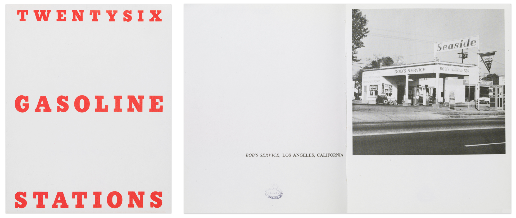
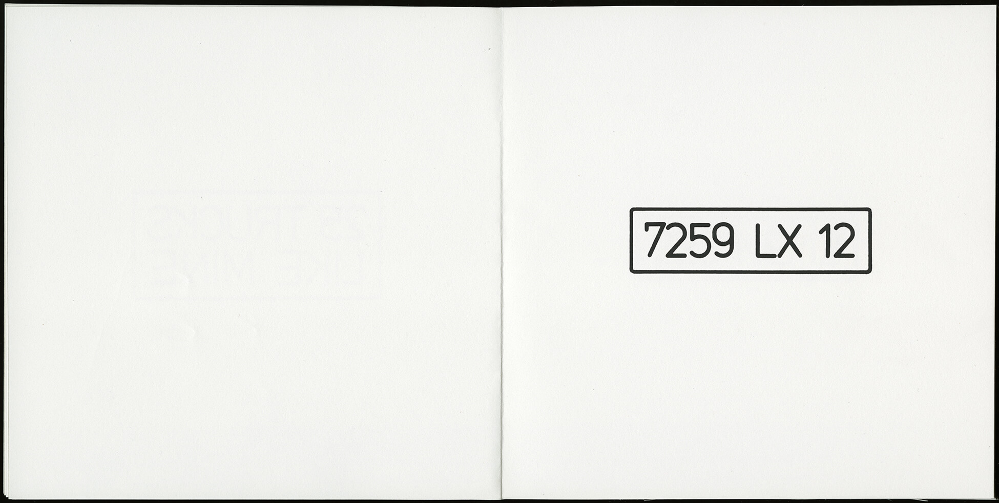
While Maggs’s artwork aligns with the systems-based formalism that defined Minimalism and Conceptual art, these languages were introduced to him through design, revealing the importance of graphic design to Conceptual art more broadly. Indeed, the latter’s modes of presentation and dissemination frequently operate within the conventions of graphic design. For instance, to circumvent the gallery system, artists like Dan Graham (b.1942) and Ed Ruscha (b.1937) would create their work for magazines or as artists’ books. Like Maggs, Ruscha started out working in graphic design. In 1962, still working as a designer, he began creating the celebrated publication Twentysix Gasoline Stations (1963). Maggs’s “numberworks” from the 1980s share a similar focus on banal, seemingly arbitrary, systems of documentation. Though Maggs ultimately displayed his numberworks on the gallery wall, he also explored the potential of the book form. Working with designer Ed Cleary (1950–1994), he developed a book maquette for 25 Trucks Like Mine, date unknown, which recorded the licence plates on trucks like his that he encountered in France.
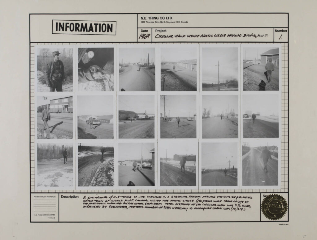
Maggs’s practice aligns with that of artists working within a conceptual framework in Canada. From the mid-1960s onward, artists across the country engaged with the procedural methodologies of Conceptual art. Roy Kiyooka (1926–1994), Carole Condé (b.1940) and Karl Beveridge (b.1945), and Bill Vazan (b.1933) explored photographic seriality, image/text relationships, and information-based systems. N.E. Thing Co., founded in Vancouver in 1966 by Iain Baxter& (b.1936) and Ingrid Baxter (b.1938), exemplified the administrative aesthetic of conceptual art practice: their art activities were shaped by the visual language of design and bureaucratic record keeping.
Ruscha is often invoked in discussions about the “deadpan” or “amateur” or “anti-photographer” approach to Conceptual art photography. Although Maggs’s work sometimes shares a deadpan, serial aesthetic with that of artists like Ruscha, he can hardly be called an anti-photographer. He maintained a dual interest in concept and craft, resulting in a persistent interplay in his work—between modernism and conceptualism, subject and structure, and subjectivity and objectivity—which aligns his work with that of artists like Michael Snow (b.1928) and Suzy Lake (b.1947).
Like Maggs, Snow defies easy categorization. Working in sculpture, painting, photography, film, and music, he created art characterized by an emphasis on materiality. Snow returned from several years in New York just as Maggs was shifting his focus away from commercial photography. Snow’s first retrospective exhibition, Michael Snow / A Survey, was mounted at the Art Gallery of Ontario in 1970. Among his early conceptual explorations of photography that were included in the retrospective was Authorization, 1969. Snow’s emphasis on process and seriality is indicative of the investigations happening in the United States, Canada, and locally in Toronto that helped inform Maggs’s own ideas about art.
Lake, who was also working in Toronto at the time, likewise explores the conceptual and material possibilities of photography. In the late 1970s and early 1980s, Maggs used Lake’s darkroom in her home studio. He was printing Ledoyen Series, Working Notes, 1979, while she was making Are You Talking to Me?, 1978. Though Lake’s work is performative, often exploring representation and body politics, both artists employed the conceptual strategies of seriality and repetition.
The Grid: Formal and Conceptual
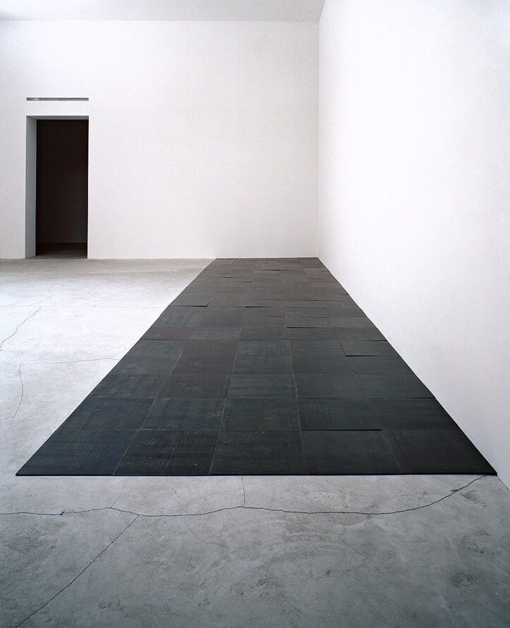
In Western art and science there is a long history of using the grid as a tool for rational organization and objective presentation of data. Far from a neutral device, however, the grid is also entwined with power structures and systems of classification that are discriminatory and connected to colonialist anthropological and ethnographic study. In art histories, it has iconic status. It is associated with rigorous systematization seen in works by conceptual artists such as Sol LeWitt and Hanne Darboven (1941–2009), and the typological examinations of German conceptual photographers Bernd and Hilla Becher (1931–2007, 1934–2015). The grid also offered a presentation framework for minimalist artists, including Carl Andre (b.1935), whose work directly inspired Maggs. In his design and art projects, Maggs used the grid to structure his ideas and shape the visual outcome, capitalizing on its analytical and objective potential. At the same time, however, Maggs’s grids are sites of narrative and expressive power.
Maggs’s early careers anticipated the dominance of the grid in his artwork. The device is integral to the practices of graphic design and photography. While often implicit, particularly in the energetic, illustrative design of the mid-century, an underlying grid offers structure to layout designers and is fundamental to typography. Graphic designer Fidel Peña recognized a way of thinking in Maggs, noting, “The way he thought, to me, was very much like a graphic designer . . . He gridded things—almost the way you would do a layout for a book.”
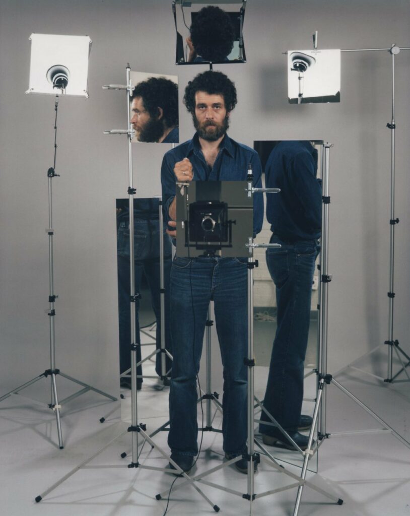
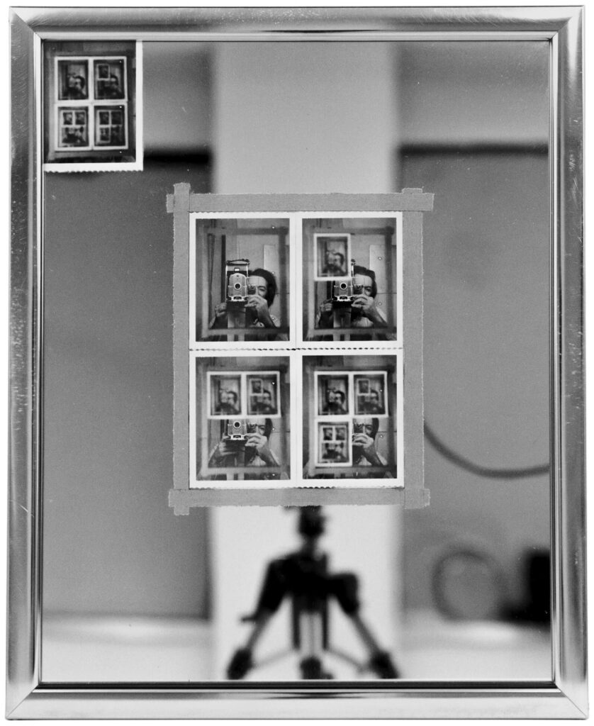
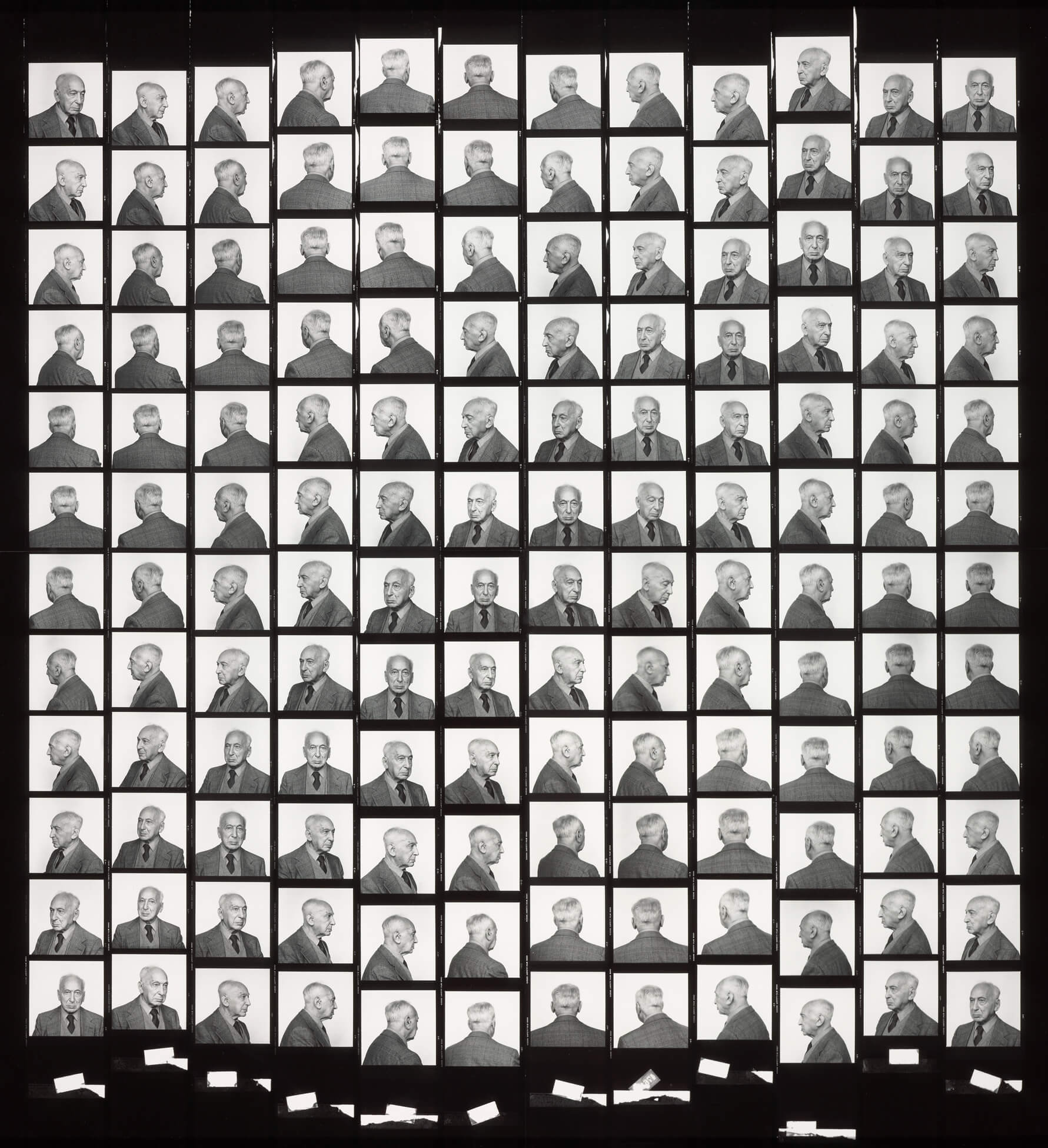
Maggs’s photography was also shaped by the grid. Michael Mitchell (1943–2020), one of his friends, asserted, “Maggs has always been introduced to his latest imagery via the grid of the medium-format contact sheet. He came to accept the form, as generated by his medium, as a part of his message. It was tidy, systematic and controllable.” It was the contact sheet that initially prompted Maggs to shift to a sequential process for his portraits. The grid was also a tool used by Maggs and his assistants for evaluating colour in the printing process.
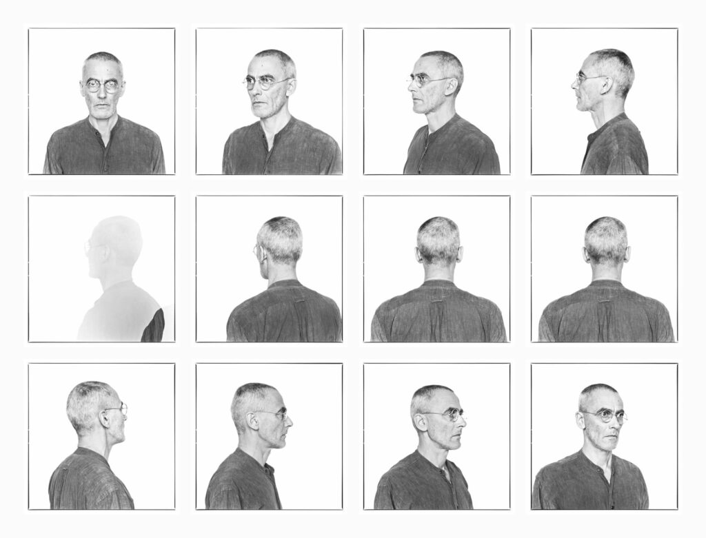
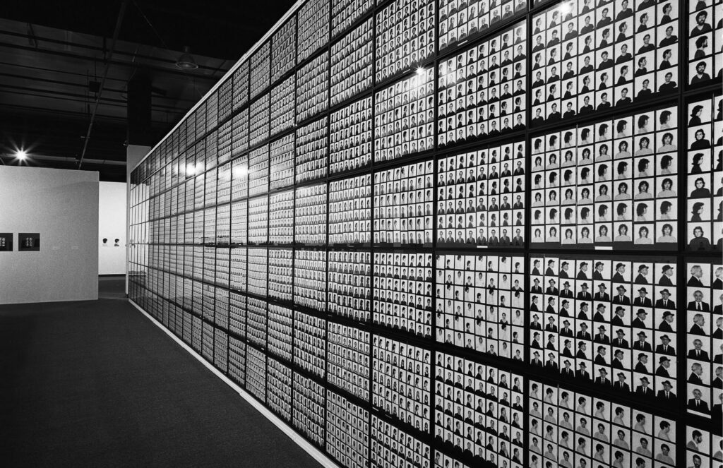
Viewed from a distance, Maggs’s grids register as large units, but the repetition within them facilitates an analytical read. In early portrait works such as Joseph Beuys, 100 Profile Views, 1980, the viewer scrutinizes details, measuring similarities and differences between frames. Curator and writer Philip Monk argues that Maggs uses grids “to reveal something of the human subject that one portrait alone could not accomplish. In these works, the grid, as much as the camera, becomes a tool for seeing.” Certainly, the back-and-forth interrelation between images becomes fundamental to the experience of his work. Although the camera freezes time, the grid affords the possibility of emphasizing duration, allowing Maggs to explore the narrative and expressive capacity of the device. A rhythmic relationship between frames in sequential imagery recalls the storyboard or comic strip format, but it also relates to motion. An emphasis on time is quite subtle in Maggs’s work, but as he moved toward a system based on sequential exposures, his gridded portraits became chronological representations.
André Kertész, 144 Views, 1980, is a powerful example of Maggs’s ability to unsettle conventional interpretations of the grid as purely analytical, rigid, and inexpressive. With his images of the iconic photographer, he meticulously planned the hanging scheme. Repeated views run diagonally across a square-shaped grid; for example, frontal views cut across the centre from the bottom left corner through to the top right. According to Maggs, André Kertész (1894–1985) referred to the final work as a “portrait mosaic.” Maggs’s rotational system for taking the photographs seems to crack open the grid and insist on a dimensional quality that resists the flattening potential of both the grid and photography. It appears at once still and moving: when the individual frames come together in the final installation, the rotation creates a rolling effect or a fluttering through the composition, enlivening the grid, amplifying an emphasis on duration, and engaging the narrative power of the grid format.
The evocative potential of the grid is amplified further still in some of Maggs’s later ephemera-based art. Notification xiii, 1996, and Travail des enfants dans l’industrie: Les étiquettes, 1994, are arranged as large-scale grids, and like much of Maggs’s work, they rely on the formal and conceptual possibilities. They are also expressive works of remembrance that engage with the themes of presence and absence and life and death that underscore much of Maggs’s work. The labour tags in Travail des enfants dans l’industrie: Les étiquettes, for example, recall the shape of a headstone. Monk, who observed the similarity, asserts that with the tags “brought together like a mausoleum wall, Arnaud Maggs has built the young workers a public memorial.” Likewise, the envelopes of Notification xiii, arranged row upon row, recall the shape of flat markers in a cemetery―the grid format extends their memorializing function. Catherine Bédard argues that in Maggs’s work, the “minimalism [of the grid] is woven through with an eminently human and sensuous content, yet shown with all the appearance of documentary objectivity.” He creates tension in the affective and analytical possibilities of the grid itself. Exploiting these oppositions, Maggs disrupts conventional views of the grid as a distancing device.
The Portrait: Editorial and Typological
Maggs’s multiple-image portraits are an extension of his interests in collecting and archiving and in the grid format. They were also shaped by the medium: “Photography,” as writer and artist David Campany argues, “has been developed as a medium of multiplicity and accumulation.” In Maggs’s artwork, multiplicity and accumulation are fundamental to both form and concept and are key to how he challenges the conventions of portraiture. There are also overlaps between Maggs’s editorial portraits and the typological approach he took in his artworks.
Maggs’s primary contribution to editorial photography in the 1970s and early 1980s was portraiture. Donna Braggins identifies in his work a compelling graphic sensibility that achieved a strong focus on the subject. “He had an interesting way of capturing people in environments, but doing it in such a way that there was something two-dimensional about it, which was very intriguing,” she explains. “He put people in very narrow planes, which created a certain kind of focus on the subject . . . almost as if he were capturing them under glass.”
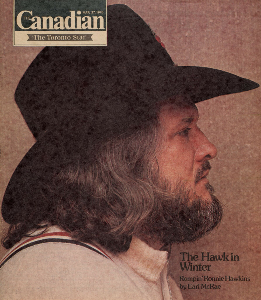
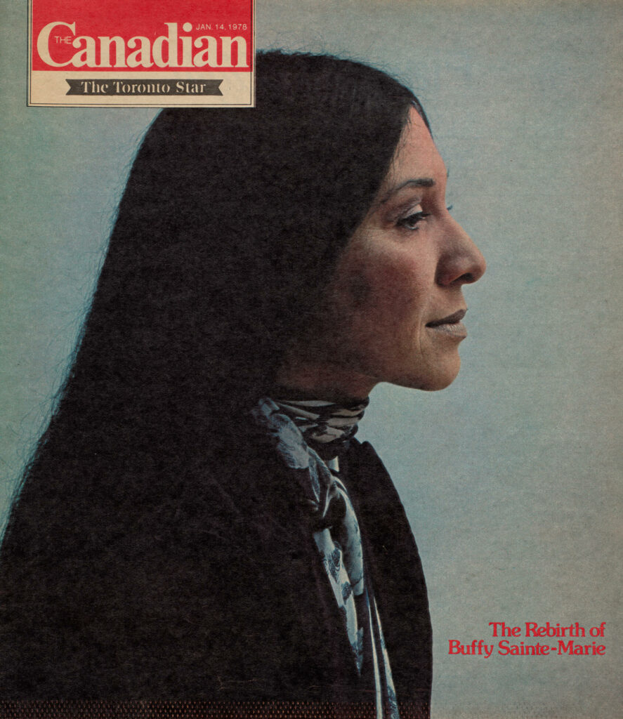
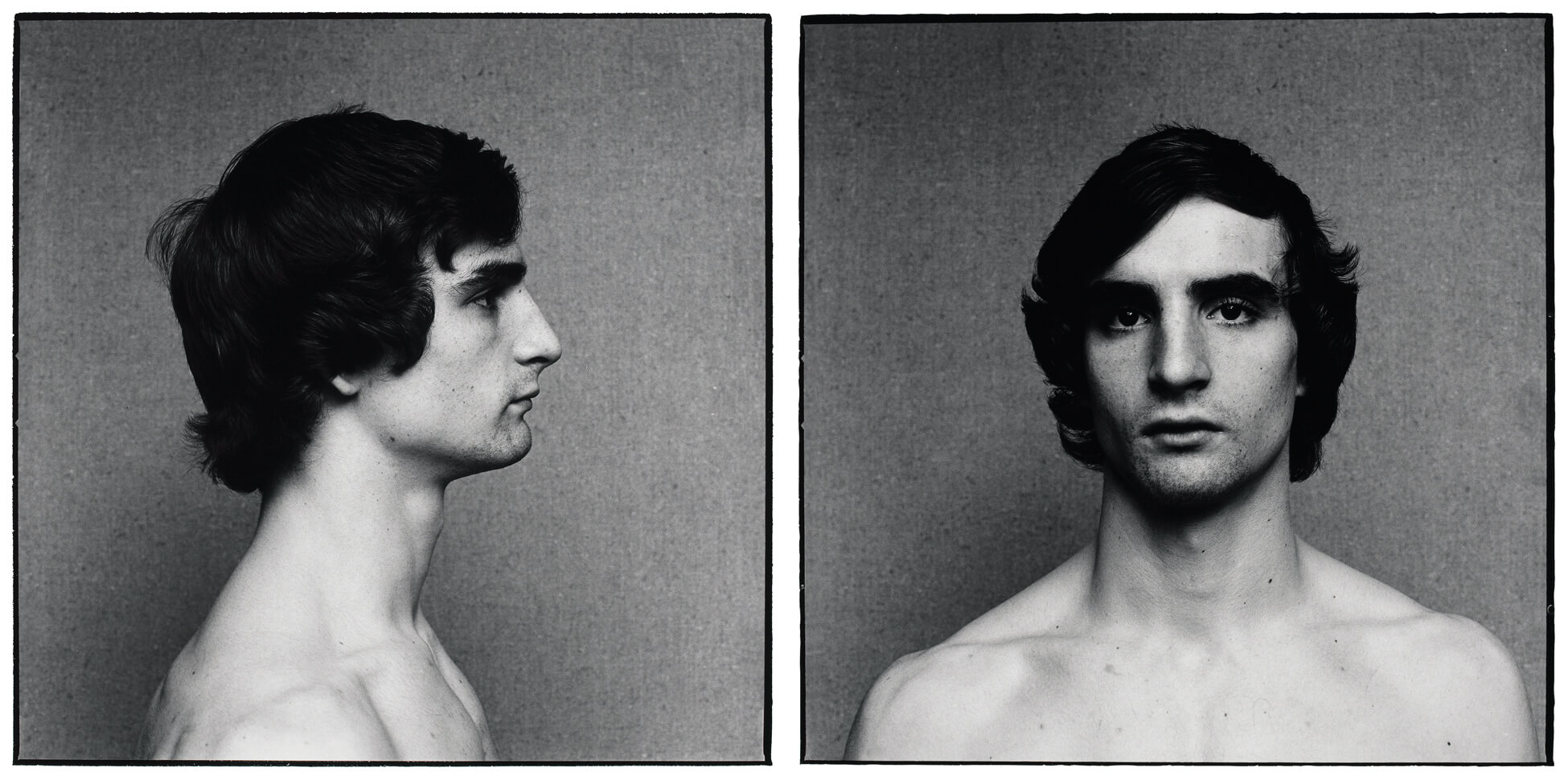
At the same time that Maggs was working on 64 Portrait Studies, 1976–78, he was photographing high-profile people for the Canadian Magazine. Some of Maggs’s cover images reveal intersections between his artistic and editorial approaches. Perhaps drawn to the shape of his cowboy hat, Maggs photographed Ronnie Hawkins in profile for a 1976 cover. For 64 Portrait Studies, Maggs’s sitters were photographed frontally and in profile and they had bare shoulders, “so there was equalization among the people,” he explained. His Hawkins contact sheets reveal similar explorations. His 1978 cover portrait of Buffy Sainte-Marie likewise portrays the musician in profile, along the lines of his approach for 64 Portrait Studies.
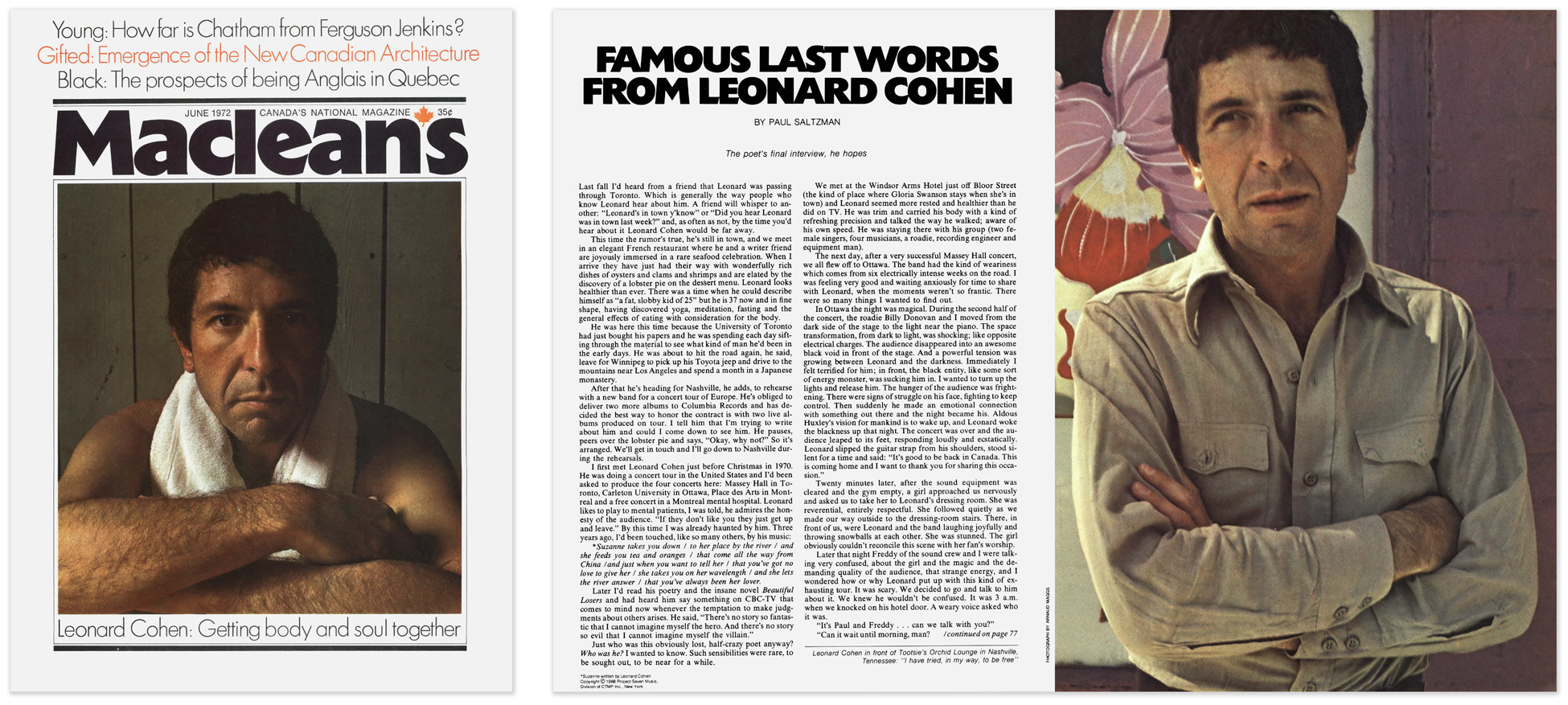
In addition to offering opportunities for artistic exploration, Maggs’s magazine shoots expanded his network. “If I go to do a commercial assignment and the person is someone that I would like to photograph also for myself,” Maggs explained, “I try to arrange another sitting in my own studio.” Such was the case with Leonard Cohen, for instance, whom Maggs photographed for Maclean’s in 1972. In 1977, he photographed Cohen again—in both frontal and profile views—in the high-contrast, square format style of his artworks.
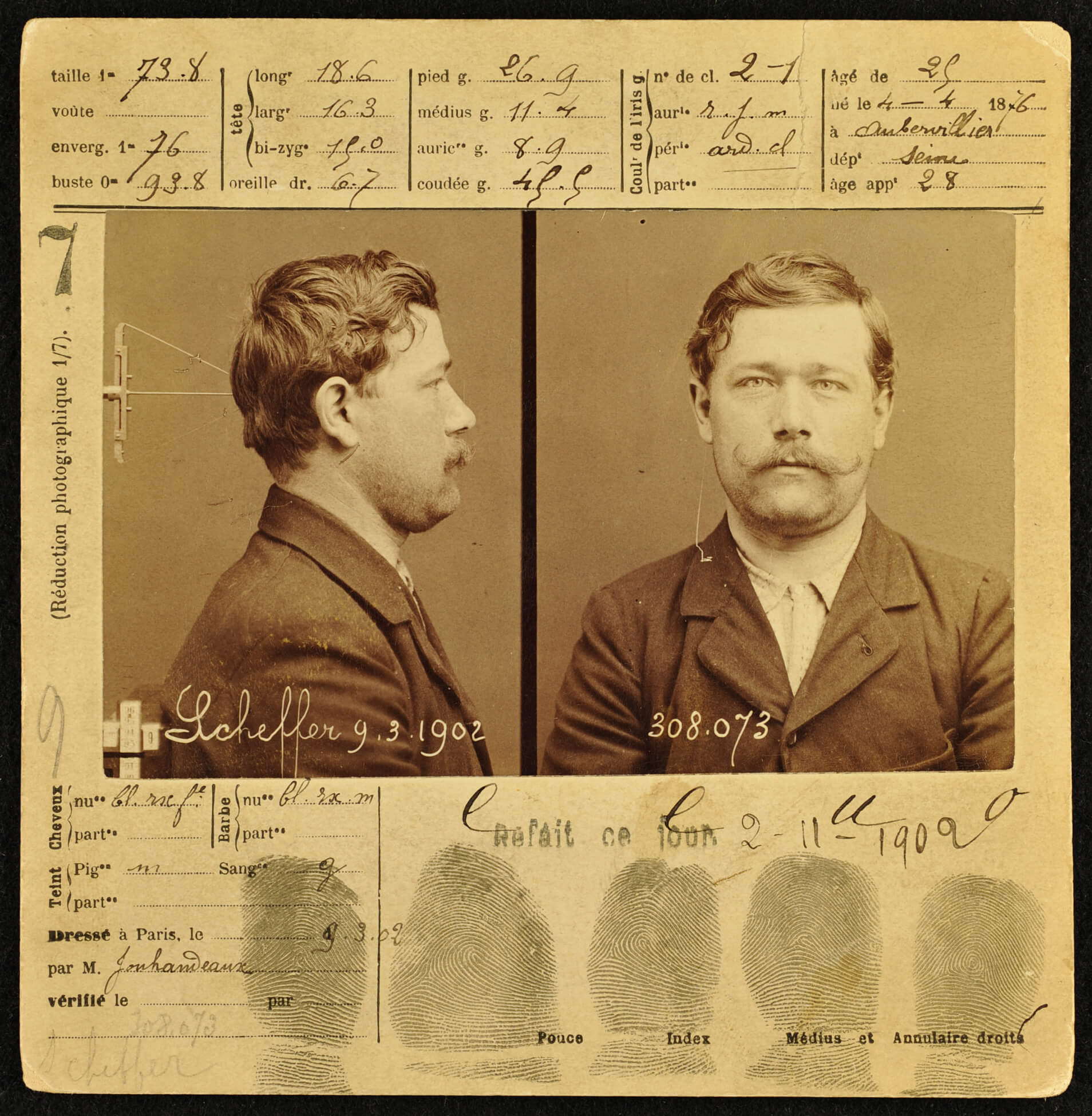
Maggs’s art was also informed by knowledge of historic portraiture. Curator Maia-Mari Sutnik connects Maggs’s work to the sixteenth-century physiognomy studies by German artist Albrecht Dürer (1471–1528). She asserts, “Dürer’s way of delineating physiognomies—frontally and in profile—led to Maggs’s conception of modular frameworks for the human head.” His images in works such as 64 Portrait Studies follow photographic traditions related to human physiognomy and classification as well. Maggs signalled the influence of nineteenth-century criminologist Alphonse Bertillon, whose mug shots established a system of identification using both a frontal view and a profile record of each subject. Developed for the judicial system in France, the Bertillon Method (or Bertillonage) was a racialized instrument of classification and surveillance. The severity of Maggs’s early portraits was felt—“Is this a police line-up?” viewers would sometimes ask. Unlike the Bertillon Method, and other nineteenth-century approaches to recording the body, however, Maggs’s detached and analytical approach was not about surveillance, but rather a reaction against soft, flattering lighting in portraiture. “I’d say [sidelighting] is the most beautiful light there is,” Maggs asserted. “But I felt from my experiments that the sidelighting brought too much attention to the lighting itself. I just wanted to be aware of the face.”
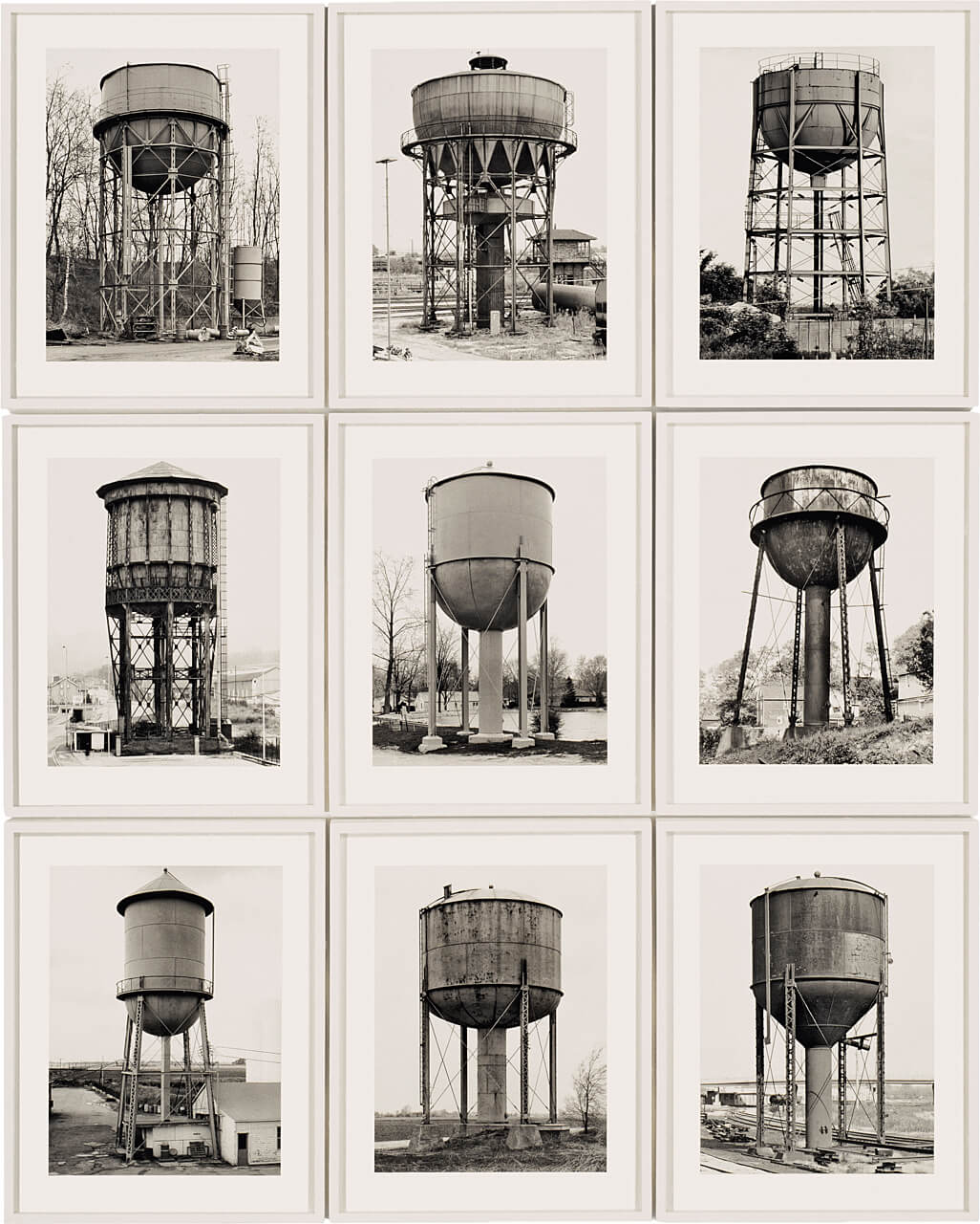
Maggs’s approach to portraiture links him to other twentieth-century artists. His work is often connected to that of photographer August Sander (1876–1964), for example, who produced an exhaustive series of portraits of German workers. Curator and writer Philip Monk notes that Maggs shares with Sander an “urge to collect and categorize, using the human being as subject.” The accumulation of photographic portraits produces a visual archive, a purpose that also connects Maggs to Bernd and Hilla Becher. Through their prolific and systematic photographic images of industrial structures and as prominent teachers in Düsseldorf, the Bechers have contributed to an understanding of German photography as sober and analytical. Their work is frequently characterized as methodical and objective, and as acts of preservation. Maggs’s grid-based portraits relate to their now-canonical architectural typologies. In 2008, Maggs poignantly reflected on his own work as “evidence of existence,” noting that “in all those pictures I took between 1976 and 1983, at least twenty percent of the people are dead now.”
The sheer volume of images that comprise Maggs’s portraits takes the visual archive to a rigorous extreme that likens his approach to the unrelenting installations of Hanne Darboven. His procedural approach—informed by the number of exposures on a roll of film and the layout constraints of contact sheets—offers an innovative methodological extension that moves his work beyond typologies. In 48 Views, 1981–83, for example, he uses forty-eight exposures to represent each subject. As the impressions accumulate, Maggs reveals more about them, even if subtly. Citing the “slightest implication of a change in consciousness” in Maggs’s exposures of Northrop Frye, curator Ann Thomas asks, “What other portrait can you say reveals as much about internal activity?”
The Collection: Aesthete and Archivist
There is an archival impulse evident in Maggs’s oeuvre, and his collections not only provided material for both his commercial and artistic work, but also shaped thematic concepts for his art. His propensity for collecting extended from his childhood fascination with the Popcorn Man and developed into a defining characteristic of both the man and the artist, one connected to his interest in classification and order. Establishing rules and parameters, Maggs used his camera to create, define, and manipulate collections, even with his portraits. “I enjoy cataloguing people’s faces,” he told Gail Fisher-Taylor in 1982. “I’ve always been a bit of a collector. And now I’ve gotten into collecting photographs of people.”
Scholars and critics have identified “an archival impulse” in contemporary art. Critic Hal Foster points to a photographic history for this instinct, asserting that a thread extends from the work of Alexander Rodchenko (1891–1956) and the montages of John Heartfield (1891–1968). Maggs’s impulse builds on the practice of Eugène Atget (1857–1927) of collecting through photographic documentation. It was also informed by his interest in design and form, the frameworks of conceptual art, and the influence of his partner Spring Hurlbut (b.1952), who herself engages with historical objects and content in her artmaking.
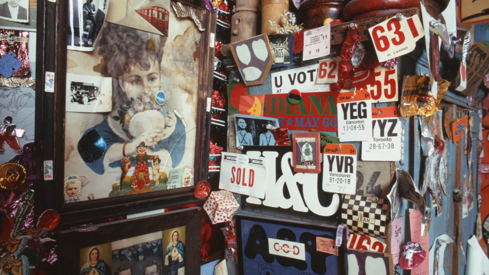
Maggs delighted in small details and humour in found objects and design ephemera and became known for his personal collection. In January 1958, Canadian Homes and Gardens included his home in an issue about achieving personal style. It appeared again in the August 7, 1965, Star Weekly story “The Weird and Wonderful House of Arnaud Maggs.” Revealing his ongoing interest in the shape of the human head, Maggs’s collection included dolls and milliner’s dummies; objects with an emphasis on letterforms also featured prominently. Many of these “weird and wonderful” objects appeared in Maggs’s photographs for his Three Small Rooms restaurant installation.
-
Leah Gringas, “The Weird and Wonderful House of Arnaud Maggs,” Star Weekly, August 7, 1965
Photographs by Ray Weber
-
Leah Gringas, “The Weird and Wonderful House of Arnaud Maggs,” Star Weekly, August 7, 1965
Photographs by Ray Weber
These articles note that Maggs’s collection extended beyond what was on display. It was rotated, a strategy reflecting his keen sense of space, the relationship between design and order, and presentation. Canadian Homes magazine included the Maggs house and collection in its March 1966 issue, for which Maggs himself supplied photographs. Emphasizing the importance of curating, Maggs explained: “It isn’t the decorating materials or their design, it’s what’s done with them.… You have to know what is original, and balanced, and pleasing to the eye.”
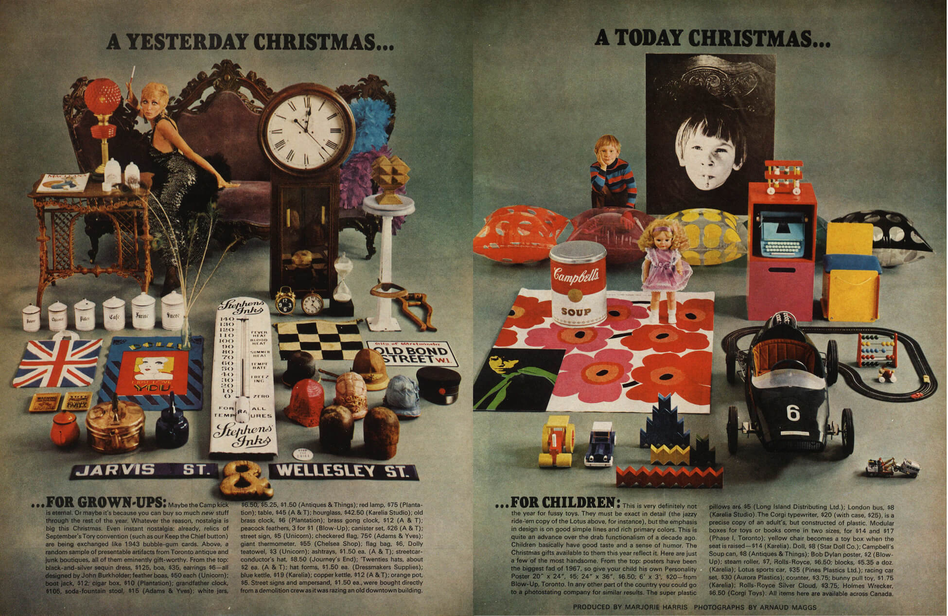
Maggs’s merchandise set-ups for Maclean’s recall the carefully arranged collections in his own home. Jonathan Eby explains that Maggs “was like a Hollywood prop shop,” which was part of his appeal as a photographer. “Anything you could imagine Arnaud probably had, and he could represent it,” Eby explains. “He was always an attraction that way as he was a one-stop shopping centre.” Maggs’s personal collection provided props for several stories for Maclean’s, especially those with a still-life direction.
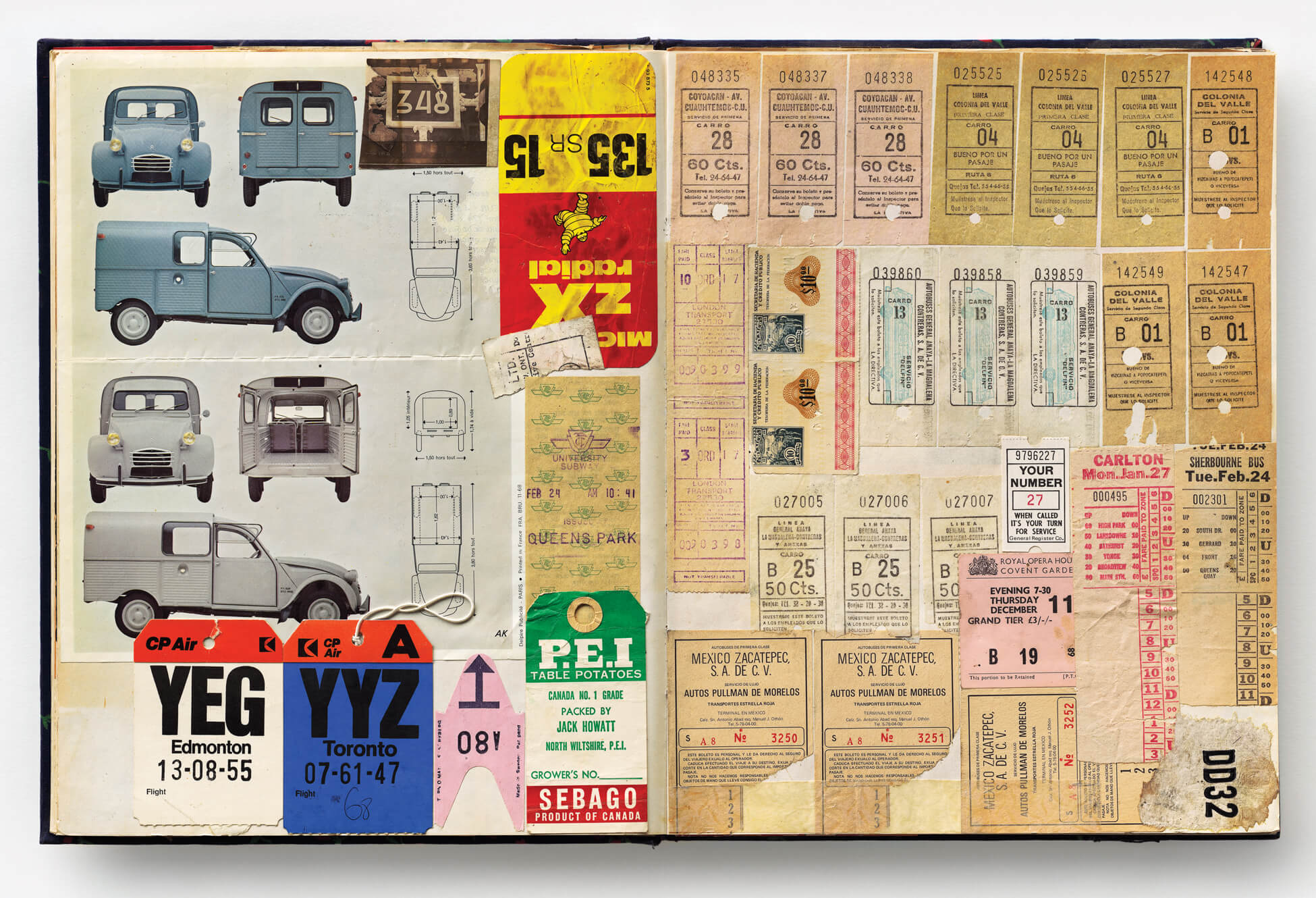
By the 1970s, when Maggs was living in Cabbagetown, his collecting habit had taken over his space. In his notebook he admitted, “I collected everything I saw which interested me. At one point my tiny living room had two television sets side by side . . . the living room walls were completely covered with pictures, paintings and photographs.” He detailed layered cloth covering the walls of the dining room cum bedroom, and albums stored in the kitchen. In his years of transition from commercial work to art practice, Maggs slowly purged his collections but never lost the impulse entirely. Scrapbook (1), 2009, offers a glimpse of ephemera he hung on to—his love of typography and letterforms on clear display. After Nadar: The Collector, 2012, features his collection of white jugs found in France.
Maggs’s later practice is defined by photographic documentation and exploration of memory and history through the use of found historical materials. As Foster stresses, archival artists both use and produce archives, which “underscores the nature of all archival materials as found yet constructed, factual yet fictive, public yet private.” Maggs’s materials are themselves records: labour tags, correspondence on mourning stationery, receipts, ledgers, and notebooks. His work offers traces of the past, making lost memories material and visible, even if only partially. Like the contradictory nature of archives and of memory itself, works such as Travail des enfants dans l’industrie: Les étiquettes, 1994, Notification xiii, 1996, Les factures de Lupé, 1999–2001, and The Dada Portraits, 2010, involve dualities, oscillating between presence and absence, life and death, and the real and the imagined. They demonstrate how the artistic use of archival material offers rich potential for explorations of memory—a conception of memory that involves both the past and the future.
Contemporary Connections
Maggs “calls us to attend to the world around us, deciphering meaning in the telling details,” writer and curator Sarah Milroy contends. “It’s a call to looking.” In the latter part of his art career, he used photography to reframe historical objects and material, insisting on their contemporary relevance. In recent years, many other artists have used ephemera and the archive to explore the critical issues and themes addressed by Maggs.
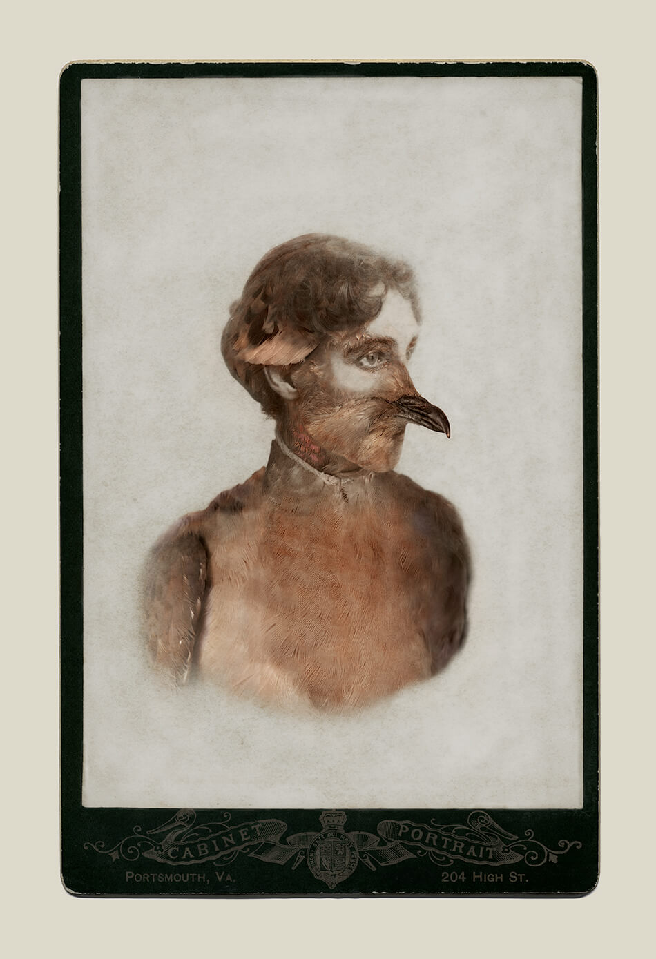
For her 2013 series, Aviary, Toronto-based artist Sara Angelucci (b.1962) created a suite of hybrid portraits by combining photographs she took of extinct and endangered birds from the Royal Ontario Museum’s ornithology collection with anonymous portraits from nineteenth-century cartes-de-visite and cards found at flea markets and online. At once bird and human, her chimeric creatures address memory and loss. Like Maggs’s Travail des enfants dans l’industrie: Les étiquettes, 1994, and Notification xiii, 1996, Aviary serves a memorializing function. Angelucci advocates for remembrance, simultaneously addressing the past and the future. Works by both Maggs and Angelucci were included in an exhibition called Metamorphosis: Contemporary Canadian Portraits at the Glenbow Museum in 2020.
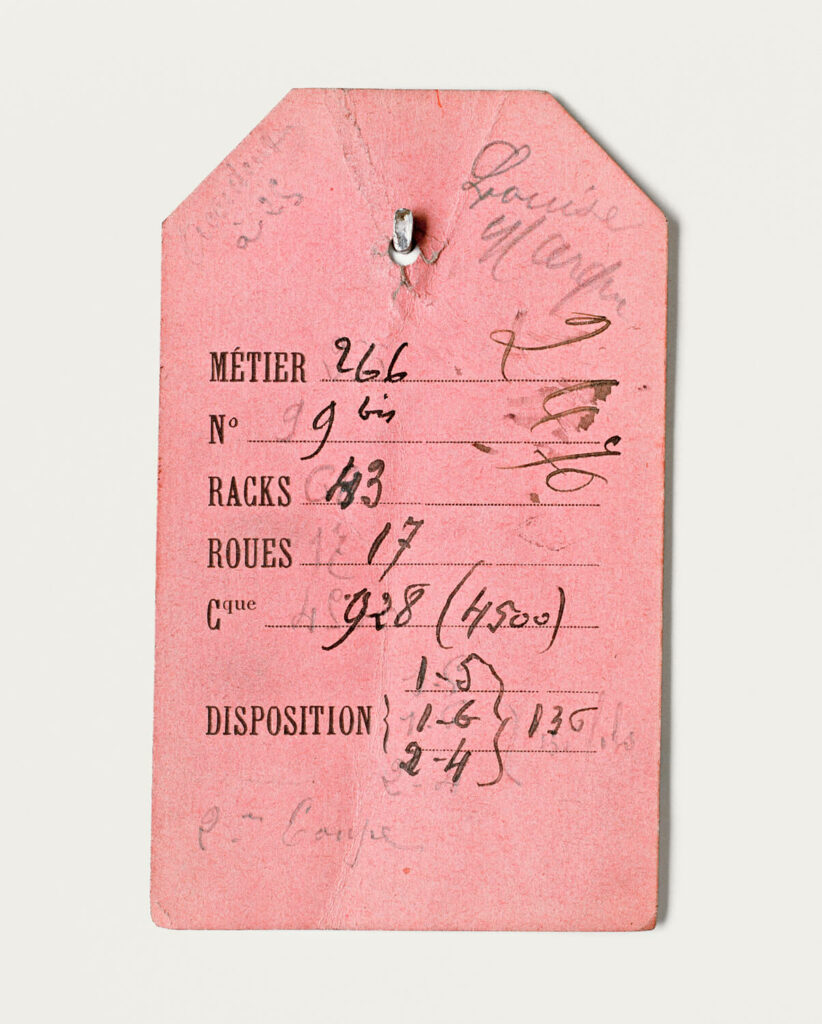
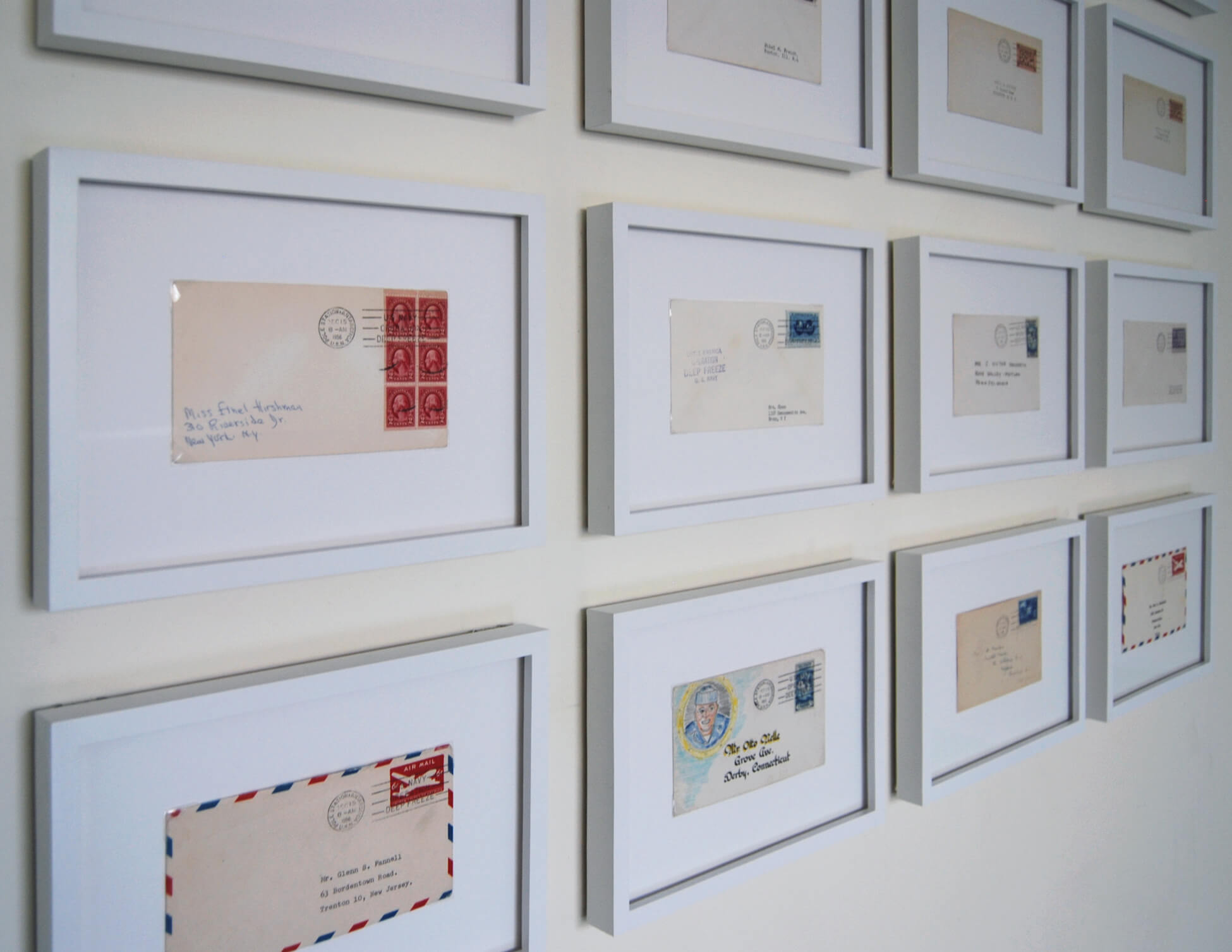
Toronto-based artist Kristie MacDonald (b.1985) shares with Maggs a dedication to precision and craft. Trained as an archivist, MacDonald uses found paper ephemera as a starting point, and she intervenes and manipulates the material for her artworks. In Ripped Pictures, 2008, she carefully stages images to replace missing parts of torn found photographs, blurring the line between fact and fiction and insisting on the subjective nature of both history and memory. “I have always used photography and found objects, and Maggs is an artist that I could identify a similar impulse in,” MacDonald asserts. “I am particularly drawn to his grids that document collections of paper—works like Notification, Werner’s Nomenclature of Colours, and Contamination.” Just as Maggs did in Notification xiii, MacDonald explores concealment and disclosure and the idea of fragmentation in Pole Station Antarctica: 8 am, December 15th 1956, 2012–present. The work offers only a partial view of envelopes from the very first batch of mail postmarked at Pole Station, Antarctica. A “fragment forces a kind of speculative search for connection . . . There is a term in Archival Studies—‘archival bond’—that refers to the intangible bond between materials of the same provenance/origin,” MacDonald explains. “I like to define it as a synonym for affect, but between objects. I think Maggs might have liked that idea too.”
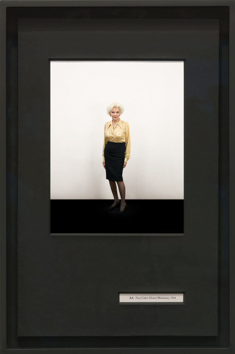
Paralleling Maggs’s interest in systems of classification, American artist Taryn Simon (b.1975) borrows both visual and intellectual strategies from Conceptual art to challenge the authority of taxonomies and archives. A combination of photography, text, and graphic design, her projects frequently employ repetition, seriality, and careful hanging schemes. Birds of the West Indies, 2013–14, is a two-part artwork for which Simon uses self-imposed systems as a guiding framework. For Part 1, she starts with a 1936 taxonomy of birds called Birds of the West Indies by American ornithologist James Bond as a conceptual and formatting reference to present an inventory of the women, vehicles, and weapons that appear in James Bond films between 1962 and 2012. For Part 2, in a nod to Michelangelo Antonioni’s Blow-Up (1966), Simon assumes the role of ornithologist and tracks, identifies, documents, and classifies all birds that appear in the Bond films. Like Maggs, Angelucci, MacDonald, and Simon strategically use photography as a call to looking.
 About the Author
 More Online Art Books
 Acknowledgements