Town is best known as a painter, but throughout his career he also developed bodies of work in drawing, printmaking, collage, assemblage, and sculpture. He retained a lifelong allegiance to abstraction as the distinctive mode of twentieth-century expression. In the graphic arts he found apt means to comment on contemporary icons. The stylistic variety in his work sprang from a determination to bring all the resources of art to bear on analyzing the rapidly changing environment in which he lived.
Early Gestural Abstraction
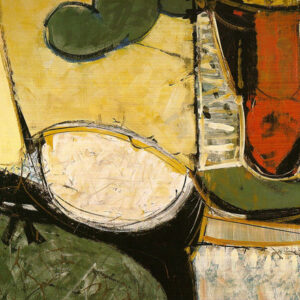
As one of the youngest recruits to the international current of Abstract Expressionist painting in the 1950s, Town perceived it as an exciting liberation into an increasingly open-ended, free-associative way of painting, prompted by an inner world of stored sensory experiences and personal memories. With Painters Eleven he looked to New York, and his lifelong admiration for Willem de Kooning (1904–1997) began at this time.
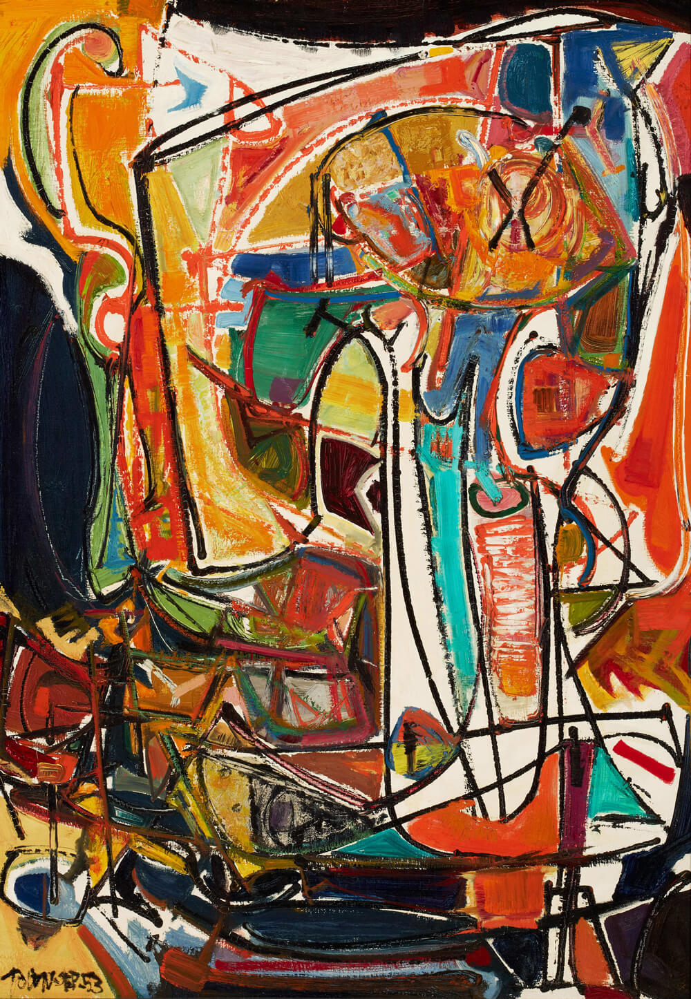
Town’s stylistic signature was energetic drawing with the brush and flourishes of calligraphic detail. Increasingly he balanced these graphic marks against larger, textured colour areas and dense layers of pigment, creating shapes that evoke multiple associations.
“Big Attack” Paintings
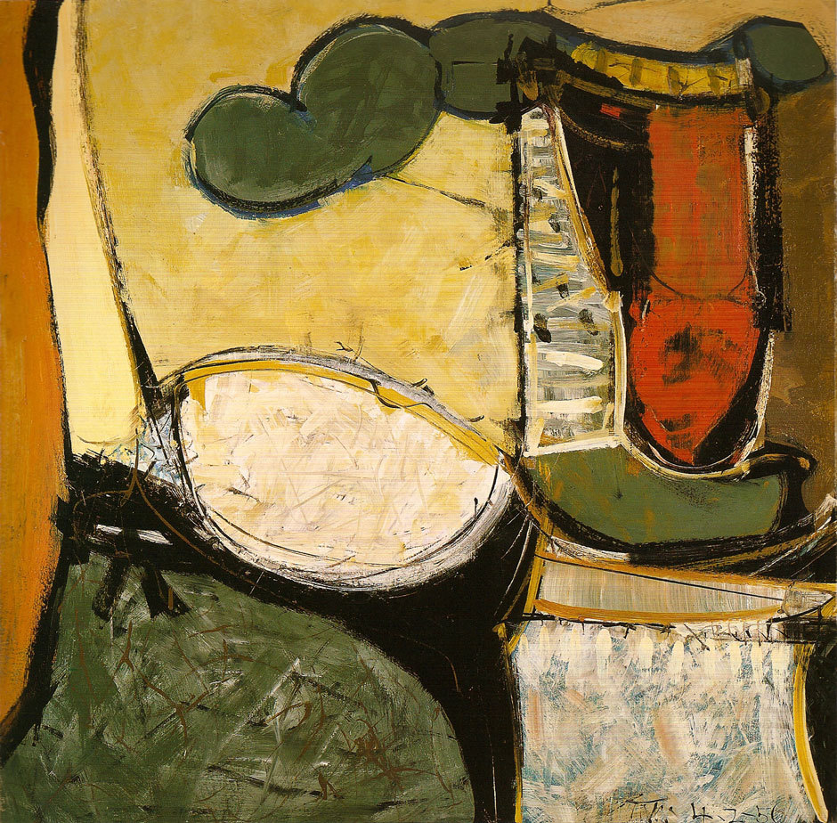
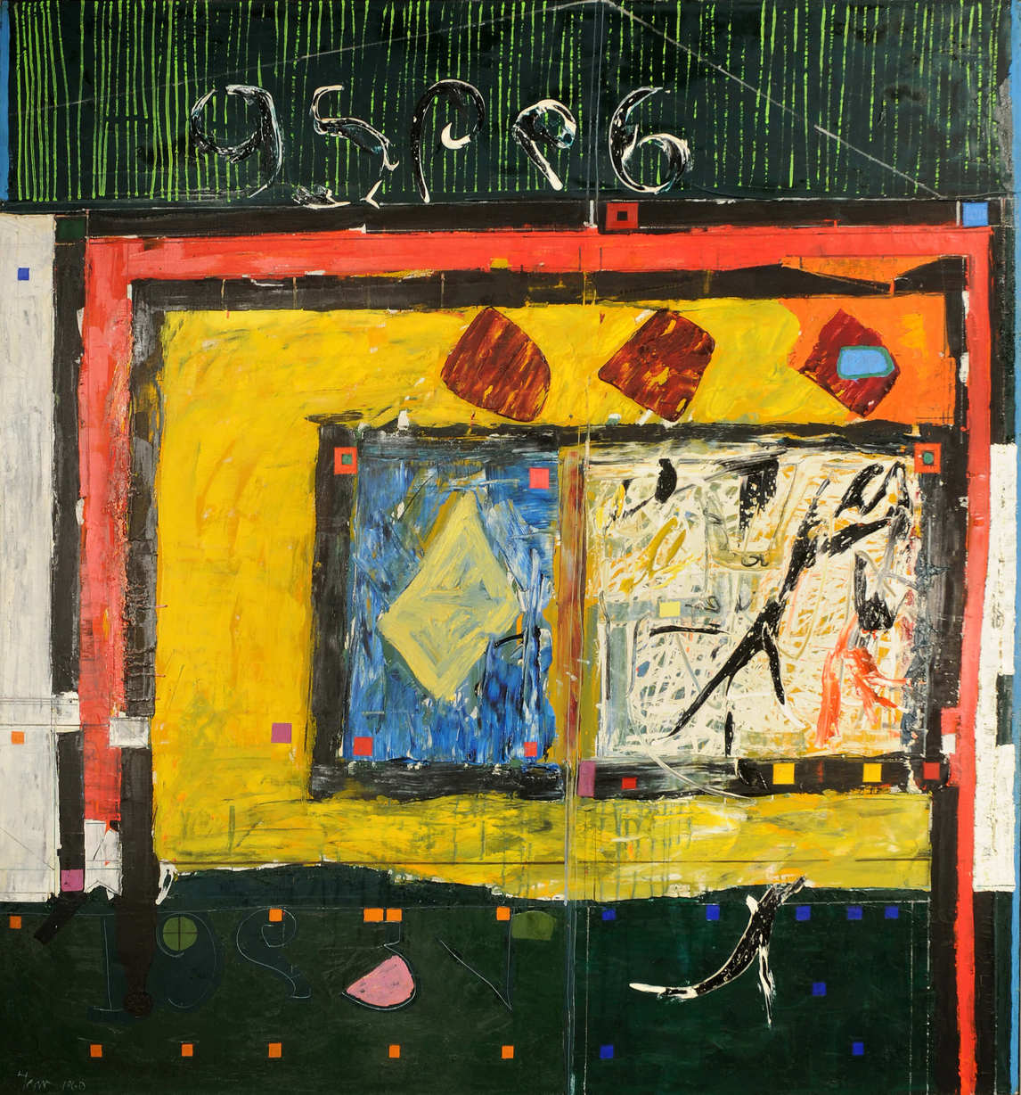
After his experience of painting the St. Lawrence Seaway mural in 1958, Town began working on much larger canvases, roughly 2 by 2.5 metres. By 1960 he was structuring these architectonic compositions with bold lines and large areas of black and saturated colour, as in Inoutscape, 1960, to create emblematic configurations. He also made many smaller paintings that began with complete spontaneity, building up thick layers of luscious paint that suggest human presences and locations in memory. A persisting theme was that of the hero, sometimes legendary but more often contemporary: baseball pitcher, aviator, architect, artist.
Town had rejected from the outset the idea of a single motif that would be the painter’s hallmark, like the floating rectangles of Mark Rothko (1903–1970) or the central motifs of William Ronald (1926–1998). Instead every painting is individual and develops an emerging cluster of associations.
Single Autographic Prints
Town earned international success for an innovative form of printmaking he developed during 1953–59, the monotypes that he called “single autographic prints.” In this medium he developed procedures that would have a profound effect on his approach to artmaking in general. In 1953 he bought a lithographer’s stone and press from Oscar Cahén (1916–1956). He used this not to make multiple copies of a particular work, but as a field on which to generate unique compositions. His first essays are simple line drawings done by reverse drawing. In Soldier Leading Horse, 1953, the paper is laid face down on the inked stone, and the motif is traced out with a pointed tool on the back so that the lines pick up the ink.
Soon he developed more complex procedures. He might pull several impressions from a pre-inked plate, each of which could then be developed in a different way. Or he could print from the surface of a wet print onto another sheet of paper. In works like Tree Zoo, 1957, he placed cut papers onto the stone to generate shapes from stencils, or pre-inked them and printed them directly onto the print’s surface.
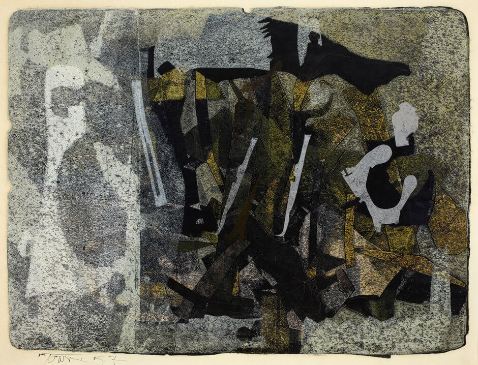
He developed increasingly sophisticated designs created with accidental and found shapes and with negative and positive use of stencils. Intangible effects of colour, texture, and illusory space result from many layers of overprinting. Town also used found materials—paper, string, cotton, leather, felt—that he placed on the stone to impress onto the print surface. Occasionally these materials remain embedded in the surface ink, like collage. This method of generating images challenged Town to think beyond his facility with the paintbrush.
Collage, Assemblage, and Sculpture
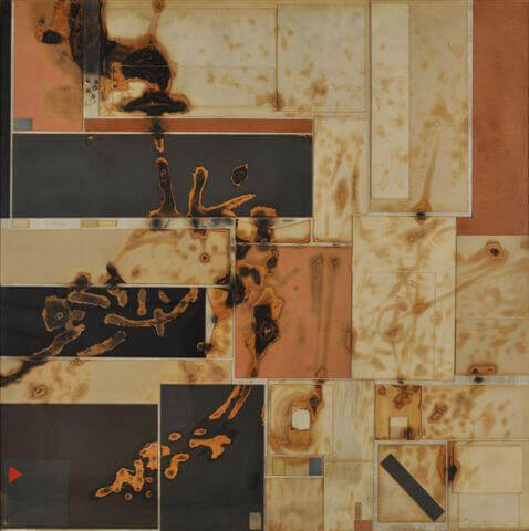
Town shared the widespread interest in collage that flourished in the 1950s as the postwar generation claimed the legacies of Cubism, Dada, and the Surrealists. In 1956 he began pasting found materials onto sheets of Masonite.
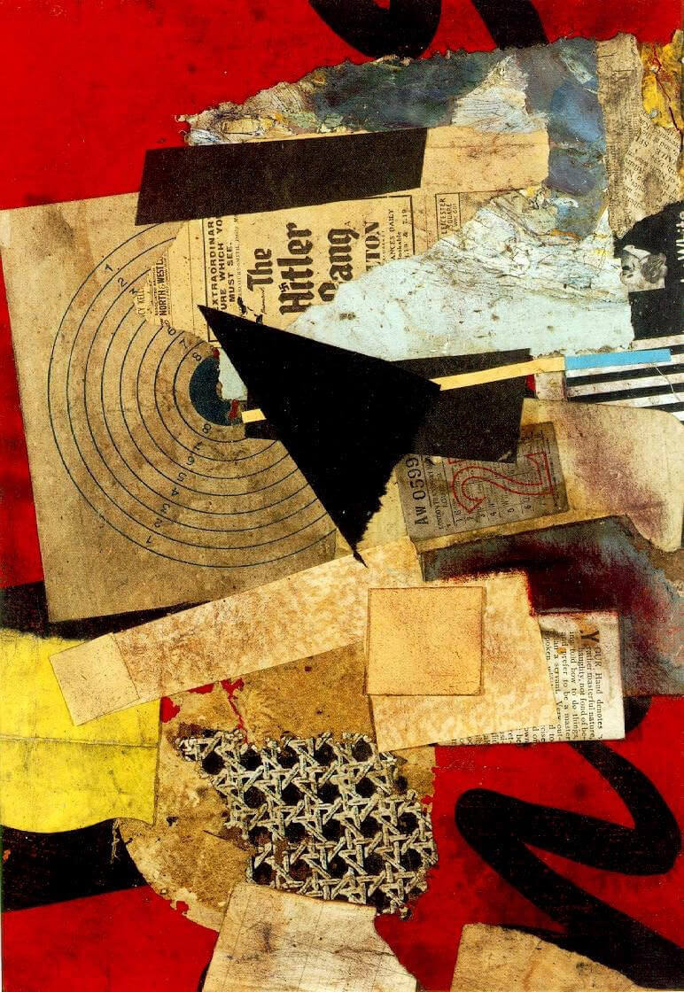
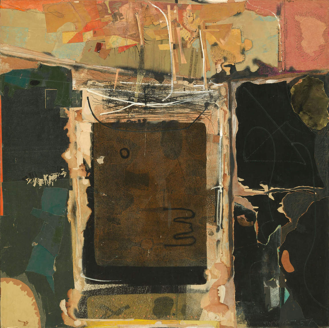
The compositional modes of his collages share the aesthetic of his paintings: they spread out to fill the surface yet are given focus as configurations by areas of drawing in ink or paint, as in Homage to C.T. Currelly No. 1, 1957, Town’s collage in honour of the first director of the Royal Ontario Museum. He juxtaposed contrasting or unexpected textures and fragments pulled from myriad everyday sources, leading the viewer through sequences of association and ambiguity, of close-up and distant viewing.
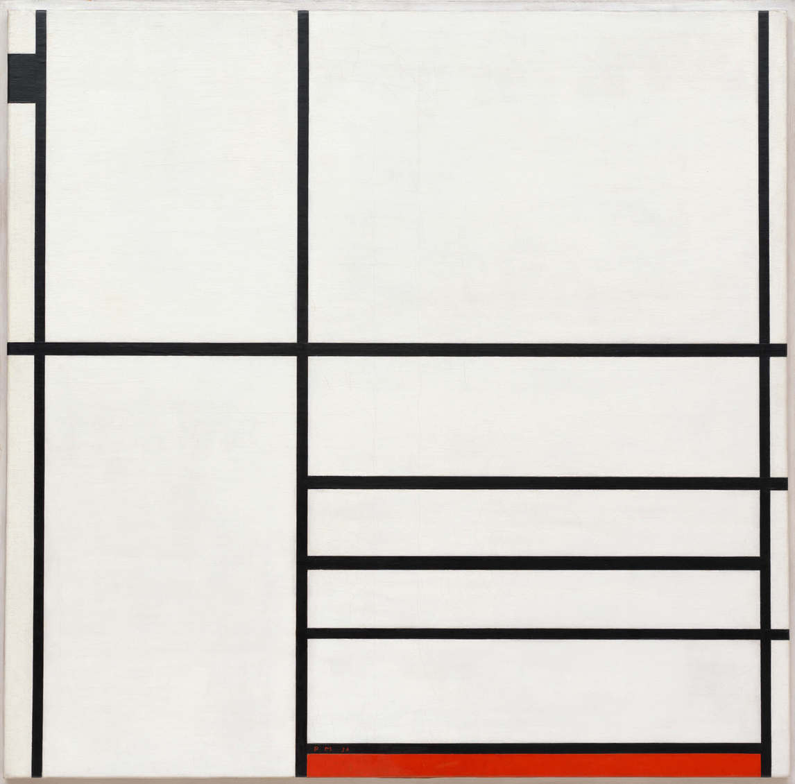
Town often incorporated the proliferating materials and new forms of the industrial world, products that rapidly mutated or became obsolete, making them witness to their moment in contemporary material culture and its transitory nature. He wrote: “[Collage] seems to me the one medium most suited to the age of conspicuous waste, and it’s marvellous to think of the garbage of our age becoming the art of our time.” He brought these ephemeral contemporary materials into dialogue with the art forms of the past, from Japanese prints to Cubism and works by Piet Mondrian (1872–1944).
In Death of Mondrian No. 1, 1961, Town used a propane torch to scorch and burn the edges of the collaged papers. As art historian David P. Silcox comments, “The scorch marks … speak of everything that Mondrian ignored. The burning stood for spontaneity and motion and against stillness, for nuance and shading and against stilted forms and flat colours.” In other works of the early 1960s he exploited smoke and singed the paper to generate accidental and evanescent forms that interact with geometric elements.
Town’s work in collage suggested a logical extension into the three-dimensional modes of relief and assemblage. He had attended welding classes in 1961–62 at Central Technical School, Toronto, and in 1963 cast three bronze figures made from found materials that he titled Greek Dynasty Group.
During the 1980s, when he had ample studio space, he created a variety of freestanding works that could be classified as either sculpture or assemblage (they were listed as collages in a Town retrospective catalogue), incorporating found objects and fragments from his own earlier production.
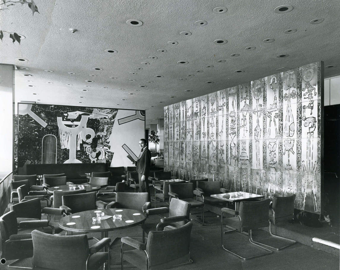
Town received commissions for two large architectural reliefs. One of them, a 2.4-by-6-metre screen for the Aeroquay Lounge at the Toronto International Airport in 1964 (reinstalled in the new Terminal 1 in 2006), is made up of sixty brass panels etched with intricate abstract patterns that resemble cryptic hieroglyphs. The other, an exterior relief for the North York Public Library in 1959, deploys writing symbols from different cultures inscribed on large ceramic tiles.
Works on Paper
By 1960 Town had stopped making single autographic prints, but throughout his career he continued to pursue printmaking and drawing as independent creative modes. His increasingly formal investigations of abstract languages in the 1960s could be accommodated equally in painting and in works on paper. For example, the advent of serigraphy and commercial photo-offset lithography provided a vehicle for his flat, hard-edged designs, such as Untitled, 1971 (an offset lithograph made after a painting).
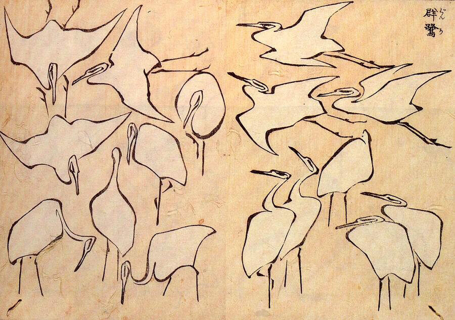
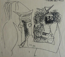
Town’s outstanding gift and love for the discipline of drawing enabled him to create a graphic commentary on contemporary culture that abstract painting could not achieve. The human figure was his predominant concern. As a student he had drawn from live models and begun a lifelong study of different stylistic approaches to the figure, from Renaissance pen-and-ink drawing, through Western and Asian brush drawing, to the expressive distortions of Honoré Daumier (1808–1879) and Henri de Toulouse-Lautrec (1864–1901). He assimilated a lexicon of styles that fascinated him, claiming two prime masters, Katsushika Hokusai (1760–1849), the great chronicler of Japanese life, and Pablo Picasso (1881–1973), the stylistic transformer.
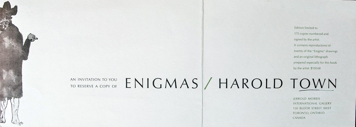
Between 1964 and 1972 Town made the Enigmas—a series of compelling, obsessively detailed pen and brush drawings intended as sardonic personal comments on the shortcomings of the Canada that he loved.
From the early 1950s on, Town also made virtuosic charcoal and brush drawings that condense into bold hieroglyphs a range of contemporary Toronto types and celebrities from the worlds of entertainment, sport, literature, and popular music. During 1968–71, with the help of his printmaker friend Frank Johnston, he made such drawings directly as limited-edition lithographs on zinc plates, titled Popsters and Celebrities.
Throughout the 1970s and 1980s Town produced series that explored variations on appropriated images of the human figure. Often he took a motif or image by another artist as a starting point and explored it through a range of styles and media, as Picasso had done in his 1957 paraphrases of Las Meninas, by Diego Velázquez (1599–1660). Town’s own suite, titled The Lady in the Cook Photo (1969–72), is based on a nineteenth-century Toronto photographer’s portrait of an unidentified woman, a plain but monumental matron.
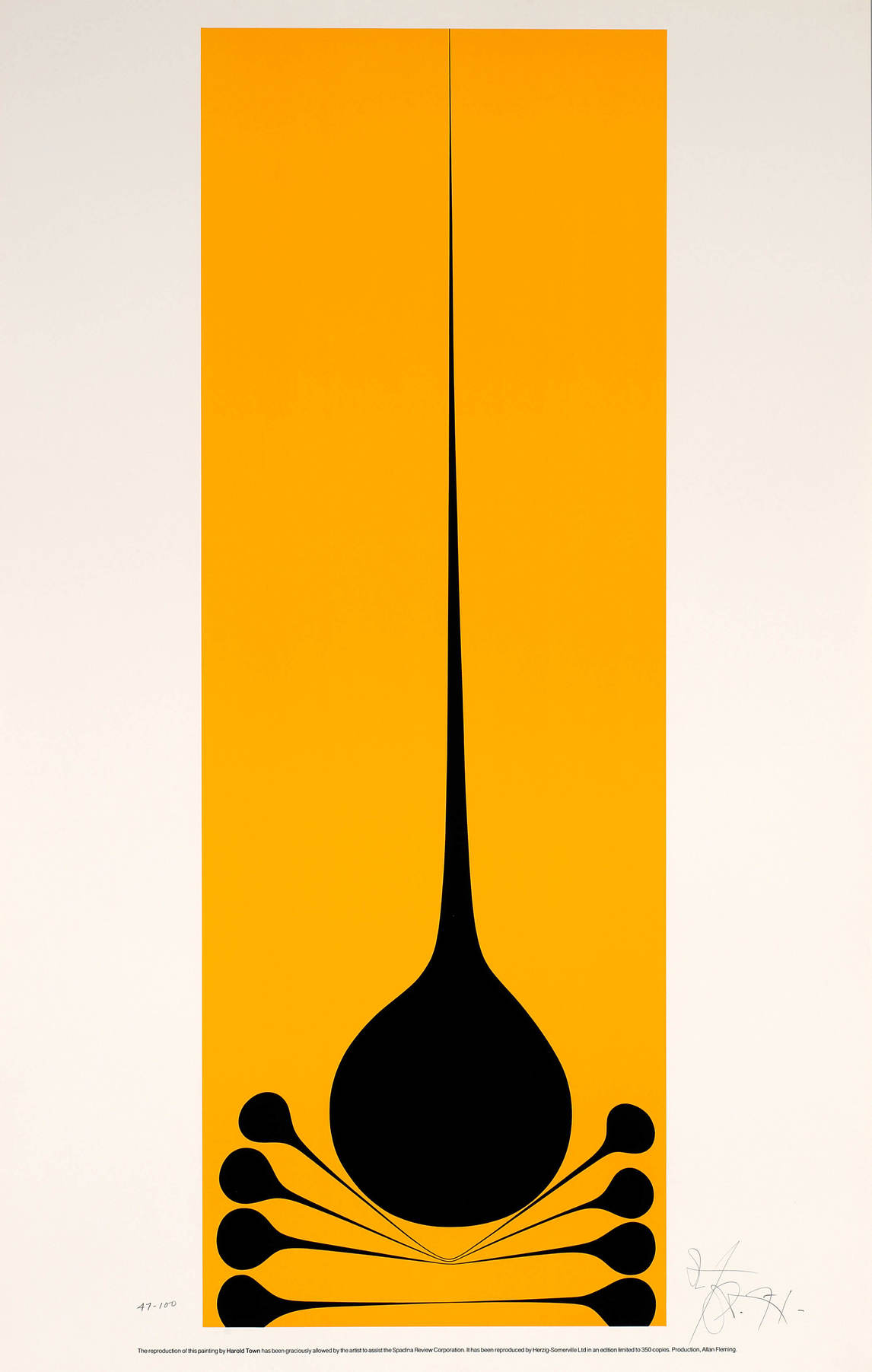
Drawing and printmaking suited Town’s interest in erotic imagery. As the Women’s Movement gained momentum in the 1970s, he placed such imagery at an ironic remove. Each of three late series—the Vale Variations (1972–77), the Gods (1975–79), and the Toy Horses (1976–84)—uses a sexually charged motif long established within his repertoire but now playfully deconstructed. These are images that comment on the history of styles and images.
Series Paintings
In 1962 Town turned decisively away from the conventions of Abstract Expressionism to embrace a more conceptually driven approach. His paintings now were made in series, still abstract, each governed by specific, deliberately chosen formal constraints. Unlike the purely non-figurative abstraction of high modernism, however, these paintings allude to aspects of a dynamic urban-industrial environment with its physical and psychological tensions.
Two overlapping series, the Set paintings and the Tyranny of the Corner paintings, represent Town’s first forays into what would later be called postmodern concerns. By using the term “set” in their titles, Town indicates that they are to be associated with the artifice of theatre and performance—the term is used for both a theatrical mise en scène and a session in jazz.
Abandoning brilliant colours and thick impasto, Town lays down black areas and lines on a white-primed canvas. The almost monochrome palette is enriched with a dark Prussian-blue paint mixed into the black, giving it richness and variation. Onto many of the black areas Town paints a texture of small repeated units, sometimes dots, dashes, or crosses but most frequently little O’s, which he called his “doughnuts.”
In Tyranny of the Corner (Sashay Set), 1962, the repetition of units invokes the presence of the machine and mechanical production. Because the units are hand-drawn, the brush has to be repeatedly loaded with paint, giving a living, organic feel to these areas of pattern. Another of Town’s procedures was to pour a diluted wash of paint onto the central area of his canvases, which he then tilted so that the paint could flow and run in streams, introducing the element of chance into the composition. This interweaving of discordant components was a technique Town had exploited in his collages.
With the Tyranny of the Corner paintings Town posed an additional constraint. He started building the composition at the corners, an area of the canvas that tends to be neglected if the focus is at the centre, as happens when dynamic symmetry or all-over compositional strategies are being used.
Through the 1960s and 1970s Town continued to devise compositional formats each of which he then explored: the Optical and Silent Light paintings (1964–69), the Stretch series (1968–70), Parks series (1970–72), and the Snaps (1972–76). Geometric elements had entered his work in 1964 paintings such as Optical and No-op, in which Town used masking tape as a tool, setting up a counterpoint between straight lines and organic, irregular components. With contrasts of light and dark, and with variations in the size of pattern units, he created shifting illusory spaces that exist in tension with a respect for the flatness of the canvas.
With the Stretches, the Parks, and the Snaps, Town further developed the principle of placing opposed stylistic vocabularies in tension, subverting what he saw as the reductionism of high-modernist, “pure” painting.
For the monumental Snaps series in 1972, Town adapted the snap-line, a traditional carpenter’s technique for transferring straight lines to a surface. He applied pigments by stretching a string in front of the canvas, loading it with paint, and then snapping it against the picture surface. This method eliminated the “hand” of the artist from the work, while producing an unprecedented intensity of colour.
Paintings of the 1980s
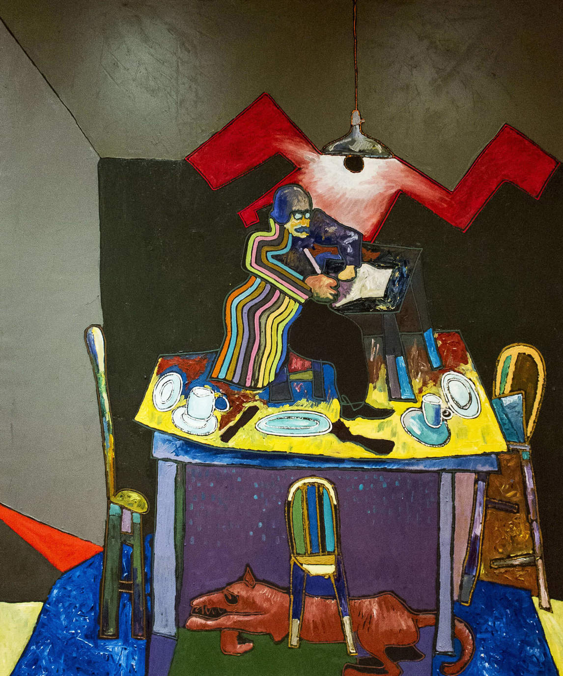
In 1980 Town brought figurative imagery back into his painted canvases, a move that had parallels with the “return to painting” that burst upon the international art scene between 1978 and 1981. Both his works on paper of the 1970s and his monumental new emblematic paintings like Spengler Writing The Decline of the West at His Desk on Top of the Kitchen Table, 1980, would have fit the parameters of the 1978 exhibition “Bad” Painting, at the New Museum, New York. The show’s curator, Marcia Tucker, defines this anti-modernist turn: “The freedom with which these artists mix classical and popular art-historical sources, kitsch and traditional images, archetypal and personal fantasies, constitutes a rejection of the concept of progress per se.”
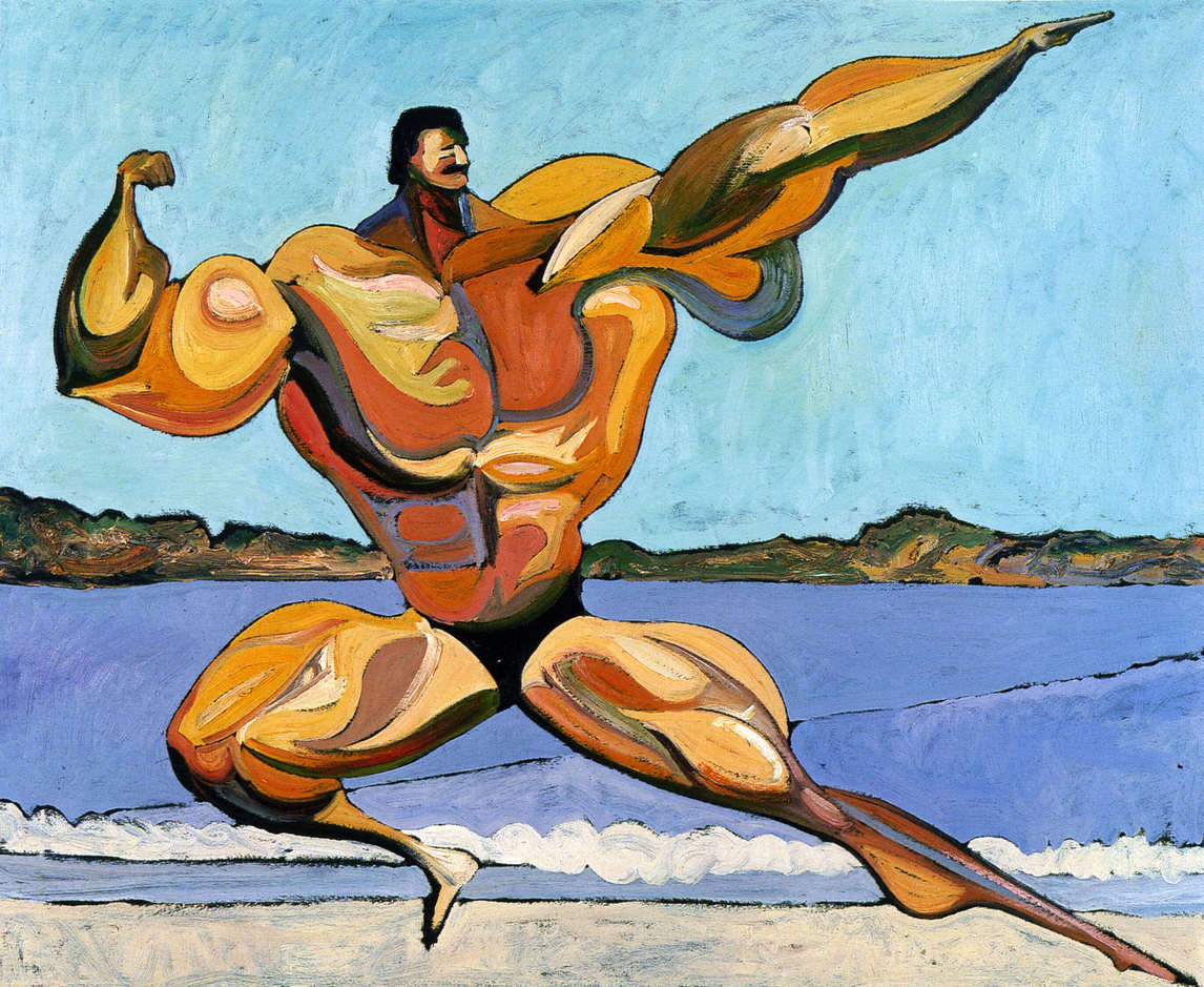
Stylistically Town’s 1980 paintings refer to the naive drawing and bright colours of folk art. Town continued this absurdist figurative vein in another late painting series, the Musclemen (1981–84), which reflected ironically on the masculine ideal in popular culture.
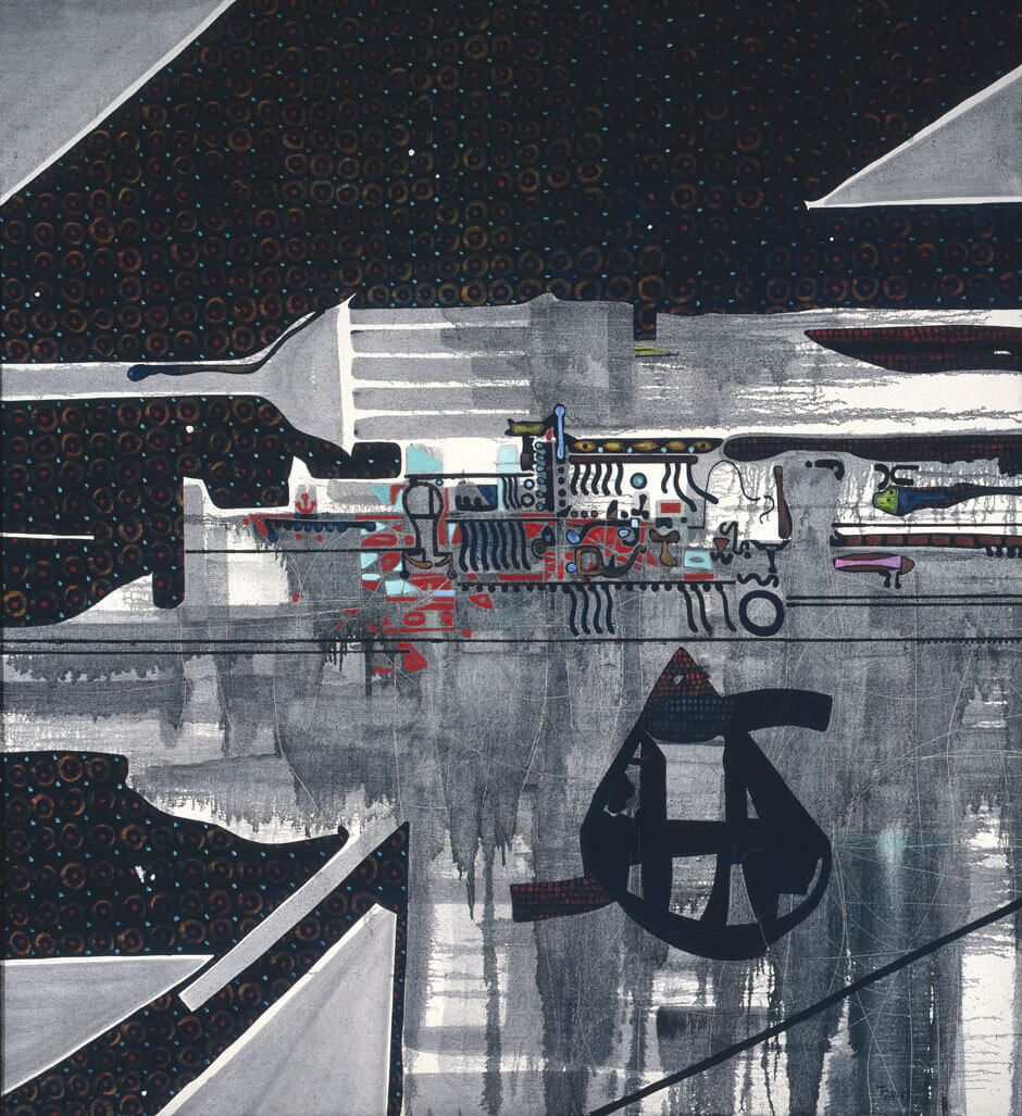
Town’s final series of abstract paintings done in the four years that preceded his death were dedicated to sheer visual pleasure and beauty. These included his Stages, a series of paintings on collaged mat board, and the Edge paintings, a series of monumental abstract canvases. Here again we see two stylistic languages in collision: the undulating horizontal colour stripes that fill the centre create a sensation of oceanic calm as they push to the edges a border of brightly coloured animated graphic shapes.
Town’s practice of working simultaneously in different media and styles was described by his contemporaries as bewildering. In a postmodern world of appropriation and boundary blurring, it simply seems normal. What validated the practice in Town’s eyes was his assimilation of sophisticated artistic traditions that could be used to reflect on his own life experience. What keeps his work fresh today is his witty and critically acute fusion of the art museum in his head with the popular culture of the urban industrial world.
 About the Author
 More Online Art Books
 Acknowledgements