Oscar Cahén became famous for his facility as a draftsman, his innovation in a multitude of media, and his use of vivid colour. As a cartoonist and illustrator, he interpreted hundreds of stories in an ever-changing range of visual languages. In his painting he conveyed monumentality and passion.
European Roots
Oscar Cahén’s formative years were spent in artistic milieux characterized by great diversity of style and approach. In the Dresden of 1932, the German avant-garde turned to the Neue Sachlichkeit movement, which for proponent Otto Dix (1891–1969) meant turning back to Northern Renaissance altarpieces and highly detailed traditional techniques for inspiration. Dix was concerned with social commentary, as were many other German artists of the 1930s, including George Grosz (1893–1959), whose distorted, debauched figures related to Germany’s strong tradition of caricature. At the same time, the lessons of the Bauhaus art school—such as the famous maxim “Less is more!”—influenced what young designers like Cahén were taught.
Cahén’s versatility was further developed in Prague, where émigré artists such as Dadaist John Heartfield (1891–1968) gathered. Artists were encouraged to diversify: graduates of the Rotter School of Advertising Art, where Oscar Cahén worked in 1937, pursued combinations of graphic design, painting, glass, film, children’s book illustration, photography, theatre design, and editorial illustration.
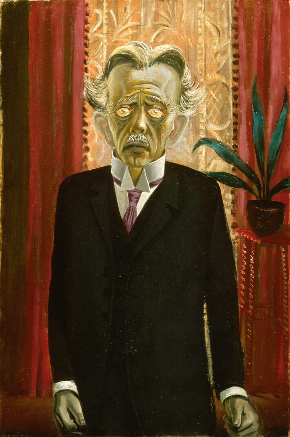
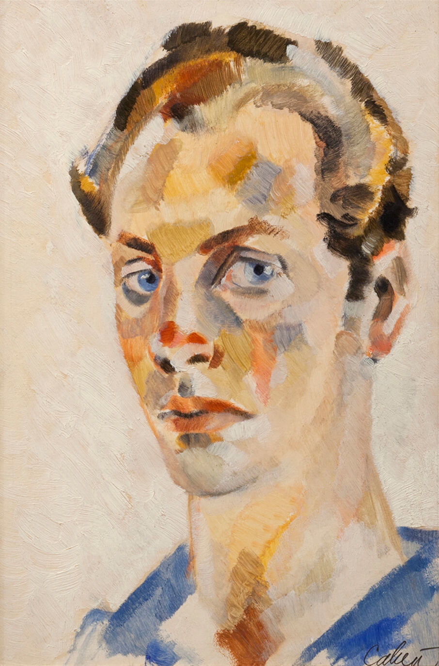
As a young painter Cahén seems to have been more interested in the psychology of portraiture, and in recording contemporary lifestyles and places, than in challenging the definition of “art” or breaking down form. He applied contemporary touches to traditional forms: his early moody-looking self-portrait, conventionally drawn and modelled, shows a proto-Cubist sensibility with Post-Impressionist colour reminiscent of Paul Cézanne (1839–1906). The “meticulously executed” drawings he exhibited alongside his portraits and landscapes portray “the superficial life of the big city . . . lively girls with high hats, stockings, and walking sticks.” In 1940 art historian Otto Demus wrote that Oscar Cahén was difficult to classify because of his “Allerweltstalent”—universal talent—but that “decorative improvisation” was his strength; the “right” Cahén was to be found in jazz band drawings rather than in his “too-smooth portraits.” Cahén was to fight against his prowess at almost slick drawing for the remainder of his career, always looking for more immediate, original ways to express his inner feelings.
Establishing Himself in Canada
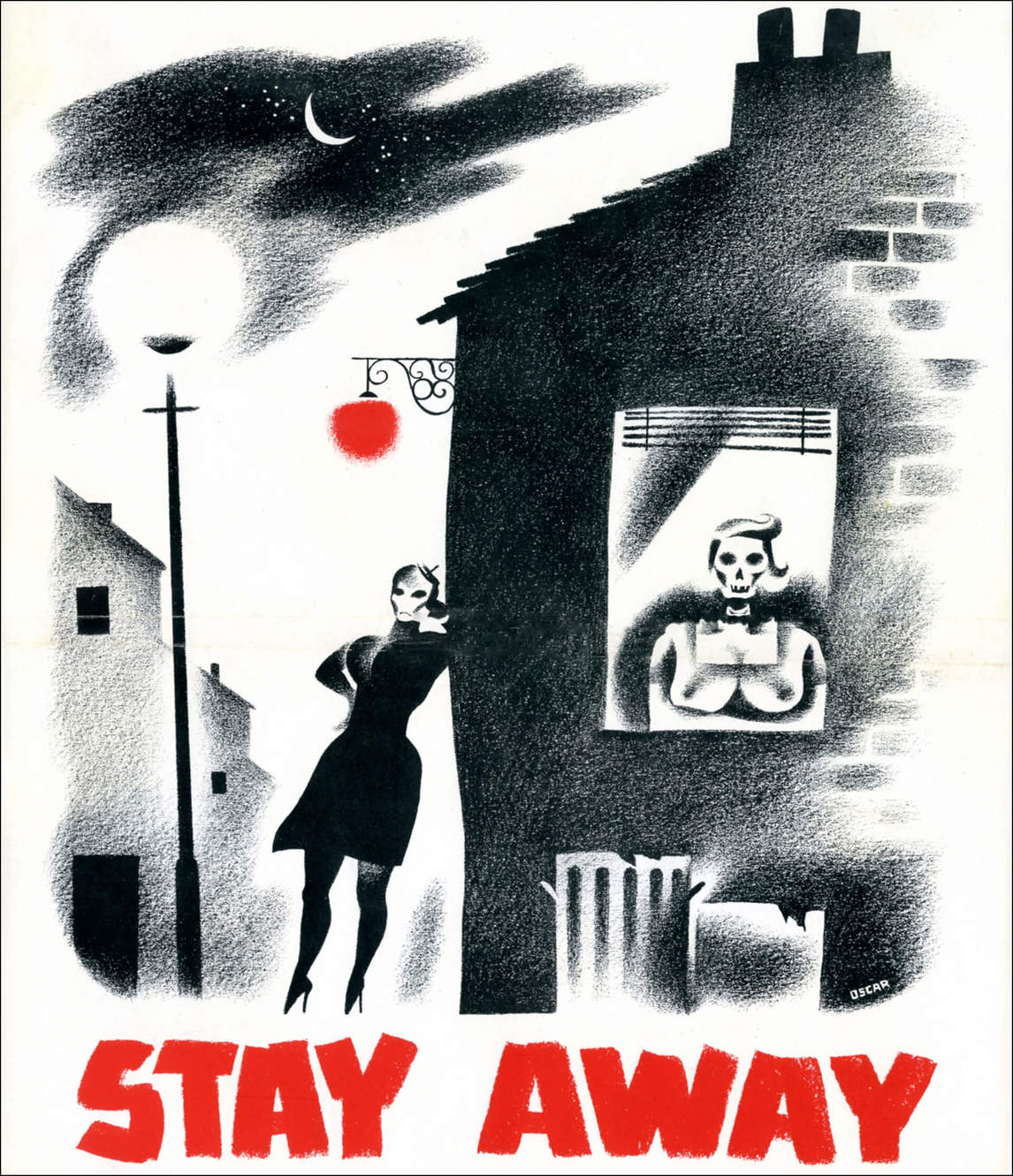
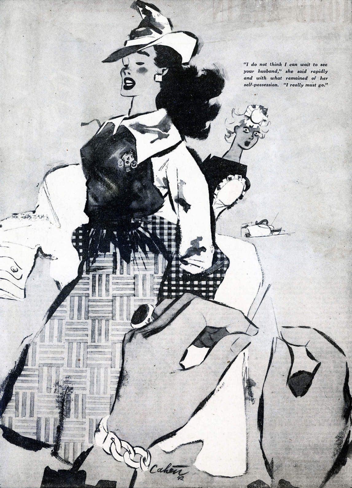
When Oscar Cahén arrived in Canada in 1940, he was already an experienced illustrator with a recognizable style: a kind of cross between fashion illustration and caricature, drawn with a calligraphic painted line. He also used a harsh, high-contrast crayon technique for subjects that warranted an element of horror, such as a poster warning soldiers to stay away from prostitutes, and a funny, cute style for spot illustrations.
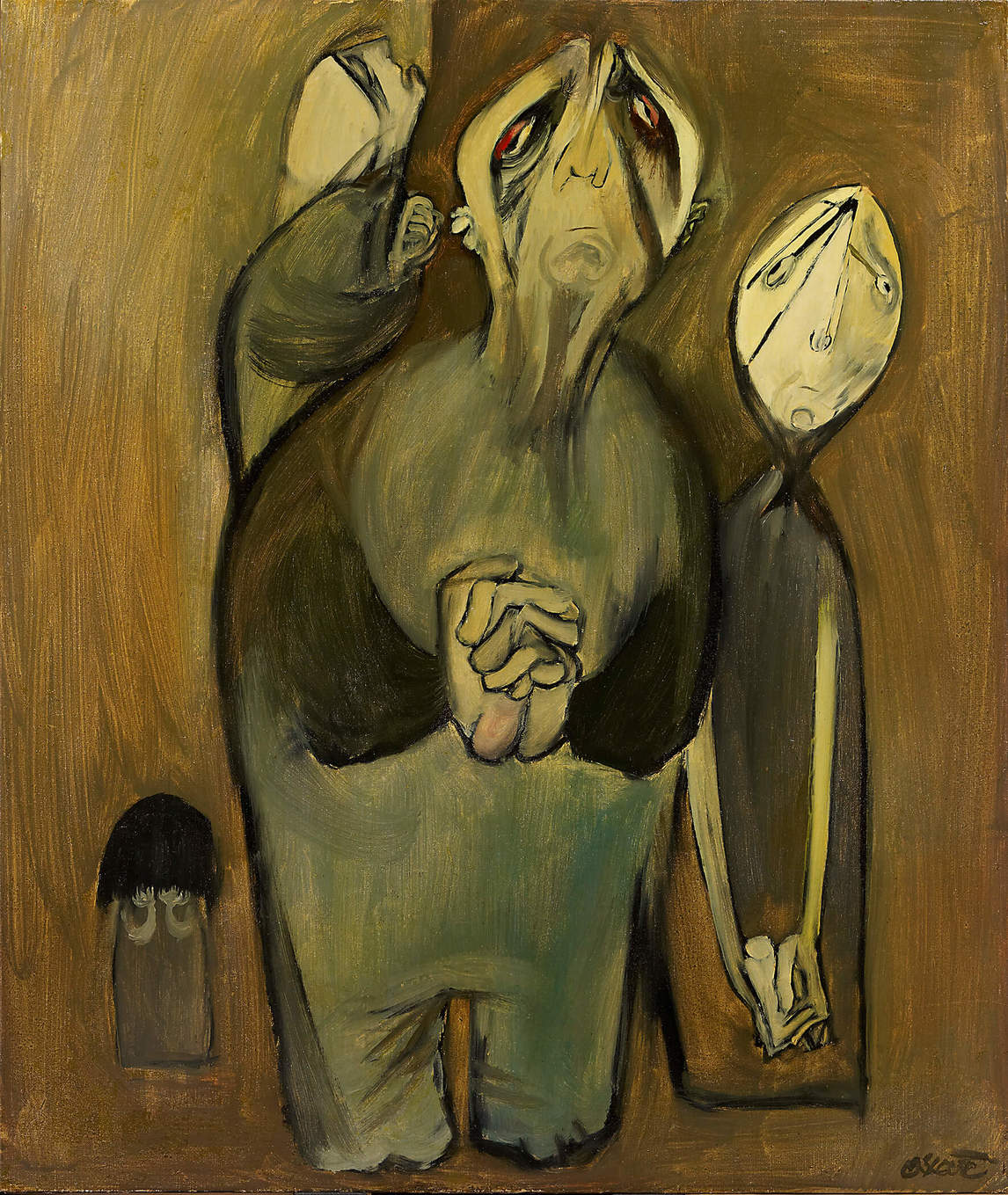
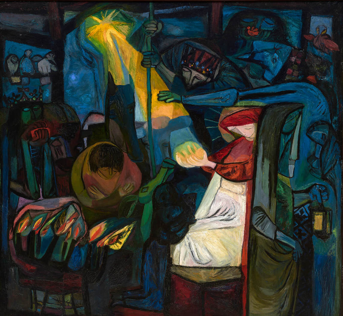
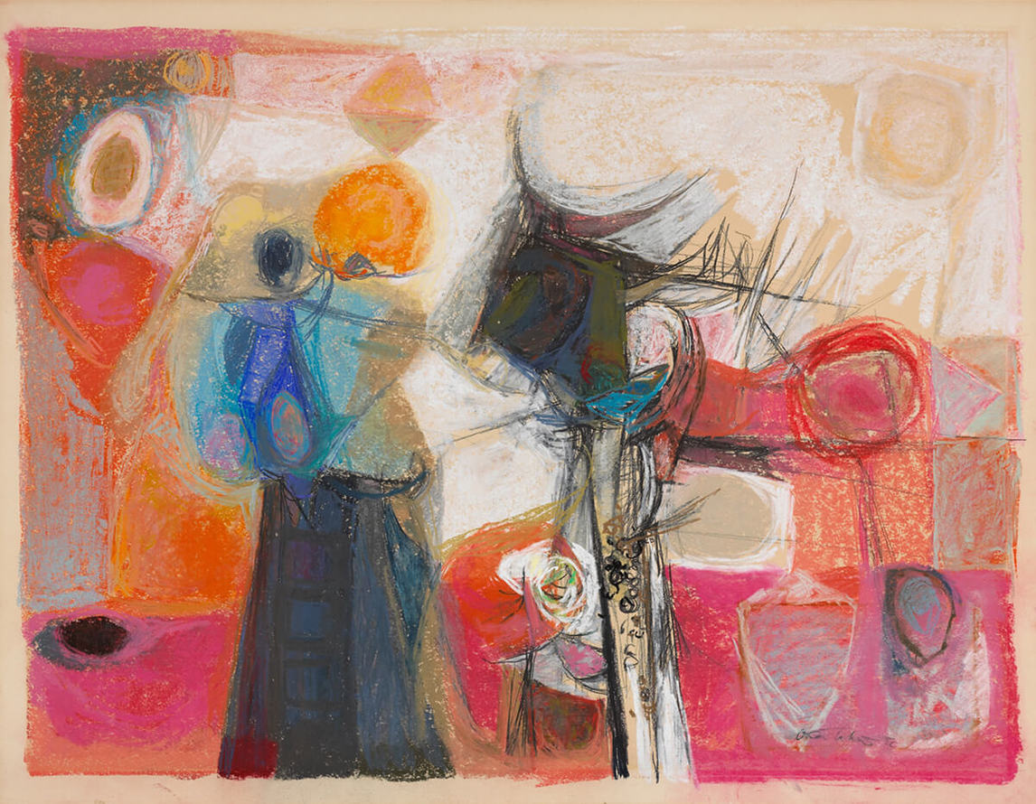
Cahén made a major transition around 1946, when—as in Praying Family, 1948—he began painting canvases portraying people suffering, using thick paint and simplified yet exaggerated body proportions and facial expressions, in dull, depressive colours. He also painted Christian imagery using Cubist and Expressionist qualities and more intense, uplifting colours. In 1949 he made his first abstract works, characterized by unusual colour combinations and an energetic synthesis of intersecting and overlapping shapes and lines. These were executed in oils and in pastels.
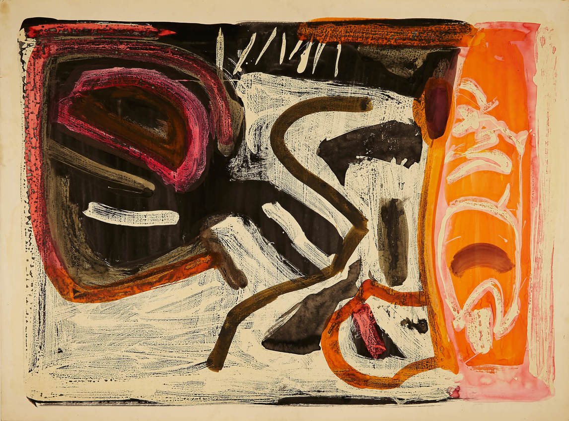
By 1951 he was working in bright aniline dyes on large sheets of paper or canvas, letting the dyes bleed wet into the highly wetted surface, yielding characteristic soft feathering of edges and lines. In 1951 Cahén increased his production, after receiving attention in national newspapers, in Canadian Art magazine, and in the competitive Art Directors Annual. From that point on his works show the hot colour and cohesiveness in composition that made him so influential. By 1955 he was using an increasingly gestural line in his abstract painting, reminiscent of his illustration work, and he sometimes returned to a more sombre palette. He also began a large series of watercolours on paper using rubber cement resist and transparent layers of colour. In other works he turned again to figurative subjects.
Influences
The twentieth century saw an explosion of art movements, which would account for the myriad influences that have been read into Oscar Cahén’s work. Elements of Gothic art, Cubism, Expressionism, Abstract Expressionism, Surrealism, Bauhaus, English modernism, American modernism, caricature, Czech and German illustration, American illustration, and the influence of his fellow Toronto painters can all be plausibly detected in Cahén’s oeuvre. Only a handful of artists, however, are documented as having any connection with Cahén.
In 1935 Cahén and William Pachner (b. 1915) formed a partnership in Prague, Cahén-Pachner Advertising Designs and Painted Posters. Cahén’s illustrations circa 1940 are often dead ringers for Pachner’s: young women with jutting chins and cheekbones and a shadow just under the eyes, skirt hems rippling, rendered in calligraphic outlines heightened with wash. Cahén added flat textured patterns and unusual compositional devices (such as hands in the foreground).
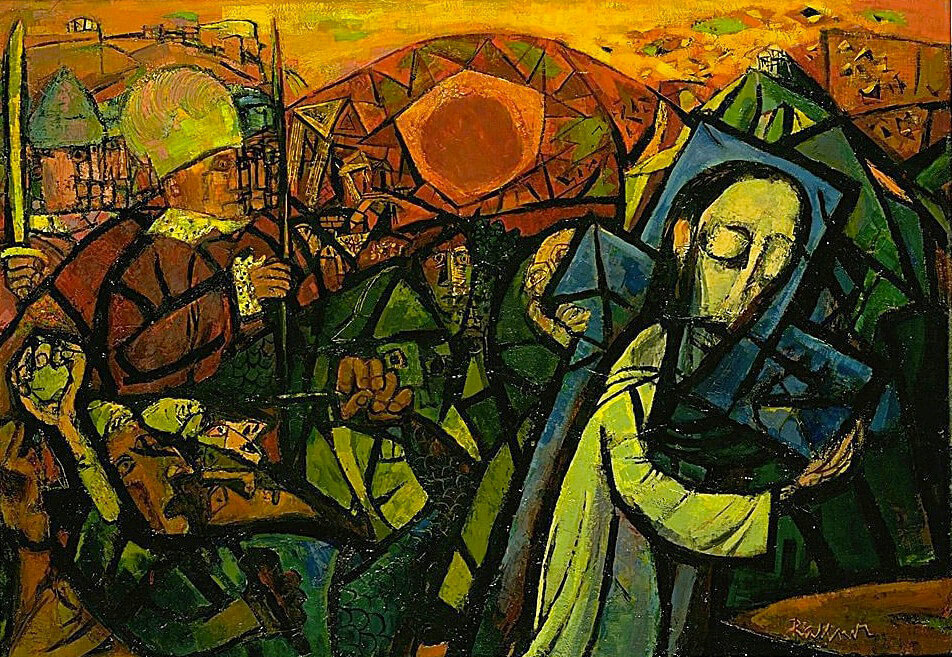
Cahén spoke highly of the French poster designer and painter Henri de Toulouse-Lautrec (1864–1901); the Jewish-American illustrator and anti-Nazi caricaturist Arthur Szyk (1894–1951); David Stone Martin (1913–1992), who designed jazz music record covers with Picassoesque line drawings; and the comic strip artist Milton Caniff (1907–1988). When Cahén began painting religious themes, he looked to Gothic art for inspiration. He also praised Miserere by Georges Rouault (1871–1958), a series of etchings relating to the tragedy of war and the question of faith, produced in 1916–17 and 1920–27 but not published until 1948. Cahén’s Christus, c. 1949–50, shares Rouault’s simplified forms delineated in black, like stained glass.
Special note must also be made of American artists Rico Lebrun (1900–1964), whom Cahén called an “artist of stature,” and Abraham Rattner (1895–1978); both artists made major works on biblical themes. It is to Lebrun that Cahén owes the occasional slumped-over figure seen from the front, drawn in heavy, scratchy lines, its body parts distorted with angst. Cahén first saw Rattner’s work on a visit to the Art Gallery of Toronto (now the Art Gallery of Ontario) with Harold Town (1924–1990), who later recalled that Cahén was hugely impressed. Rattner may have been behind Cahén’s 1949 turn to a Cubist design over an entire canvas and to the use of intense colour, as in The Adoration, 1949, but this remains speculative.
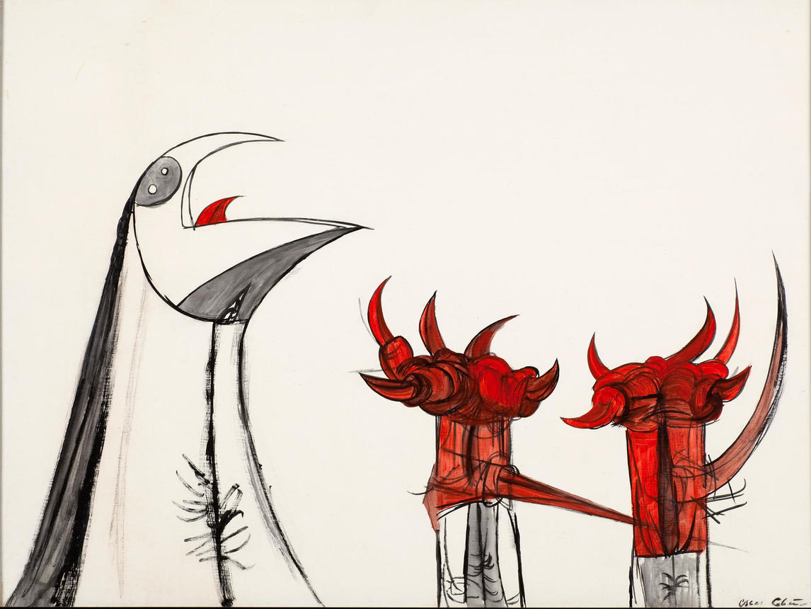
Much has been made of the impact of British modernists on Toronto artists around 1950; Graham Sutherland’s (1903–1980) abstractions of nature using exaggerated thorns have been especially noted. Two postcards of Sutherland images exist in Cahén’s estate; Harold Town claimed that Cahén was “fascinated” by him. Cahen’s Vegetation, 1951, is indeed reminiscent. Sutherland saturated the art of so many Toronto artists that the hook/thorn/crescent became a ubiquitous visual phoneme calling out to those striving to be au courant. Cahén also distilled thorny motifs from his analysis of claws and beaks, as in Untitled (230), 1950–51, but he was no doubt encouraged to keep with them because they resonated so well with peers and supporters. He was, after all, concerned with communicating, and he looked forward to “turning out pictures which will please both me and the public at large.”
Making Illustrations
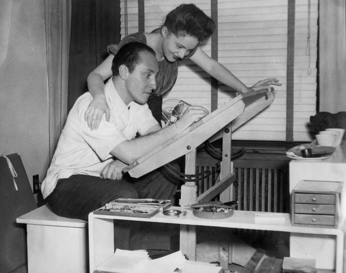
In photographs, we see Oscar Cahén working at a drafting table in one studio for his illustration and at an easel in another studio for oil painting and for making exploratory sketches. Water-based media would have been executed on a flat surface.
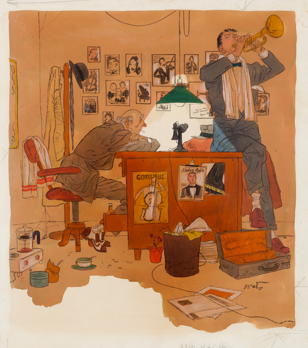
In fiction and non-fiction illustration, the art director discusses with the illustrator what might be depicted and what style would be suitable. Usually the illustrator submits a rough drawing or a detailed comprehensive sketch for approval before executing a polished final. However, Cahén said:
In my illustrations I rarely make such preliminary drawings. In fact, much to the dismay of art directors, my “roughs” are usually so sketchy that I can’t make them out myself. What I do is to start my finished drawing with a hard pencil right on the board, then I ink in the final design and erase the pencil marks which made up the initial draft. Thus, by eliminating first roughs, I feel I am able to retain in the completed illustrations the full quality of the initial enthusiasm. As for media used, I mix my techniques as subject or purpose dictates.
Indeed, Cahén used ink, graphite, pastel, casein, scratchboard, watercolour, wax, dyes, and oils—often several together. He also employed “Bourges sheets”—transparent plastic overlays in process colours (cyan, magenta, yellow, and black) that made it easy and inexpensive to do multi-hued illustrations without the cost that colour-separating full-colour paintings would entail.
Making Fine Art
In contrast to his illustration work, Cahén made sketches before embarking on a painting. He usually stuck to traditional media, such as oil on canvas or Masonite and watercolour, pastel, or ink on paper, though he sometimes painted with aniline dyes. Aniline dye is made from petroleum by-products and came in hues far more vibrant than any other art material of Cahén’s day—even neon pink. Unfortunately, many of these dyes have faded in his works.
Although he may have begun with sketches, Cahén built up his oil paintings in several passes on different days; he even went back into canvases he had formerly considered finished and had already signed—as we can tell by comparing the finished state of Untitled (221), 1953, with how it appears in period photographs of the interior of Cahén’s home.
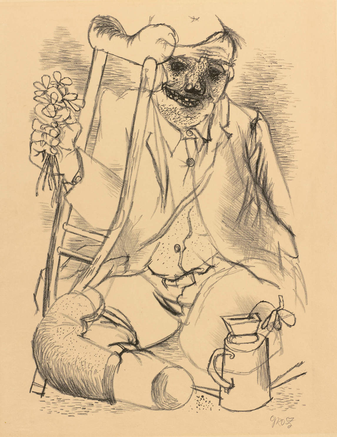
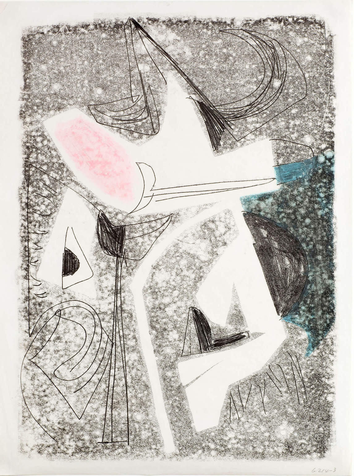
Cahén apparently made few lithographs. He did, however, often ink up a stone, place paper on it lightly, and then rub it and draw on it with a sharp object. When the paper was lifted off, it picked up the ink and the stone’s pleasingly soft, dappled texture. The scored lines came out black. Drawing on the paper with the pointed tool left no visible mark, meaning Cahén could not be exactly sure what he was doing. This exercise would have countered the slick facility that he was ever-wary of slipping into.
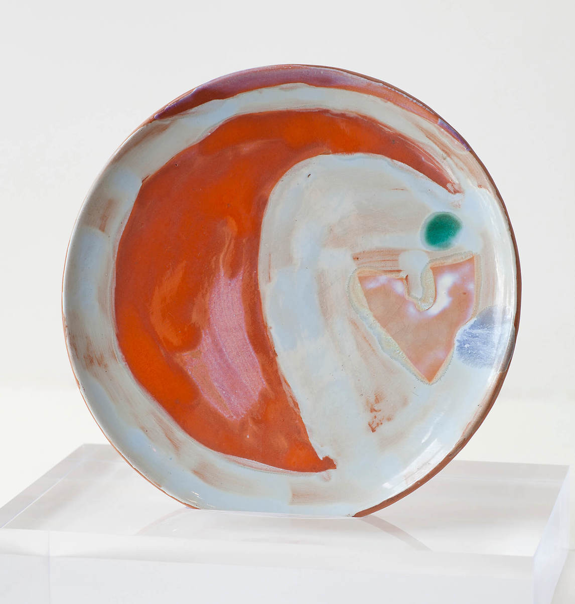
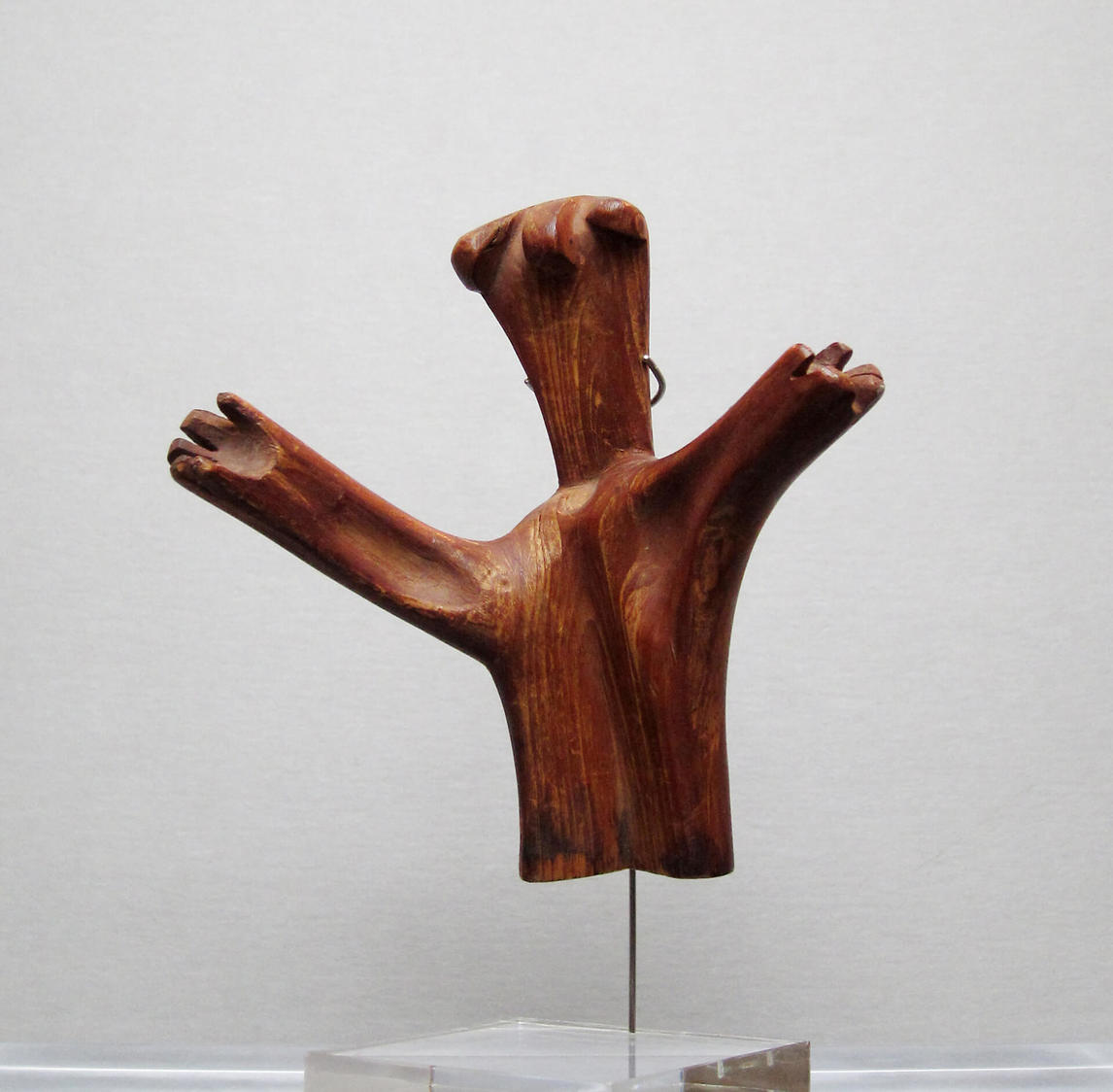
Cahén experimented with ceramics, probably with Blue Mountain Pottery founders Jozo Weider (1907–1971) and Denis Tupy (b. 1929). He glazed a small number of plates with abstract designs and, according to his son, also designed a set of dishes with a blue fish pattern, now lost. Cahén also enjoyed woodcarving; his small figures emote the same keening passions of his paintings circa 1947.
Technical Innovations
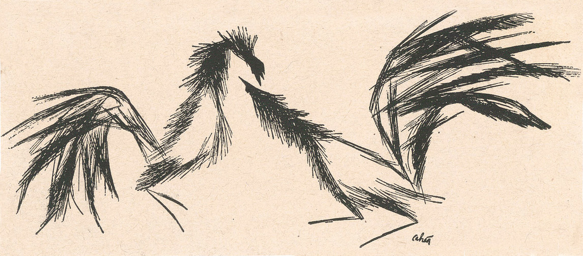
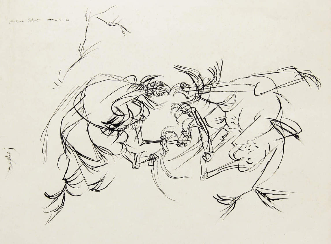
Cahén did most of his technical innovation in illustration before taking it into his self-directed painting. A 1943 spot illustration of two roosters, rendered with a touch of analytic Cubism, anticipates the highly Expressionist Cockfight of 1951. Cahén also first used collage in his commercial work, papering the background of a domestic scene with newspaper in one picture, sticking a real postage stamp onto a letter in another.
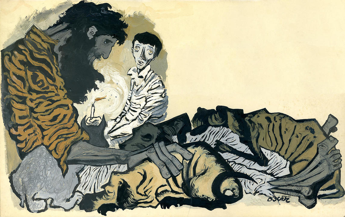
One of his most noticeably different illustration styles was used for “The Californian’s Tale,” exaggerating the figures’ bony limbs and giving them oversized feet and hands, practically sculpting them in heavily applied paint contained by rugged black outlines recalling Gothic art and Expressionism.
Perhaps Cahen’s most original contribution was a technique he called “monoetching,” which he began using around 1950 for both figurative and abstract works. The result was not actually an etching—a print made from a metal plate with the image eaten into it with acid—but it looked like one. The monoetching was in fact a thin layer of wax on illustration board that Cahén then scratched through with a needle. Water-based pigment applied overtop seeped through the scratches into the exposed board beneath.

Monoetching carried with it an element of uncertainty because, until the final pigment wash was applied, it was almost impossible to see whether the wax had covered all areas, or whether the scratches had gone too deep or too shallow. Indeed, it would have been difficult for Cahén to even see what he was drawing. This may account for the spidery hand and missing lines of the woman’s shoulder and head in We Don’t Understand Our DPs, 1951. But the awkwardness of the draftsmanship in wax gave emotional meaning to these wraithlike, alienated refugees. In a depiction of the Crucifixion, c. 1950, Cahén used the monoetching to advantage when he literally gouged out the illustration board and filled it with red paint to represent the wound in Christ’s side.
Cahén continued exploiting water-resist approaches with rubber cement after 1953. Taking advantage of the medium’s fluidity, he drooled and drizzled abstract forms onto paper, then painted over them with thin watercolours and inks, layer after transparent layer. Again, he would not have been able to see exactly how the image was turning out until he removed the rubber cement. The element of surprise preserved spontaneity and again provided Cahén with a way of disrupting his facility at painting and drawing, allowing him to break through to new visual languages.
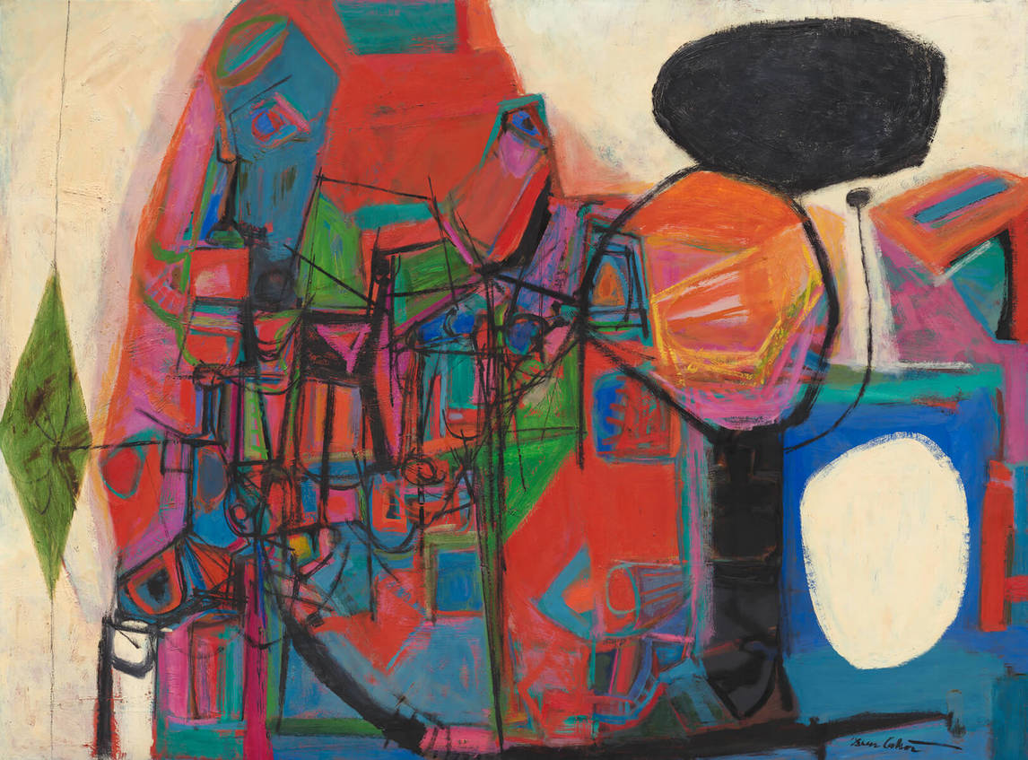
Probably more than any other of his talents, Cahén is best remembered today for his luminous colour sense. Orange and pink come together often; fiery reds and limpid blues and greens characterize some of his best-known works. At Cahén’s 1954 solo show at Hart House in Toronto, critic Hugh Thomson said, “As soon as you enter, the colors and startling designs come out at you from the wall.” Another described his colour as a “battering ram.”
Oscar Cahén was unusual in his ability to move from one medium to another and from representational to abstract idioms with equal success. For instance, he often illustrated beloved automobiles with elegant curves, staying true to their make and model—but when painting his own Austin-Healey, he began sketching in pencil the fan, pistons, and other elements of its engine that, by the time he moved to oils, became an exuberantly coloured concatenation of forms synesthetically conveying sound. Although he was quick to absorb myriad sources and could initially seem derivative when embarking on a new path, he rapidly amalgamated each influence into expressions of his own and became innovative. As a result, his work never became stale, and he was often a trendsetter. As critic Robert Fulford surmised, “If any one man can be given credit for the vitality of Toronto art in the 1950s, the man is Oscar Cahén.”
 About the Author
 More Online Art Books
 Acknowledgements