Arnaud Maggs had a broad range of artistic influences from the histories of photography, art history, and mid-century graphic design. Known for his disciplined, rigorous approach to image making, he shaped his visual and conceptual languages over decades of creative practice in commercial art. “He never abandoned his design principles or knowledge or understanding,” curator Ann Thomas maintains. “He just brought it into his new creative sphere.”
Design Influences
Maggs worked as a graphic designer in the mid-twentieth century, when design was heavily influenced by European modernism and the profession itself was being further defined. The visual and conceptual underpinnings of art movements such as Dada, De Stijl, and Constructivism informed twentieth-century developments in graphic design. The Bauhaus, which sought to integrate art and life, was particularly critical when Maggs came of age as a designer.
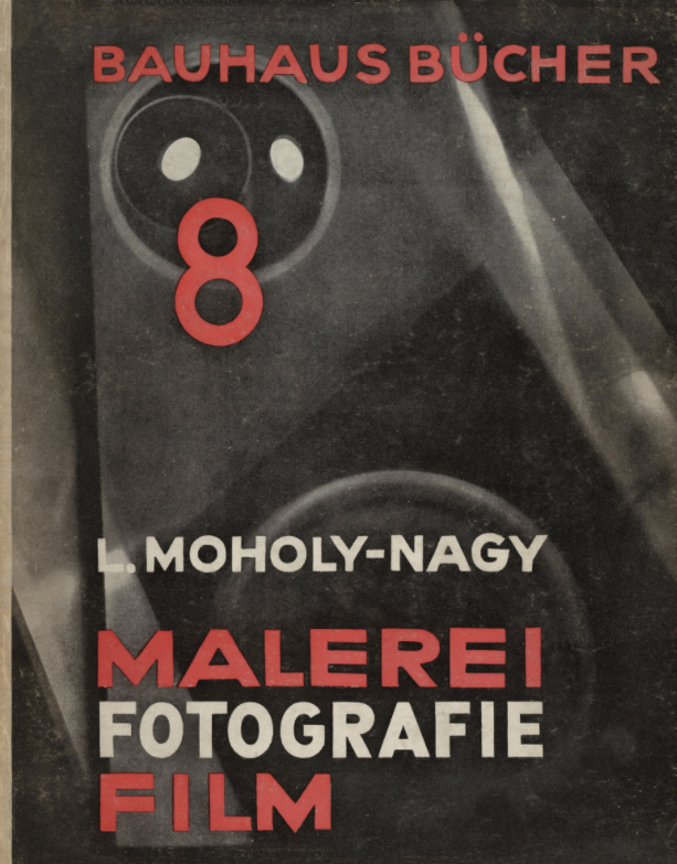
Bauhaus teachers, including Josef Albers (1888–1976), Wassily Kandinsky (1866–1944), Paul Klee (1879–1940), and Lázsló Moholy-Nagy (1895–1946), rejected representational imagery and pursued abstraction. Moholy-Nagy insisted that typography and photography were fundamental to modern visual literacy and communication. El Lissitzky (1890–1941), whose work informed Constructivism and the Bauhaus, was of particular interest to Maggs. “Everything [Maggs] did,” asserts Ann Thomas, “had some connection to that structured way of thinking about art.”
The influx of émigrés cemented the European influence on modern graphic design in the United States. Albers and Moholy-Nagy were among many artists and designers who went to the United States to escape Nazi Germany. Both brought their ideas to new teaching posts—Albers at the experimental Black Mountain College in North Carolina, and Moholy-Nagy at the New Bauhaus (now the Institute of Design) in Chicago—joining others who were beginning to frame a context for graphic design education in American schools. Informed by Moholy-Nagy and Jan Tschichold (1902–1974), Canadian designer and typographer Carl Dair (1912–1967) helped to shape graphic design in Canada from the late 1940s until his death. His teachings were central to Maggs’s early development as a graphic designer.
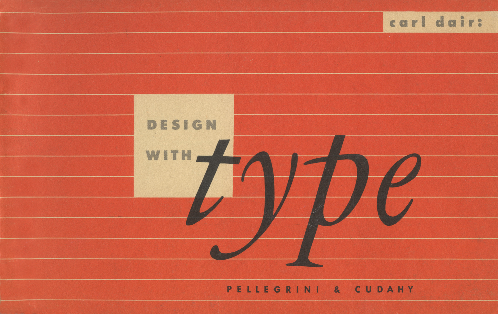
Dair’s first book, Design with Type (1952), lays the groundwork for effective typographic design and the importance of contrast. It asserts that the organization of diverse elements into a visual unit is fundamental to typographic design—and design more broadly. This publication developed in part out of talks Dair delivered at the Montreal Museum of Fine Arts and l’École des Beaux-Arts. Maggs attended the lectures, absorbing key lessons about contrast, structure, and space. Indeed, establishing a “visual unit,” to borrow Dair’s term, was a structural and spatial strategy Maggs would employ as both a designer and an artist. In addition to influencing Maggs’s understanding of form and structure, Dair’s classes introduced him to the work of American practitioners, including graphic designer, illustrator, and writer Jerome Snyder (1916–1976).
Snyder designed album covers and his illustrations appeared in leading American magazines, including Fortune. Characterized by a playful energy and sense of humour, Snyder’s work inspired Maggs. “I would take things out of his drawings and try to disguise them so people wouldn’t know where I had gotten the influence!” he admitted. Like Snyder, Maggs worked as an illustrator and designer. Although his work for IBM in the 1960s demonstrates the visual economy of the grid-based Swiss International Style that came to prominence in the 1950s, it fits within the context of American illustrative graphic design like Snyder’s, which reacted against the rigidity of the International Style. Maggs’s design work was frequently playful, energetic, and characterized by the use of illustration and hand lettering.
As designer Barry Zaid (b.1938) explains, there were “a number of illustrators who—like Push Pin—also worked with lettering,” and in Toronto, Arnaud Maggs and Theo Dimson (1930–2012) “were tops in that area at the time,” with Dimson’s approach being refined and Maggs’s mischievous. Push Pin Studios, founded in 1954 by Seymour Chwast (b.1931), Milton Glaser (1929–2020), Reynold Ruffins (1930–2021), and Edward Sorel (b.1929), was a hugely influential design and illustration studio in New York with an international reputation and many admirers and copiers. Though it formed the same year Maggs left New York, the influence can still be seen in his work. Several of Maggs’s Toronto colleagues headed south to work at Push Pin in the 1960s, including Hedda and Doug Johnson, for example, and Zaid, who went there following a brief stint at Art Associates when Maggs was art director.
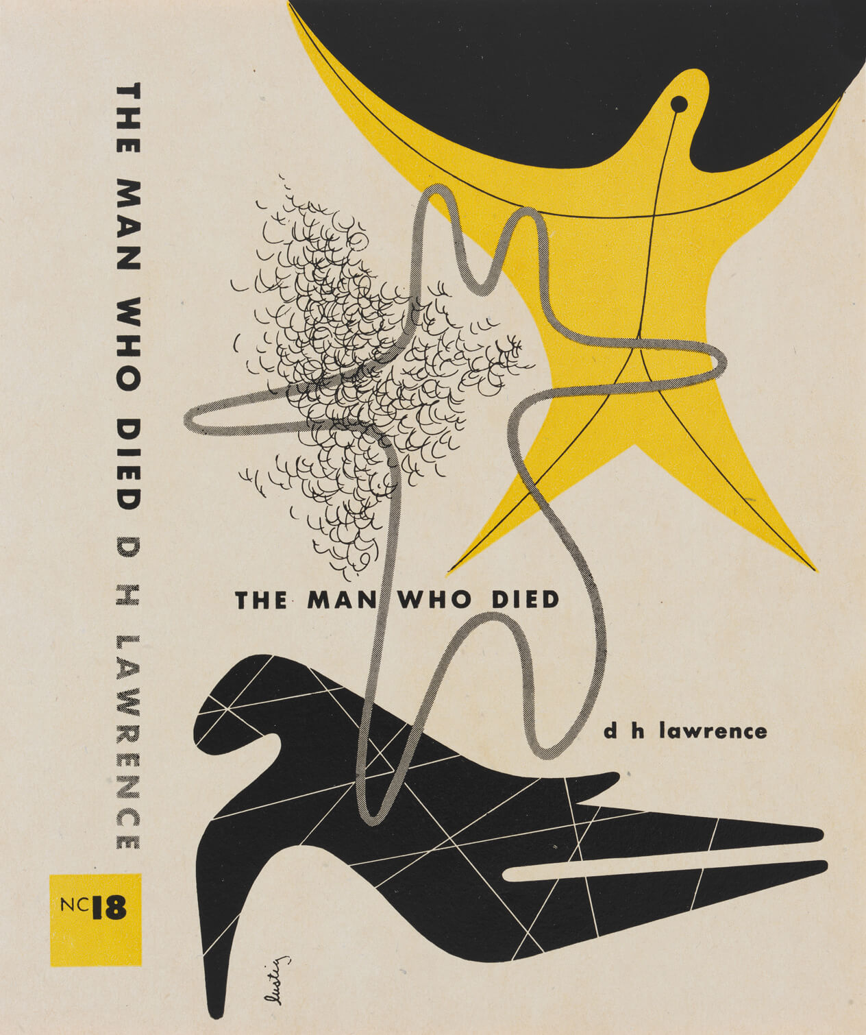
The approaches of many American mid-century designers were similarly defined by illustrative eclecticism, including that of Alvin Lustig (1915–1955), whose ideas impressed Maggs. Lustig’s inspiring talk at the Montreal Art Directors Club in 1951 compelled Maggs to move to New York and truly commit to creative work. Known equally for his practice and as a champion of the graphic design profession, Lustig expounded the interconnections between design and painting―and the aesthetic influence of abstract artists such as Joan Míro (1893–1983) and Klee are undisguised in many of his designs. Maggs also named Míro as an inspiration, alongside other painters such as Pablo Picasso (1881–1973), Klee, Arshile Gorky (1904–1948), and Willem De Kooning (1904–1997), and he cited Fantastic Art, Dada & Surrealism (1936), a book published by the Museum of Modern Art, as an important influence. “The book even smelt surrealistic,” wrote Maggs.
Lustig’s philosophies on design and life had an enduring and important impact on Maggs’s career as it evolved from commercial to fine art practice. In his writing, Lustig addressed the differences between the applied and the fine arts. “The basic difference between the graphic designer and the painter or sculptor,” Lustig stated, “is his search for the ‘public’ rather than the ‘private’ symbol.” Further, he insisted, “it is this tragic split between the public and private experience that makes both our society and our art fragmentary and incomplete.” In addition to a significant and influential body of work, it is his insistence—inspired by the Bauhaus—on integrating art and life through design that contributes to Lustig’s legacy and his influence on Maggs. His dedication to shaping design as a profession with mutable boundaries perhaps also contributed to Maggs’s comfort in moving from one discipline to another.
Inspiration from Art
Maggs’s ideas were directly shaped and informed by the work of other artists, which often contributed to pivotal moments in his own work. Additionally, his notebooks and interviews reveal a range of inspirations, and several of Maggs’s artworks establish a dialogue with historical references.
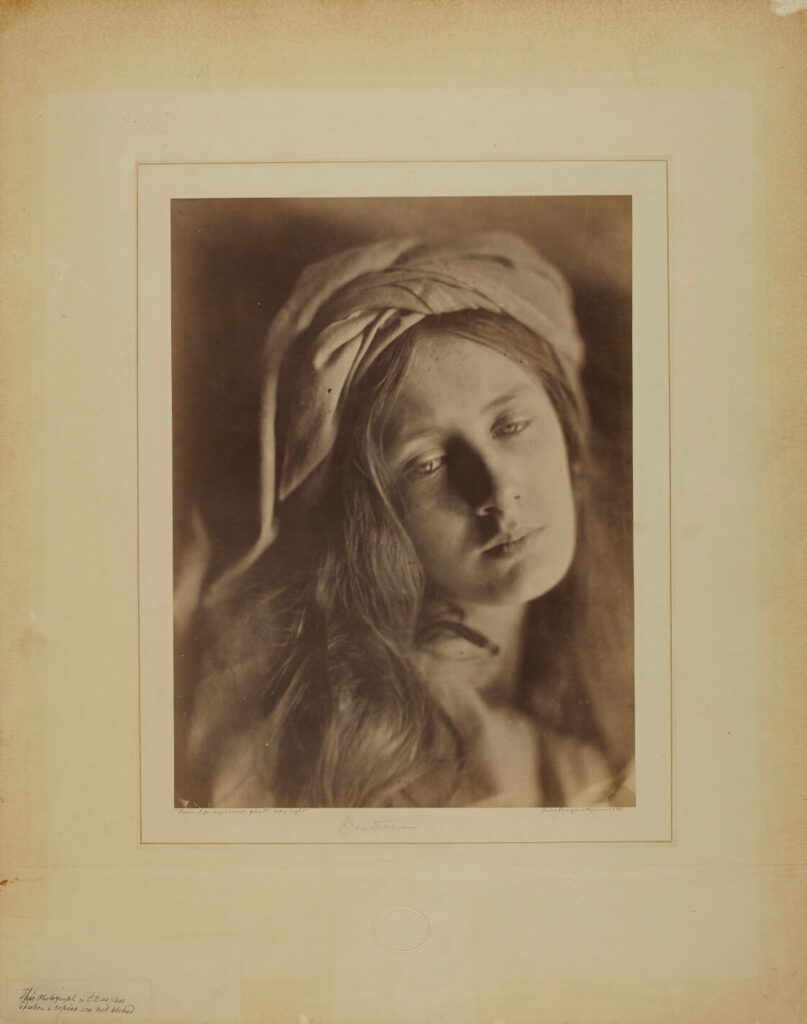
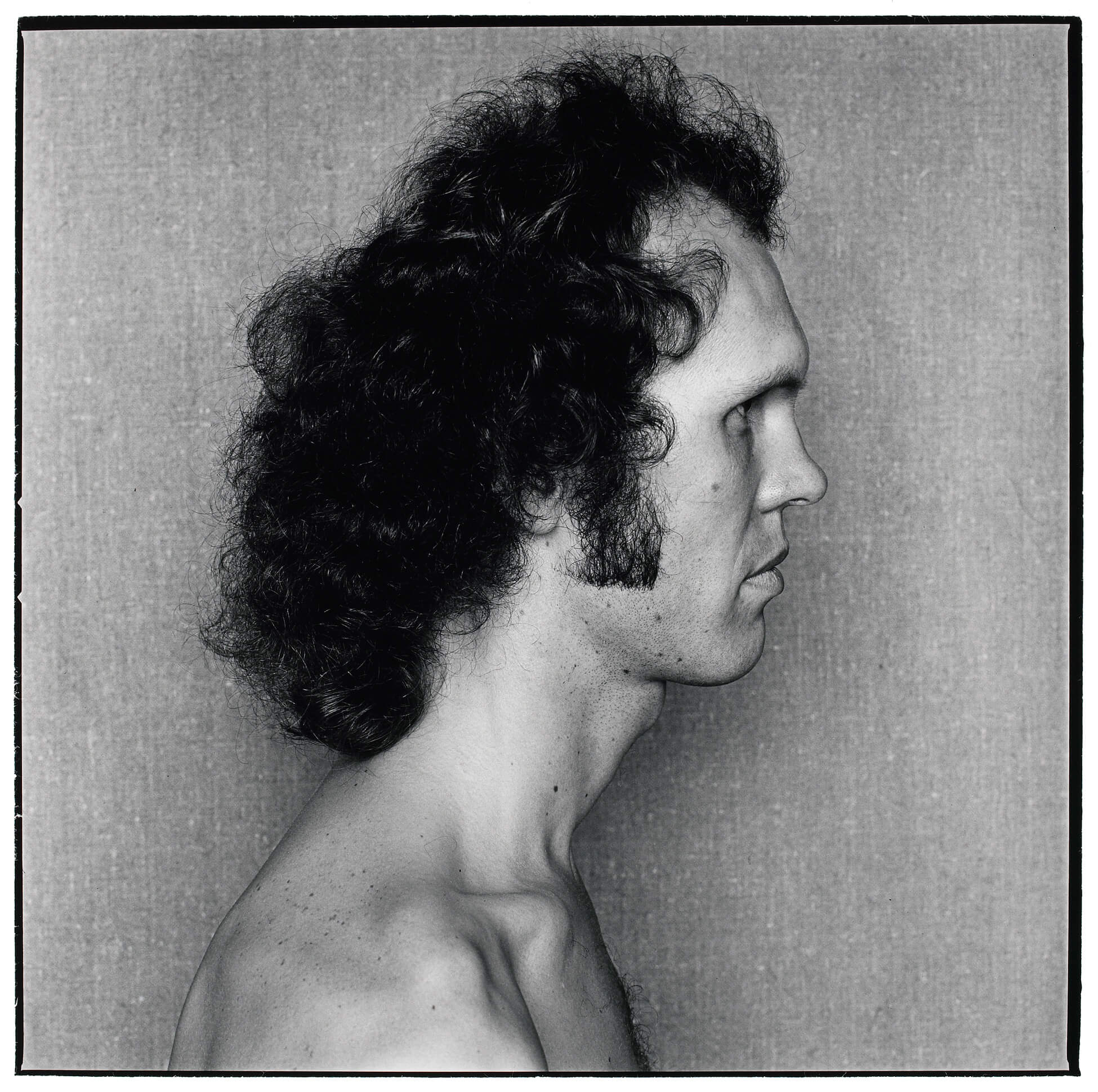
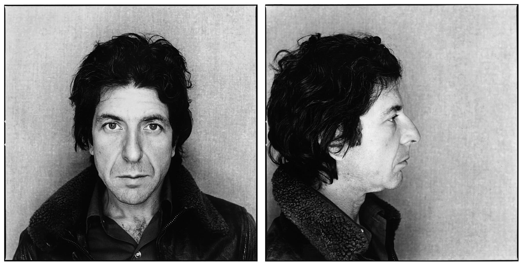
Of particular importance to the artistic development of his photography were his early lighting explorations. Maggs’s first experiments as an art photographer were inspired by the soft, sculptural portraits of nineteenth-century photographers such as Julia Margaret Cameron (1815–1879). “I really liked very much the sort of Victorian north light side light on the face because it’s very sculptural,” he explained. His goal, however, was to emphasize the two-dimensional shape of the human head, rather than its three-dimensional form. “For me it wasn’t working because it looked a bit too beautiful. It didn’t bring out the asymmetrical properties of the face, which is what I wanted to see.” Uninterested in flattery, he pursued a graphic approach instead.
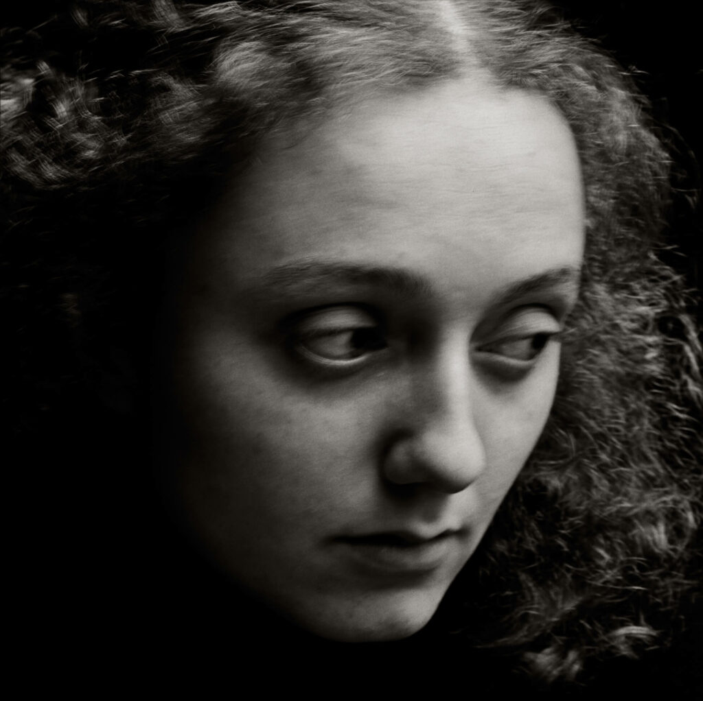
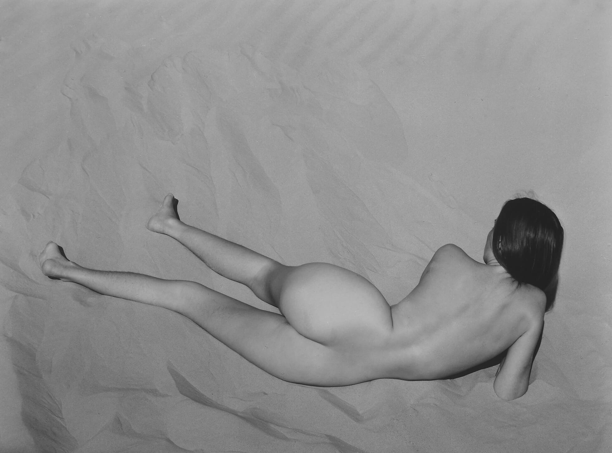
Maggs found his solution in axis lighting, which was inspired by the work of Edward Weston (1886–1958). This method put the light source behind the camera and emphasized the outline of subjects. In Weston’s Nude on Sand, Oceano,1936, Maggs told critic Robert Enright, “there is almost a black edge around her body.” Although the dark outline is not as dramatic in his own work, as seen in this example from 64 Portrait Studies, 1976–78, axis lighting afforded the matter-of-fact appearance Maggs was looking for. The outline has a flattening effect, allowing him to emphasize the shape of the human head, including its asymmetries. It was an important discovery, and it guided his approach to lighting for the rest of his career. “Everything I have done since, except for ‘After Nadar,’ has used that lighting,” he told Enright.
The graphic appearance of his work is further amplified by his approach to making prints. The visual efficiency of images by Irving Penn (1917–2009) and Richard Avedon (1923–2004)—their spare backdrops, emphasis on close-ups, and high-contrast images—was an inspiration to Maggs. His assistant Katiuska Doleatto suggests that Avedon’s work in particular informed his approach to printing. “Arnaud really loved Avedon’s work,” she explains, noting that, like Avedon, he preferred punchy, high-contrast prints, “but it was important that there be detail. . . . You still need the texture of the hair to show through.” In 1988, when Maggs was exploring number- and letterforms, he created Spine, a high-contrast Xerox homage of sorts featuring the spine of Avedon’s book collaboration with art director Alexey Brodovitch and writer Truman Capote: Observations (1959).
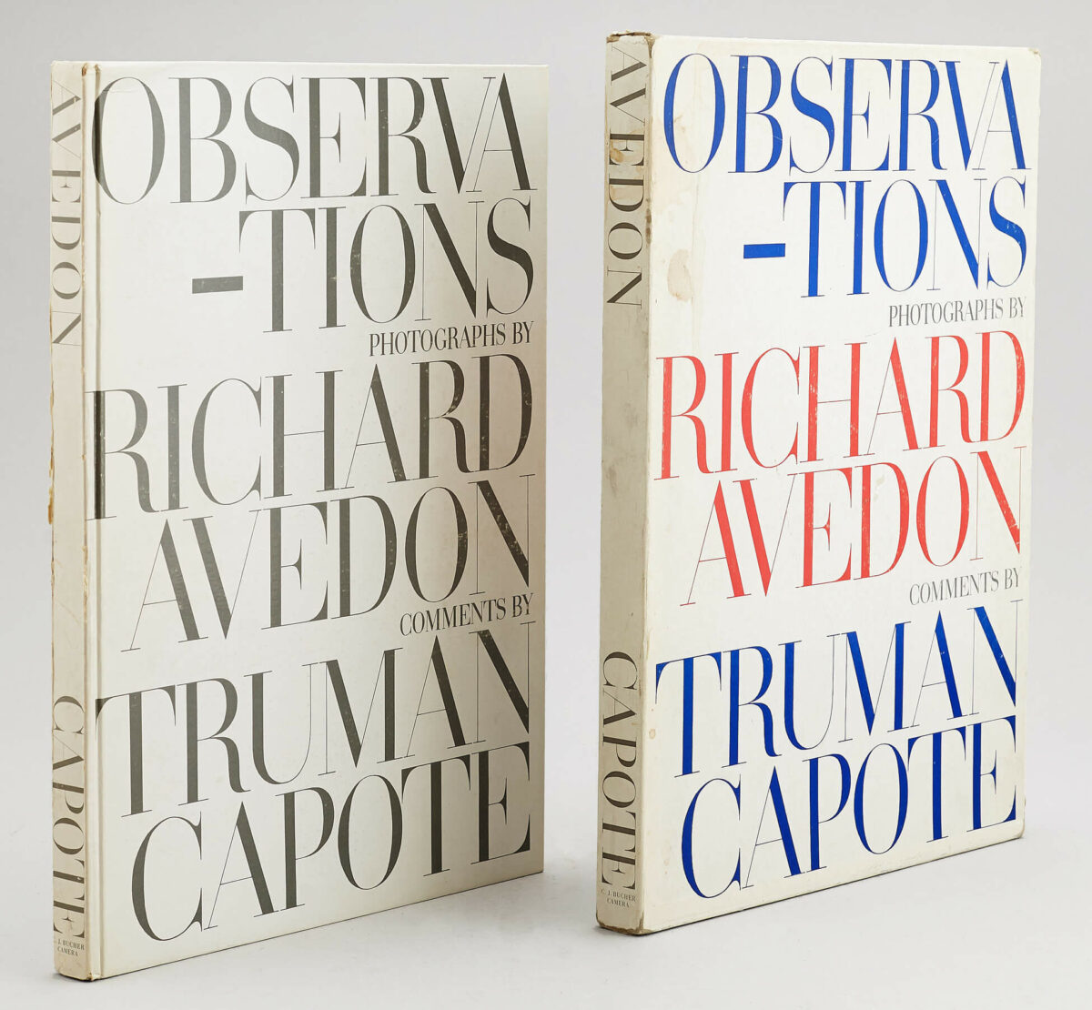
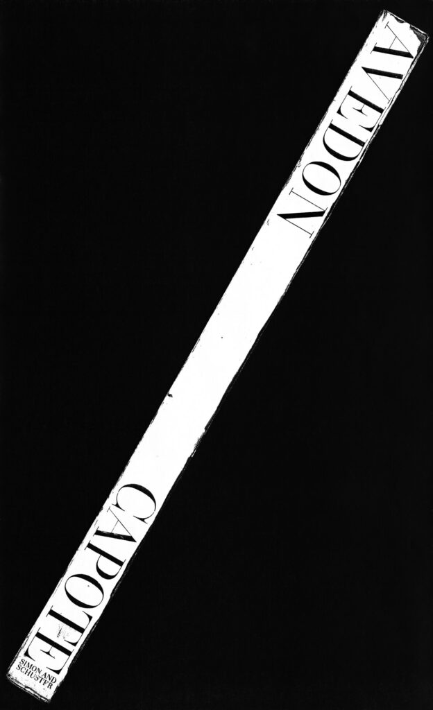
Penn and Avedon both straddled the line between commercial photography and art, attaining museum status in the 1960s and 1970s. Observing that it was predominantly their portraiture, rather than their commercial advertising and fashion work, that garnered attention from curators, Philip Monk suggests they served as examples for Maggs as he contemplated an art career.
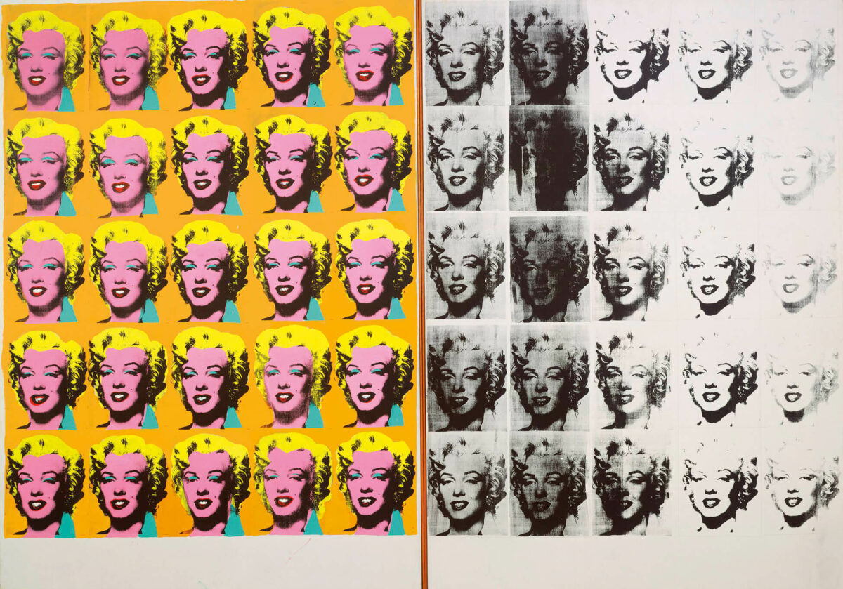
There are also several parallels between the career of Andy Warhol (1928–1987) and that of Maggs. The two were working in commercial art at the same time, when Maggs was in New York, and there were overlaps in their professional circles. However, as Maggs later noted, they were at different stages. Maggs was a young, ambitious designer, keen to earn a living. Warhol, by contrast, was more firmly established in the commercial realm and was making moves in the direction of art. “Andy wasn’t struggling in the same way. In some circles he was regarded as the artist of the moment,” Maggs explained. “If he was struggling, it was to become the artist he eventually became. I was just beginning. I was struggling to survive.” Nevertheless, Warhol continued to be an important influence.
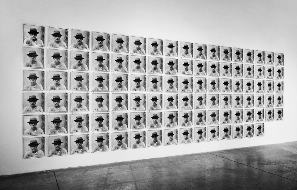
Many have pointed to affinities between the formal characteristics of Maggs’s work and the grids and seriality of Warhol and the minimalist sensibilities of Sol LeWitt (1928–2007) and Carl Andre (b.1935). The multiplicity and repetition that defined Warhol’s silkscreened portraits, for example, shaped Maggs’s ideas about structure and format both conceptually and formally. Declaring Warhol his favourite artist, Maggs asserted, “He would show a grid, repeating the same image with variations caused by either too much or too little ink in the silkscreen. I would show a grid, which would appear to be the same image but which would actually be very similar portraits of the same subject.”
Akin to designer Alvin Lustig’s influence, Warhol’s impact on Maggs’s conception of what it is to be an artist was also significant. Allied with the languages and strategies of advertising and popular culture, Warhol’s practice was defined as much by his persona as by the work itself. Though Maggs was not intent upon establishing a persona, he understood the value of storytelling in shaping views about his work, particularly as he sought to move away from commercial work and establish himself as a serious artist. As his portraits of artists such as Joseph Beuys (1921–1986) and André Kertész (1894–1985) attest, Maggs also shared with Warhol interests in celebrity and collaboration.
Systems and Procedures
Maggs established systems and procedures for the conception, making, naming, and display of his artworks. His approach was a synthesis of modernist design strategies, photographic studio practice, and the languages of Minimalism and Conceptual art.
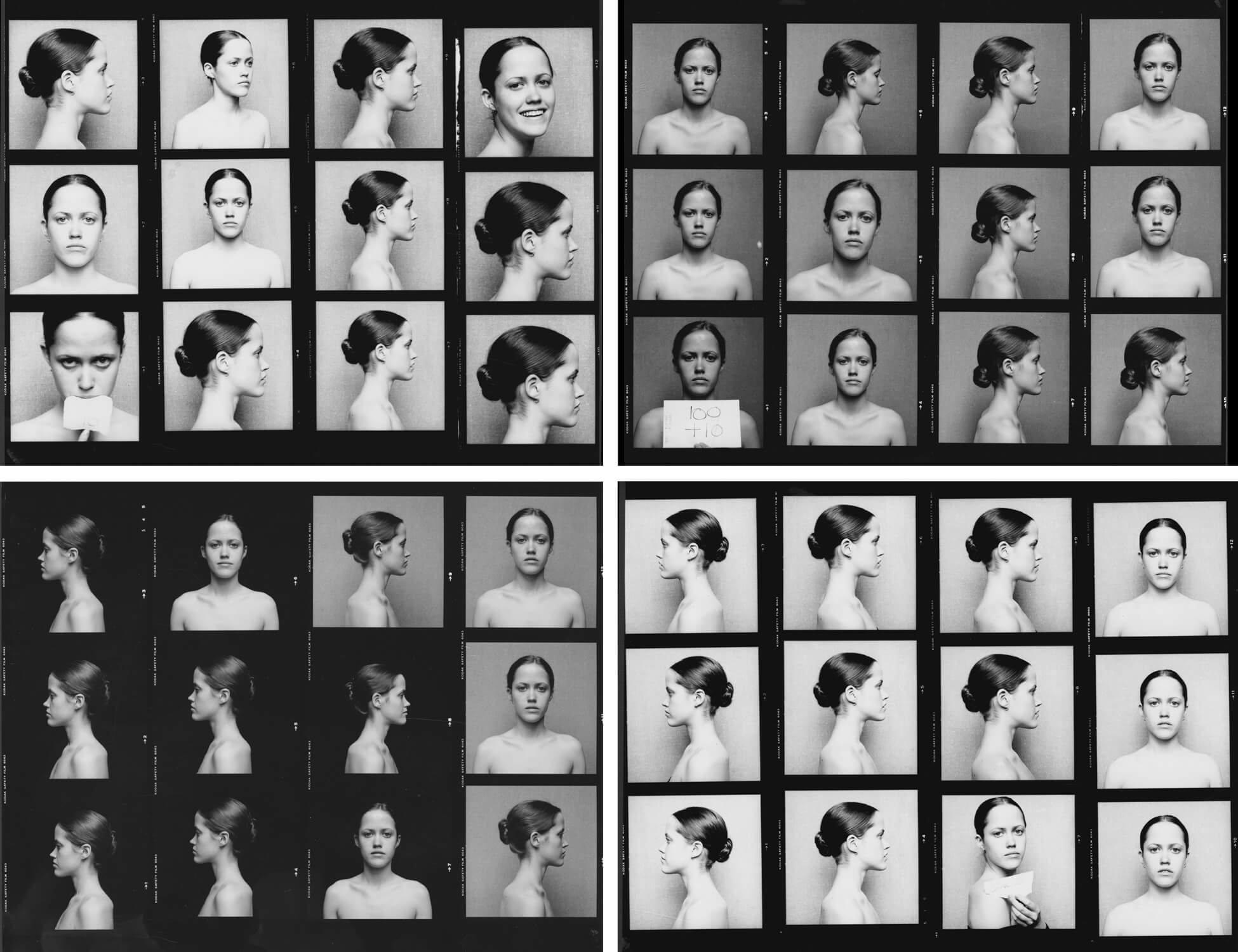
As a commercial photographer, Maggs would take many images and final selections would be made upon reviewing negatives or contact sheets. As an artist, he started out working much the same way. Contact sheets for Maggs’s 64 Portrait Studies, 1976–78, reveal experimentation with variables. For example, his daughter, Caitlan Maggs, is photographed against both light and dark backgrounds, in different poses. From a large number of exposures, he edited down his final selections with an eye to achieving a consistent, neutral look for the collection of sixty-four portraits as a whole.
Not all of Maggs’s artworks have a specific number of exposures in their title, but many do. The strategy is in keeping with the self-referential and instructional naming conventions of artists associated with Minimalism and Conceptual art. The title of the first conceptual photobook by Ed Ruscha (b.1937), Twentysix Gasoline Stations (1963), for example, announces the total number of images that comprise the work. Likewise, the number of portraits that make up Maggs’s 64 Portrait Studies is stated in the title. Although the total number of photographs in this work was design-driven, subsequent pieces relied on a more rigorous system related to the number of exposures.
It was a 1979 photoshoot at Restaurant Ledoyen in Paris that sparked Maggs’s procedural approach. Time constraints forced him to adapt his plans. He scaled down his intentions according to the number of chefs in relation to the number of exposures on a roll of film. Maggs typically used two cameras: when shooting on 35mm film, he used a Nikon F2 without a built-in light meter; when using 120 film—as he did for the Ledoyen chefs—Maggs photographed with a Hasselblad 500C. Square-format images would allow twelve exposures per roll of 120 film. This approach informed ensuing projects, including Kunstakademie, 1980, which Maggs planned in advance, allotting two sitters per roll of film and shooting six frames for each.
-
Arnaud Maggs, Ledoyen Series, Working Notes, 1979
20 gelatin silver contact prints, 40.3 x 40.3 cm
Installed at YYZ Artists’ Outlet, Toronto, in 1979, photographer unknown -
Arnaud Maggs, Ledoyen, Paris (1 of 2), detail of contact sheet, August 1979
Gelatin silver negatives, 6 cm (each negative)
Library and Archives Canada, Ottawa -
Arnaud Maggs, Kunstakademie, 1980
Gelatin silver contact prints, 83 x 233 cm
The Estate of Arnaud Maggs
-
Arnaud Maggs, Kunstakademie (detail 128), 1980
Gelatin silver print, 40.3 x 40.3 cm
The Estate of Arnaud Maggs -
Arnaud Maggs, Kunstakademie (detail 131), 1980
Gelatin silver print, 40.3 x 40.3 cm
The Estate of Arnaud Maggs -
Arnaud Maggs, Kunstakademie (detail 415), 1980
Gelatin silver print, 40.3 x 40.3 cm
The Estate of Arnaud Maggs -
Arnaud Maggs, Kunstakademie (detail 417), 1980
Gelatin silver print, 40.3 x 40.3 cm
The Estate of Arnaud Maggs
Ledoyen Series, Working Notes also pushed Maggs to see the contact sheet as fundamental to the artwork. The series was mounted in 1979 in a solo exhibition at YYZ, an artist-run gallery in Toronto. It was the first work that Maggs exhibited in the contact sheet format―an important choice. The presentation not only declared the significance of his process, but also modified it. The contacts provided evidence, so to speak, of the order of events. He no longer selected images after the fact from a large collection of possibilities. Still analytical and framed by an interest in classification and physiognomy, Maggs’s method was now bound by sequential exposures.
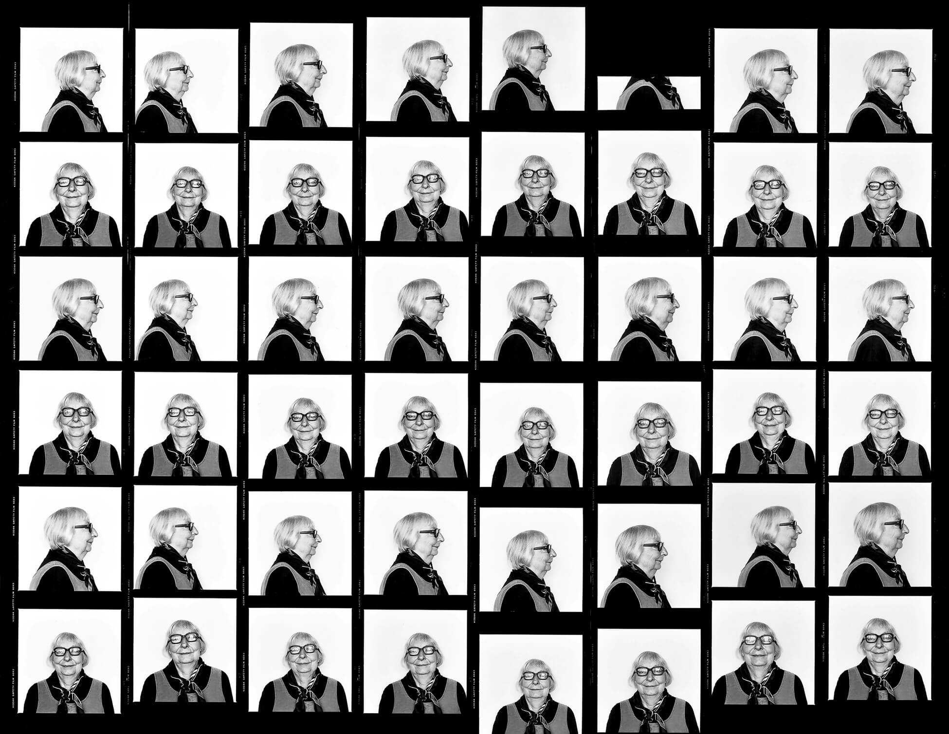
Exhibiting contact sheets also revealed evidence of a different kind. Any mechanical difficulties were laid bare (see his portrait of Jane Jacobs from 48 Views, 1981–83), emphasizing the particularities of the medium and the process. Moreover, shifts in position or displays of personality and emotion in his sitters over the course of the shoot were captured in the system, rather than eliminated in a selection process. The many frames comprising Ledoyen Series, Working Notes show movement in the head and shoulders of some of the Ledoyen chefs. Some—particularly the young chef in the gallery above—could not help but smile in front of the camera. Neutrality was no longer guaranteed. Indeed, as critic David MacWilliam suggests in his review of the work, “Maggs allows the subtle, individual differences of each subject to dominate and to provide a candid yet gentle comment on human nature.”
In works like 48 Views, Maggs put more rigid procedures in place. Rather than photograph all the frontal and profile views separately as he did with Joseph Beuys, the Ledoyen chefs, and the students at the Kunstakademie in Düsseldorf, Maggs had his subjects alternate between frontals and profiles. Noting that he found the “process a little bit boring” in works such as Joseph Beuys, 100 Profile Views, 1980, Maggs felt alternating their views “was far more interesting.” For 48 Views, his subjects re-addressed the camera for each exposure for a total of forty-eight frames, which he determined would fit perfectly on a 16 by 20 inch sheet.
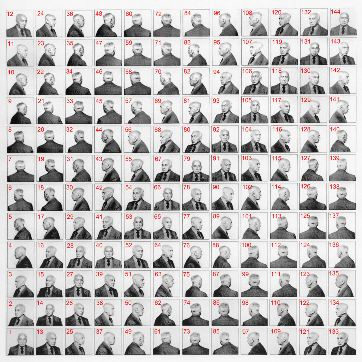
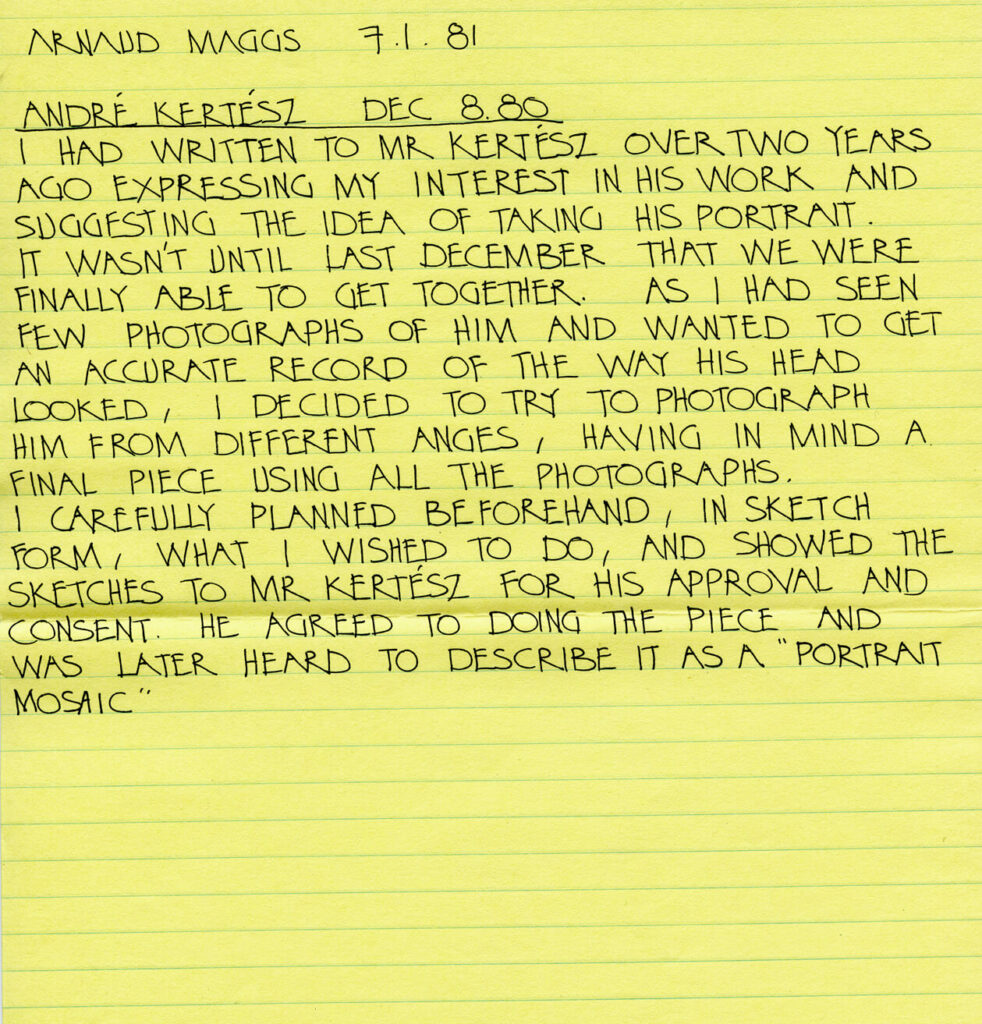
For Turning, 1981–83, and André Kertész, 144 Views, 1980, Maggs introduced an additional procedure. He marked out a system of rotation that, just like a clock face, established twelve key locations for his subjects. He photographed them at each point, documenting a rotation from twelve o’clock to eleven o’clock in twelve frames. Maggs had Kertész enact the rotation twelve times, ultimately resulting in 144 frames of the famous photographer from all sides. For the eighty-six-year-old Kertész, enacting Maggs’s instructions would have been something of an endurance test. As curator Maia-Mari Sutnik points out, “It is evident by frame no. 89 that Kertész’s challenge was not to fall asleep.” Many of Maggs’s grid-based portraits emphasize duration. The motion blur in frame eighty-nine of André Kertész, 144 Views stands out and underscores the effect of time, making the viewer aware of the physically demanding nature of the shoot.
The systems and procedures involved in Maggs’s serial portraits define the early part of his artistic career. However, there are holdovers from this period that are notable in his other works. For example, the installation of each number comprising The Complete Prestige 12″ Jazz Catalogue, 1988, follows logical numerical order. Similarly, there are identifying numbers on each of the labour tags that Maggs photographed for Travail des enfants dans l’industrie: Les étiquettes, 1994, and his hanging scheme for the work calls for the tags to be installed in numerical order.
Scale
Maggs’s photographic artworks are characterized by their monumental scale. Most often grid-based and serial in nature, they are commanding in their enormity. His expansive installations have the potential to envelop the viewer, inviting bodily engagement. Exhibition space was a critical consideration for Maggs in decisions about scale and format throughout his career —so much so, in fact, that he saw much of his work as site-specific. “[M]y works have usually been site specific, especially at the Susan Hobbs Gallery,” Maggs explained. “Not too many galleries in the city have such a huge wall. It’s 50 feet long and 12 feet high.”
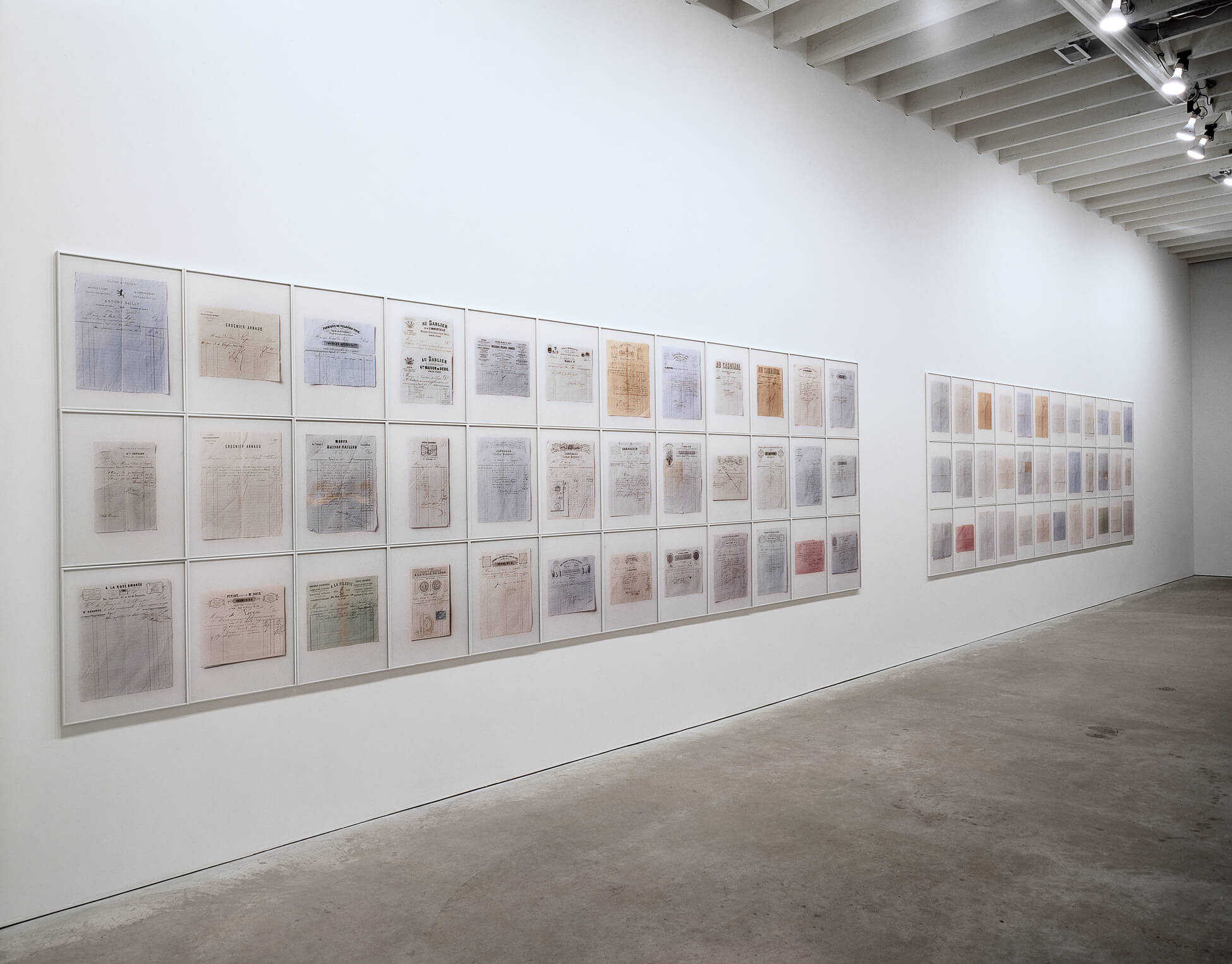
As just one example, the grand scale of that wall allowed Maggs to put the two large-scale grids that comprise Les factures de Lupé, 1999–2001, in dialogue with each other. The grid on the left features the front sides of thirty-six invoices, each outlining banal purchases made by a couple from Lyon, France—the Lupés—in the 1860s. On the right, Maggs mirrors the same collection, though this time showing the versos. Maggs’s statement at once captures the importance of that wall to the development of many of his artworks, and points to the limitations of working to that size. Understanding the value of developing a well-balanced visual unit, Maggs often edited in the face of spatial restrictions in a gallery.
Maggs’s engagement with scale was also informed by the grid structures and seriality of Conceptual art and Minimalism, and his decision to print large-scale images is in keeping with the oversize works characteristic of contemporary photographic output from the 1970s onward. When determining the scale of each individual print, Maggs was careful to establish visual and conceptual weight.
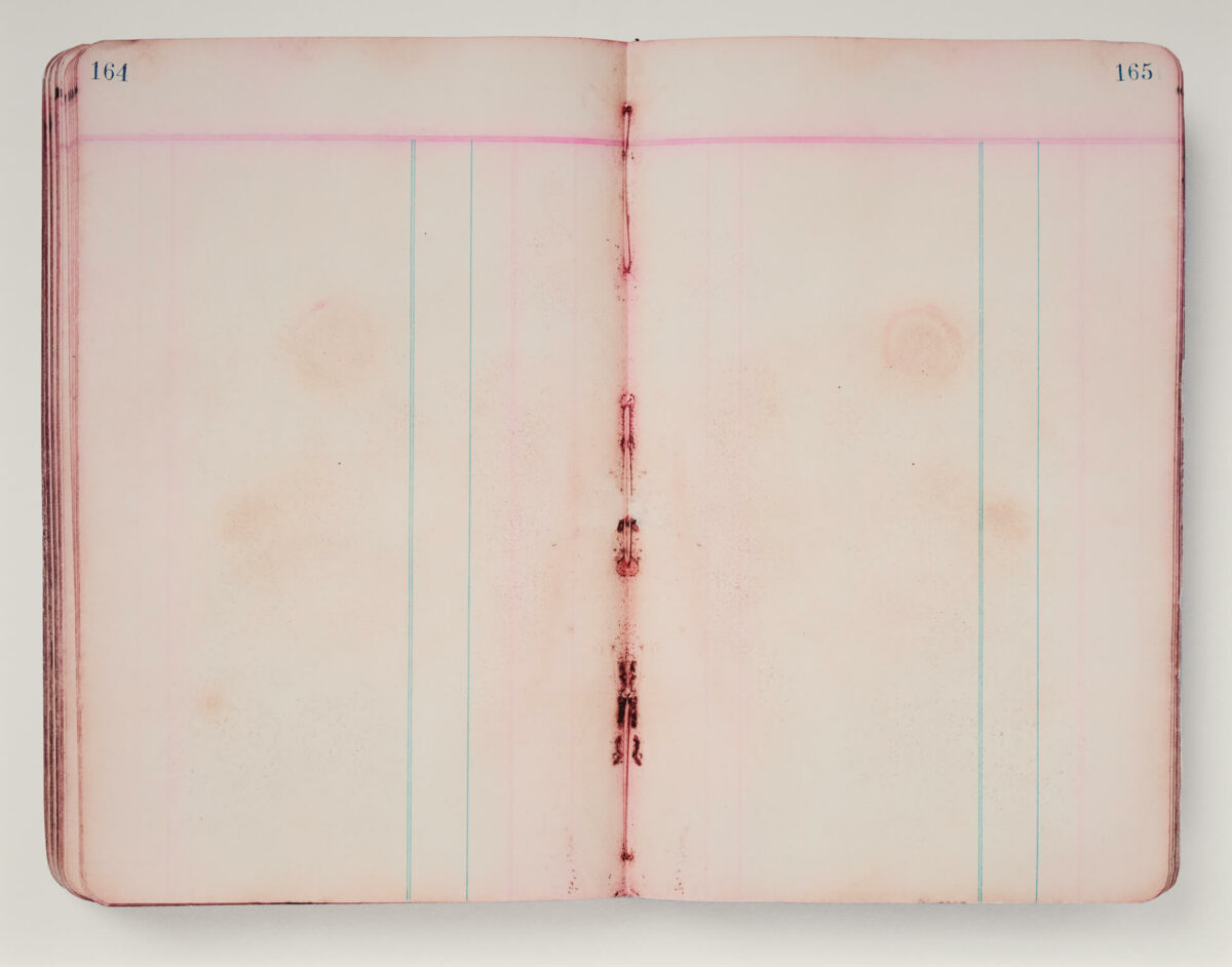
Contamination, 2007, for example, is a series of sixteen chromogenic prints that document mould growth on the water-damaged pages of a Yukon gold rush ledger from 1905. Emphasizing the importance of the subtle detail to his conception of the work, Maggs printed each image at 33 by 41 inches. As if seen through a microscope, his enlargements read as specimens. The scale draws attention to the delicate blooms of mould and the soft staining on the pages.
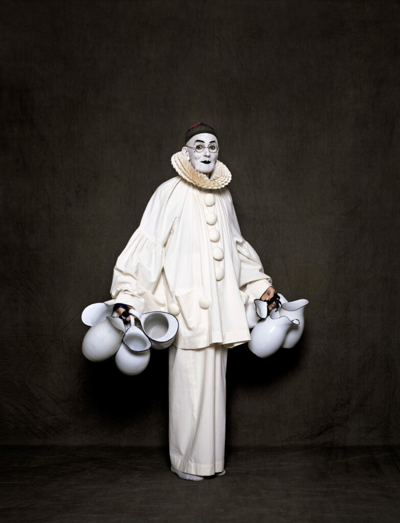
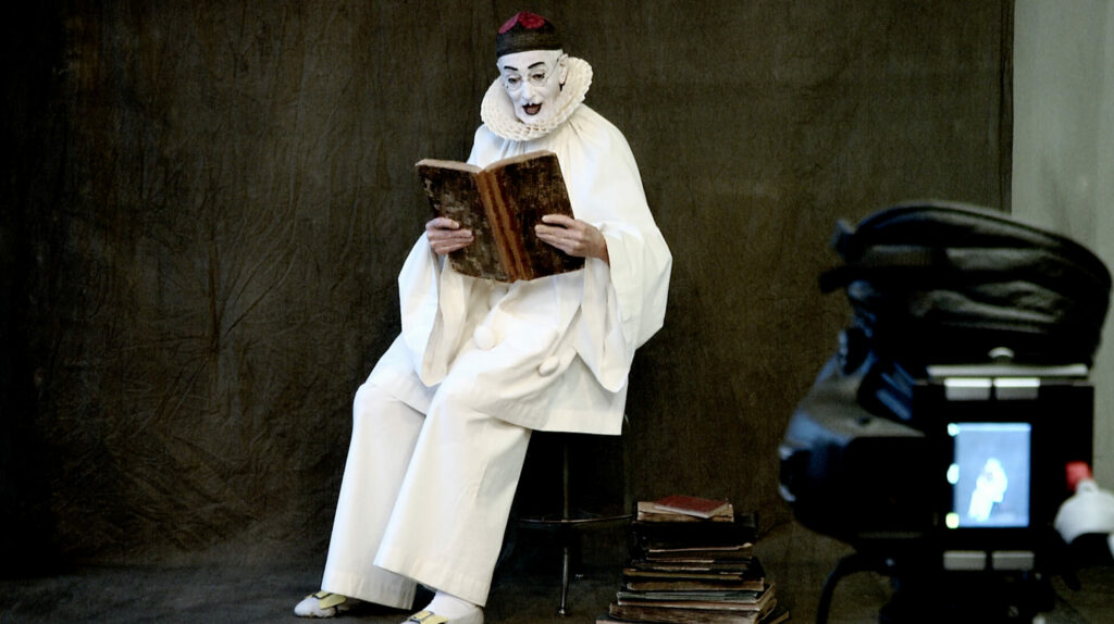
Prints for his final project, After Nadar, 2012, are similarly large-scale. Their size is fundamental to the work and helps to make a powerful connection with the viewer. As his assistant Katiuska Doleatto suggests, “You almost feel like you can walk into this space that he was in.” The bigness amplifies the theatricality of After Nadar—in these works, Maggs performs Pierrot. It simultaneously puts Maggs’s body into a relationship with the viewer’s own, underscoring human vulnerability and the theme of mortality that inflects the work.
Maggs’s process was at once intuitive and methodical. When determining the final scale for his images, he would print an image at multiple sizes to test the possibilities. The goal, according to Doleatto, was to ensure the work had impact. “Anything too small can just look insignificant,” she asserts. Standard photographic paper sizes also contributed to his decisions. Many of the individual prints that form Maggs’s grid-based artworks, for instance, are printed on 16-by-20-inch sheets of photographic paper. As Doleatto explains, twenty inches marked the maximum height of the individual photographs that formed a grid. Anything larger made the grid cumbersome and led Maggs to linear hanging schemes.
Production Techniques
The production processes and technologies used by Maggs as a graphic designer share similarities with those he used as a photographer, illuminating parallels between his ways of working and seeing in each discipline and revealing how practice informs artistic concept.
-
Arnaud Maggs, How to Keep Your Food Safe in Summer, 1962
Illustration paste-up, pen and ink, wash on wove paper, 38.2 x 51 cm (support)Library and Archives Canada, Ottawa
This illustration was created for Canadian Weekly, June 30, 1962.
-
Arnaud Maggs, How to Keep Your Food Safe in Summer, 1962
Illustration paste-up, pen and ink, wash on wove paper, 38.2 x 51 cm (support)
Library and Archives Canada, Ottawa
-
Arnaud Maggs, How to Keep Your Food Safe in Summer, 1962
Illustration paste-up, pen and ink, wash on wove paper, 38.2 x 51 cm (support)
Library and Archives Canada, Ottawa
When Maggs worked as a commercial artist in the 1950s and 1960s, one of his regular tasks was to create layouts and fit type. Working in see-through layers on illustration boards, graphic artists would create paste-ups or mechanicals with artwork positioned in preparation for reproduction. Black artwork and typography form the base layer, and for designs and illustrations in colour, transparent overlay sheets would be positioned atop the base to indicate the areas of colour. Each overlay has matching registration marks to ensure all layers align. How to Keep Your Food Safe in Summer, an illustration prepared by Maggs for the June 30, 1962, edition of Canadian Weekly, depicts a family heading off to a picnic. The paste-up for the illustration comprises a base layer of fine black linework, followed by a spot colour overlay for the banner, and an overlay drawing of colour for the rest of the illustration. Once complete, a paste-up would be converted to a negative using a process camera, which would then be used to prepare plates for the printing press.
The relationship between a photographer and an assistant is not dissimilar to relationships in the commercial art studios Maggs worked in, where specialists did various tasks and Maggs was the art director. Although he did some of his early photographic prints himself, he quickly began working with assistants to achieve superior print quality. “He admitted he knew nothing about photography,” asserts Paul Orenstein, who assisted him in the 1970s. Maggs was careful to surround himself with those who had greater technical proficiency. “He’s always said to me, ‘I’ve always made a habit of hiring assistants who know more than I do,’” confirms Mike Robinson, who started printing for Maggs in 1995. He was exacting: Orenstein recalls that some images would require several reprints to achieve what Maggs wanted and credits this rigour with making him a strong printer.
Orenstein, who started working with Maggs during his period of transition between commercial photography and art, recounts an illustration project that Maggs took on for Toronto Life that is indicative of Maggs’s methods. In 1972, Ken Rodmell was hired as art director for that magazine, and he commissioned Maggs to create a series of illustrations. Repeating similar drawings over and over, Maggs made hundreds of variants, and Orenstein recalls him being critical of the results: “He would deconstruct each one and reject them saying ‘it’s not free enough’ or ‘it’s too forced’.” For Orenstein, the process was revelatory. Maggs’s rigorous approach and his interest in slight differences came through in this project, as it would elsewhere during his career. “Gradually, as he was describing why he didn’t like one and why he did like another,” Orenstein explains, “I could see what he was seeing.”
-
LEFT: Arnaud Maggs, illustration for Toronto Life, 1972
CENTRE AND RIGHT: Arnaud Maggs, Variations 1 and 2, 1972
Pencil on wove paper, 60.8 x 47.8 cm (each)
Library and Archives Canada, Ottawa -
LEFT TO RIGHT: Arnaud Maggs, Variations 3, 4, and 5, 1972
Pencil on wove paper, 60.8 x 47.8 cm (each)
Library and Archives Canada, Ottawa
This attention to detail and comparison of similar images served the photographic printing process as well. Maggs preferred photographing with natural, north light. Depending on the length of his shoot, however, the light could change, resulting in different densities in the negatives across a series. The grid became a useful tool for achieving a consistent look across all frames. “The overall ‘colour’ had to work,” explains Doleatto. “You could have darker and lighter images within the grid, but it’s because they worked with ones that were in the surrounding area that it would work overall.”
Maggs and his assistants would go through a process of test printing and assessing the options to ensure consistency. Putting them up in a grid, Robinson notes, allowed them to “see the transitions in lighting and contrast.” And once you did that, he says, “you could be predictive for the next roll.” Robinson’s burning maps and printing notes for Joseph Beuys, 100 Profile Views, 1980, demonstrate the complexity of the adjustments made to accommodate for the lighting changes during the shoot.
 About the Author
 More Online Art Books
 Acknowledgements