
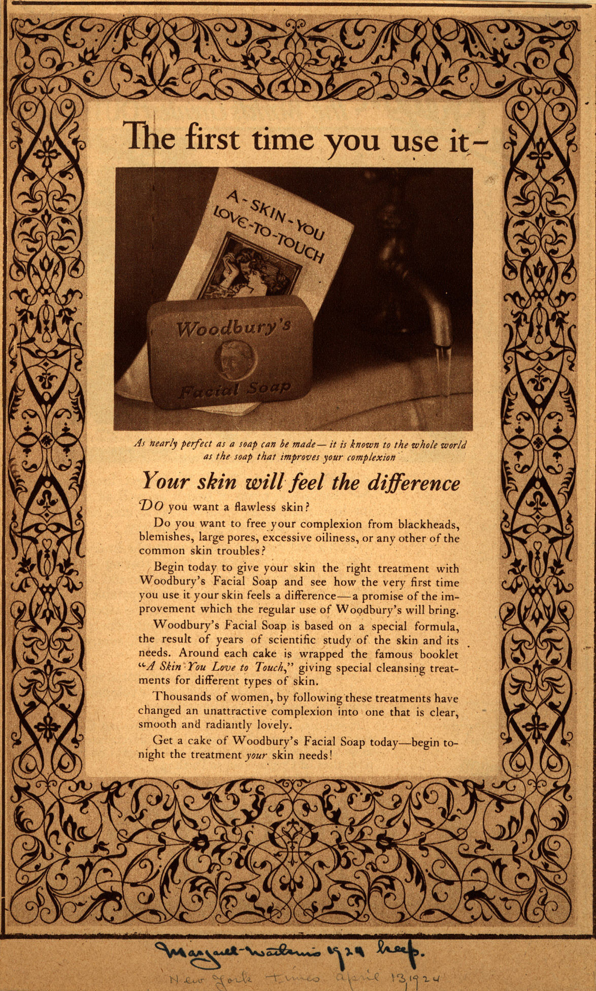
Study for an advertisement [Woodbury’s Soap] 1924
![Study for an advertisement [Woodbury’s Soap]](https://www.aci-iac.ca/wp-content/uploads/2024/03/margaret-watkins-woodburys-soap.jpg)
Margaret Watkins, Study for an advertisement [Woodbury’s Soap], 1924
Palladium print, 15.4 x 20.3 cm
Various collections
It was Margaret Watkins’s ability to portray domestic objects in seductive ways that prepared her to become a successful advertising photographer in the second half of the 1920s in New York City. She was one of the earliest to develop a photographic language for advertising. Here, in a study for an ad for Woodbury’s Soap, commissioned by J. Walter Thompson in 1924 and also accepted at the juried exhibition at the San Francisco International Salon of 1925, Watkins intersects her rectangular shapes of soap and pamphlet and lets them hover over the circle of the marble sink’s edge. The palladium printing process allows for a long scale of grey tones between the dark chiaroscuro background and the light of the edge of the pamphlet. The running tap water also catches a range of tones, with a flash of white from window light neatly situated between the water and its dark shadow line. The objective is to sell a bar of soap, but it is the hint of mystery with the scene’s fading into darkness and the imagined pleasure of the feel of the water, all formed into a set of triangles (the line of the water meeting the edge of the pamphlet, the corners of the soap and the pamphlet) and circles (the sink’s doubled edge, the circle in the centre of the soap). Again, Watkins has achieved a brilliant reshaping of domestic objects into a sensuous realm.
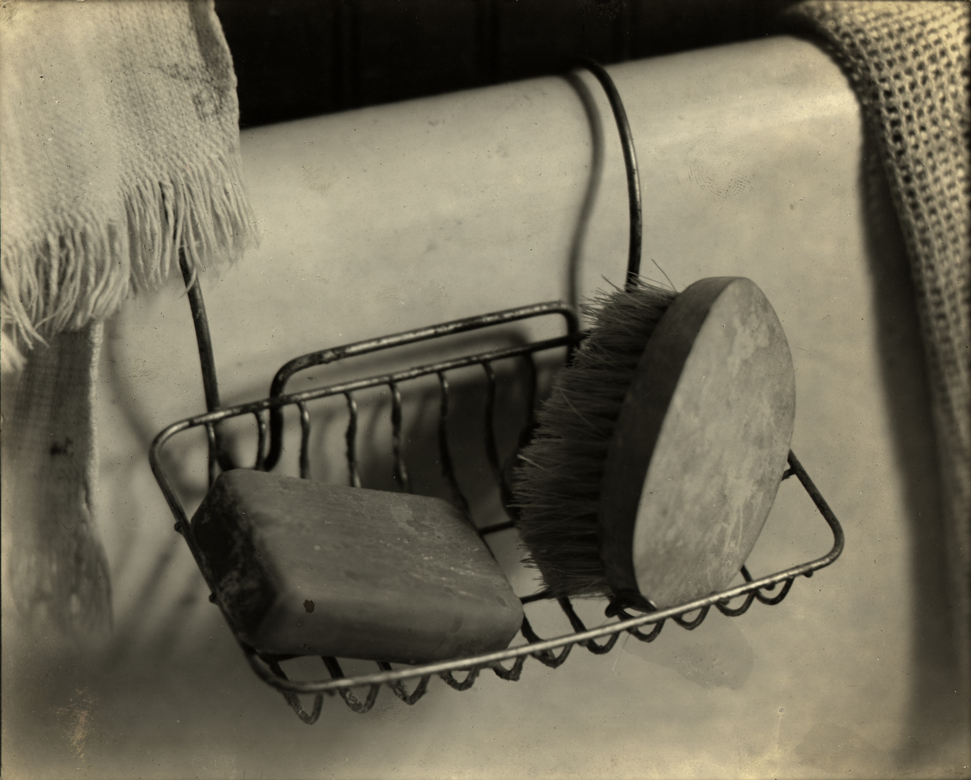
Watkins’s solo show at the Art Center in New York in November 1923 included the category “Still Life & Design.” One of those images was Soap Dish, 1919, sometimes exhibited as Still Life – Bath Tub. This photograph of soap kept a sense of the everydayness of cleaning, or the need for cleaning (in the scratches on the unnamed bar of soap and the worn scrub brush), even while it worked with geometric form, texture, and a range of tones. In comparison, Watkins’s 1924 Woodbury’s Soap image simplified the composition and eliminated the scratches, allowing the sensuousness of form and tone to take over. The idealized object was ready to carry the hope of a life fulfilled if you bought the product.
Watkins provided at least three images for the ad campaign. Two vintage print versions remain (one in the Library of Congress), while another appeared in the New York Times in 1924. The modern form of the image echoed the pamphlet’s text, which offered a scientifically researched regime of cleanliness that would result in “perfect skin.” And the sensuousness of Watkins’s image repeated the meaning of their slogan “A Skin You Love to Touch” (reinforced by the pamphlet’s image of a heterosexual couple). But Watkins’s photograph embodied the equivalent of a broader (essential?) notion of pleasure. She had found the ideal advertising image.
Two years later, a J. Walter Thompson art director obviously remembered her success with this photograph when he requested: “the inner line of the wash bowl… or… the fat, round lines of the porcelain base of a faucet… a smart touch of modern bathroom.”
In Watkins’s own essay on “Advertising and Photography” in the 1926 Pictorial Photographers of America annual, she wrote, “stark mechanical objects” and “commonplace articles show[ing] curves and angles” proved to be a foundation for effective marketing: “the purchaser, however indifferent to circular rhythms, unconsciously responds to the clarity of statement achieved by stressing the essential form of the article.”
 About the Author
 More Online Art Books
 Acknowledgements